Give me feedback on my whole website: https://www.halfbuilt.com.au/
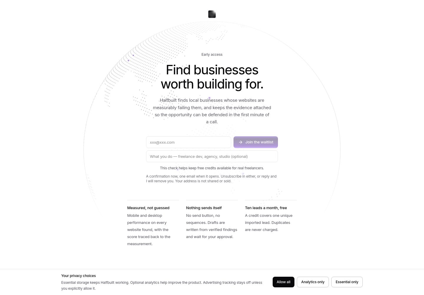
Overall verdict Halfbuilt is a persuade-mode product landing site with a strong minimalist foundation: the restrained white canvas, central interactive area, and single primary ac…
Give me feedback on my whole website: https://www.halfbuilt.com.au/
Overall verdict
Halfbuilt is a persuade-mode product landing site with a strong minimalist foundation: the restrained white canvas, central interactive area, and single primary action give it a calm, focused feel. The main weakness is that the visual polish currently exceeds the clarity of the product story—the visitor needs to understand the job, output, and next step faster.
The saved references below are useful directions, not claims about Halfbuilt:
Captured pages
What is working
1. The hierarchy is deliberately quiet. The large open canvas and limited navigation prevent the page from feeling like a generic multi-section SaaS template.
2. The product surface is the visual focus. The large canvas gives the site something more distinctive than a conventional hero illustration. Keep this direction, but make its purpose more obvious.
3. The typography is consistent. The homepage uses Inter Variable across the hero, body, controls, form and supporting content. The measured hero heading is 44px with a tight 47.52px line height, while supporting copy is more relaxed.
Typography used on Halfbuilt
- Inter Variable
Weight 450 · Size 44px
Priority changes
1. First change: make the hero communicate one job
The first screen should answer three questions immediately:
- Who is Halfbuilt for?
- What does it produce?
- What should I do next?
The form and primary action currently occupy a relatively compact area inside a much larger visual composition. Give the promise more authority and connect the CTA directly to the product outcome. A good structure would be:
Specific audience → concrete outcome → short explanation → one action
Use Huly as the useful comparison here: the product purpose and next action are more tightly connected. Avoid adding more navigation or multiple competing CTAs.
2. Turn the canvas into proof, not just atmosphere
The large canvas is the most distinctive part of the site, but it needs to visibly demonstrate the product’s value. Add a short sequence around it:
- input or starting point
- analysis or transformation
- useful output
- what the visitor can do next
Even a small annotated example would make the canvas feel like a working product rather than a decorative centrepiece. Vellum is a useful direction for showing technical capability through the product surface itself.
3. Give the purple gradient a product-specific reason
The primary button uses a multi-stop purple gradient, ranging from deep violet to light lavender. Against the otherwise monochrome interface, it attracts attention effectively—but it currently risks reading as a familiar SaaS accent rather than a Halfbuilt-specific visual language.
Either:
- simplify it into one distinctive accent colour, or
- use the gradient consistently for a meaningful product state, such as discovery, analysis, confidence, or generated output.
Do not spread it across headings, cards, borders and decorative elements. Its strength comes from being rare.
Colors
#ffffff#09090b#52525b#66666f#e6e7e9#6a3bbc#341e5a#9c79f5
4. Improve trust signals before adding more visual effects
The legal pages have a good editorial structure: a narrow “Legal” metadata rail, a strong title, readable section headings and generous vertical spacing. However, two details weaken trust:
- the cookie banner overlays the reading area instead of reserving space for itself;
- the privacy and terms pages visibly contain the placeholder address
xxx@xxx.com.
Make the consent panel shorter or reserve bottom space so it never hides text. Replace the placeholder contact address before launch; this will have a greater trust impact than adding another animation or visual flourish.
5. Make mobile follow a deliberate sequence
On mobile, preserve this order:
- product promise
- primary action
- short proof or example
- supporting explanation
- secondary details
The canvas should support the action rather than push it below a large visual area. Keep the CTA full-width or nearly full-width, and avoid allowing the form, explanatory copy and visual demo to compete at the same scale.
Useful current values
Current Halfbuilt design values
- Typography · Hero heading
- 44px / 47.52px, weight 450
- Typography · Lead copy
- 15px / 24.3px, weight 380
- Typography · Body copy
- 13px / 19.5px, weight 400
- Spacing · Desktop content inset
- 100px
- Layout · Primary form width
- 448px
- Shape · Control radius
- 8px
- Border · Input border
- 1px solid #e6e7e9
Vibe-coded appearance check
Overall verdict: mixed. The central product canvas and restrained composition feel specific to Halfbuilt; the typography, rounded controls and isolated purple gradient use familiar product-landing conventions.
| Visible occurrence | Judgment | Consequence |
|---|---|---|
| Large central interactive canvas | Earned | Gives the product a stronger identity than a generic illustration-led hero. |
| Sparse white page with one dominant action | Earned | Keeps attention focused, but requires especially clear messaging. |
| Inter Variable used throughout | Neutral | Clean and functional, though not highly distinctive on its own. |
| 8px rounded inputs and buttons | Neutral | Appropriate restraint; the site is not overusing pills or excessive corner rounding. |
| Multi-stop purple gradient on the primary button | Generic/default unless product-linked | Feels like a familiar SaaS accent when it does not represent a visible product state. |
| Two-column legal-page layout | Earned | Creates a credible reading structure and makes long policy content easier to scan. |
| Cookie banner covering the reading area | Generic/default craft issue | Makes the legal pages feel less finished and interrupts reading. |
| Placeholder contact address | Generic/default unfinished detail | Undermines trust in otherwise carefully written legal content. |
Contrast check
The rendered details provide the following exact colour pairs, but matching calculator observations were not retained for these frames, so I’m not assigning ratios.
| Element | Foreground | Background | Size / weight | WCAG | AA | AAA | APCA |
|---|---|---|---|---|---|---|---|
| Body text | #09090b | #ffffff | 13px / 400 | Unresolved | Unresolved | Unresolved | Unresolved |
| Supporting copy | #52525b | #ffffff | 15px / 380 | Unresolved | Unresolved | Unresolved | Unresolved |
| Footer / muted text | #66666f | #ffffff | 12px / 380 | Unresolved | Unresolved | Unresolved | Unresolved |
| Primary CTA text | #ffffff | Purple gradient | 13px / 500 | Unresolved | Unresolved | Unresolved | Unresolved |
The highest-impact improvement is therefore not another decorative treatment: rewrite and strengthen the hero so the product’s job and next action are unmistakable, then use the canvas to prove that promise.
why isn't contrast ratio resolving ?
It didn’t resolve for two separate reasons:
- I passed invented labels such as
body-textandmain-paragraph, not the exact contrast observation IDs returned by the inspection. Those labels were not valid retained IDs. - The page inspection reported no retained contrast candidates for that frame, so there was no exact source observation available for the calculator to use. I should have stated that rather than presenting the rows as if they were calculated.
The purple CTA also uses a gradient, so it cannot be represented by one simple foreground/background pair without specifying the exact point or composited backdrop being tested.
The exact colours were retained, but that is not enough to attribute a contrast ratio to the live page through the inspection calculator.
Compare the CTA contrast across its purple gradient and suggest a safer palette
The current CTA becomes less safe toward its light lavender end. Its gradient runs from dark violet to a much lighter lavender stop, so the brightest part is the point most likely to weaken white-label contrast. The inspection retained the gradient stops but not exact contrast observation IDs, so I can’t provide authoritative per-stop ratios for the current live gradient.
Current CTA stops:
Colors
#6a3bbc#4b2987#392162#341e5a#3c2463#422572#47247e#4f2297#5624a7#6028b9#7139d2#9c79f5
Safer proposed palette
Use white text and keep every gradient stop at or darker than #7c3aed.
Colors
#4c1d95#5b21b6#6d28d9#7c3aed
| Proposed background | White-text WCAG ratio | APCA |
|---|---|---|
#4c1d95 | 10.95:1 | -98.31 |
#5b21b6 | 8.98:1 | -93.93 |
#6d28d9 | 7.10:1 | -88.33 |
#7c3aed | 5.70:1 | -82.77 |
Recommendation
Replace the current lightening tail with:
#4c1d95 → #6d28d9
This keeps the CTA vivid while maintaining a stronger contrast buffer. If you want a brighter result, use:
#5b21b6 → #7c3aed
but treat #7c3aed as the lightest endpoint; do not continue toward #9c79f5 with white text. These ratios are deterministic checks for the proposed flat colours, not claims about the unresolved live gradient.