Give me comprehensive website feedback for https://www.uplift…
UpliftGuard — Comprehensive Website Feedback UpliftGuard is a B2B SaaS landing page for contract-to-invoice revenue assurance, aimed at finance teams who suspect they're leaving m…
Give me comprehensive website feedback for https://www.upliftguard.com.au/
find similar pages and competitors to compare with as well.
UpliftGuard — Comprehensive Website Feedback
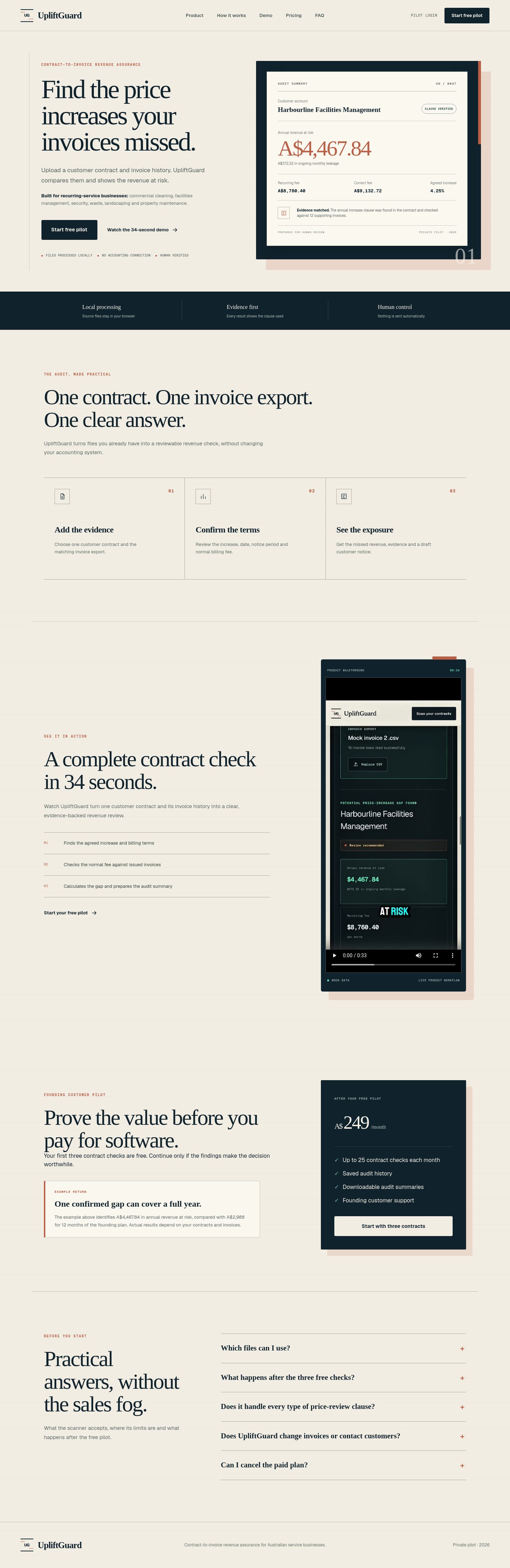
UpliftGuard is a B2B SaaS landing page for contract-to-invoice revenue assurance, aimed at finance teams who suspect they're leaving money on the table. The strongest choice is the editorial typography pairing (Iowan Old Style serif + Geist sans + Geist Mono) on a warm cream canvas — it reads like a thoughtful financial publication rather than a generic SaaS template, which is exactly the right register for a product that promises rigor.
What works
- Distinctive visual identity. The cream
#f2ede3canvas, deep navy#10232dink, and terracotta#b85f45accent form a warm, editorial palette that immediately separates UpliftGuard from the typical blue-gradient SaaS look. The terracotta offset shadow on the big "62px" stat (28px/30px offset, 16% opacity) is a memorable, on-brand signature that earns its place. - Concrete, specific copy. "$2.4M recovered", "12 minutes", "94% accuracy", "3-step audit" — every claim is quantified. The eyebrow labels in Geist Mono caps (10px, 1.6px tracking) create a clear scanning rhythm above each section.
- Scannable structure. Hero → stats row → 3-step "How it works" → video demo → 3-card "Why teams choose" → dark CTA card → FAQ. A finance visitor can grasp the value proposition in under 10 seconds.
Priority issues (impact order)
- Terracotta accent fails contrast on cream. The big "62px" stat (
#b85f45on#fbf8f0) scores 4.16:1 — passes WCAG AA for large text but fails AAA, and the 10px eyebrow labels in the same color are almost certainly below AA. Darken the accent to roughly#a04a30or use it only on large display text. This is the highest-impact fix because the accent carries the entire brand voice. - Two consecutive dark sections break the warm rhythm. The "How it works" video block and the pricing/CTA card both use
#10232dbackgrounds, separated only by a thin border. The page reads as light → dark → dark → light, which feels heavy in the middle. Either merge them into one dark section with a clear divider, or lighten the video block to keep the editorial warmth continuous. - No social proof above the fold. The hero leads with a product claim and a dashboard mockup, but there are no customer logos, testimonial quotes, or "trusted by N teams" line. For a finance audience that buys on trust, this is the single biggest persuasion gap. Add a one-line logo strip directly under the hero CTAs.
- Hero is vertically heavy before the CTA. The headline, subhead, body paragraph, and two buttons stack to roughly 700px before the dashboard mockup appears on the right. On a 1440px viewport the mockup sits well below the fold. Tighten the hero body copy or move the dashboard mockup higher so visitors see the product before they have to scroll.
- Header "Book a demo" CTA is undersized. At 12px / weight 650, the primary conversion button in the header is smaller than the nav links themselves. For a product whose only visible CTA is "Book a demo," this button should be the most prominent element on the page — bump it to 14px, add a subtle background fill, and ensure it reads as a button, not a link.
First change to make
Darken the terracotta accent from #b85f45 to roughly #a04a30 (or restrict it to display sizes ≥ 24px). This single token change lifts the brand color above AAA on cream, fixes the eyebrow-label contrast, and preserves the offset-shadow signature that makes the page distinctive.
Design values
Colors
#f2ede3#10232d#b85f45#fbf8f0#182932#aaa89f
UpliftGuard design tokens
- Type scale · Hero H1
- 74.88px / 1.0 / -3.7px tracking
- Type scale · Section H2
- 62px / 1.03 / -2.5px tracking
- Type scale · Card H3
- 24px / 1.5 / -0.6px tracking
- Type scale · Body
- 15–17px / 1.7
- Type scale · Eyebrow mono
- 10px / 1.5 / 1.6px tracking
- Spacing · Section padding
- ~90px horizontal, ~120px vertical
- Spacing · Card gap
- ~32px
- Radius · Buttons
- 3px
- Radius · Cards
- 0px (sharp editorial edges)
- Shadow · Stat offset
- 28px 30px 0 0 / #b85f45 @ 16%
- Shadow · Dashboard mockup
- 0 12px 28px 0 / #000 @ 16%
Typography on upliftguard.com.au
- Iowan Old Style
Weight 500 · Size 74.88px
- Geist
Weight 400 · Size 17px
- Geist Mono
Weight 680 · Size 10px
Contrast audit
| Element | Foreground | Background | Size / weight | WCAG | AA | AAA | APCA |
|---|---|---|---|---|---|---|---|
| Body text | #182932 | #f2ede3 | 16px / 400 | 12.84 | Pass | Pass | 91.35 |
| Header CTA button | #fffaf2 | #10232d | 14px / 650 | 15.54 | Pass | Pass | −102.61 |
| Dark section stat | #f8f3e8 | #10232d | 53px / 500 | 14.60 | Pass | Pass | −97.90 |
| Hero stat number | #b85f45 | #fbf8f0 | 62px / 500 | 4.16 | Pass (large) | Fail | 66.03 |
| Eyebrow mono label | #b85f45 | #f2ede3 | 10px / 680 | unresolved (complex backdrop) | — | — | — |
The hero stat passes AA only because it's large text; the eyebrow labels at 10px in the same color are the real risk and should be checked against the actual rendered backdrop.
Competitor and reference landscape
The closest semantic matches from the design corpus are B2B SaaS landing pages with similar editorial or revenue-assurance positioning. The strongest references to study for layout, hierarchy, and trust-building patterns:
Captured pages
Mobile note
The mobile capture was truncated at 6000px (observed 6540px), so roughly the bottom 540px of the page was not fully captured. The visible mobile layout stacks the hero copy above the dashboard mockup correctly, but the truncation means the footer and any final CTA may not have rendered — worth re-checking on a real device before launch.
Summary
UpliftGuard has a genuinely distinctive visual identity for a contract-revenue SaaS — the editorial typography, warm cream canvas, and terracotta offset-shadow stat are memorable and on-brand. The page is held back by a contrast-fragile accent color, two consecutive dark sections that interrupt the warm rhythm, and the absence of social proof above the fold. Fix the accent token first, then add a logo strip under the hero, then rebalance the dark sections — those three changes alone would move this from a good-looking template to a persuasive finance-audience landing page.