how can i improve this section
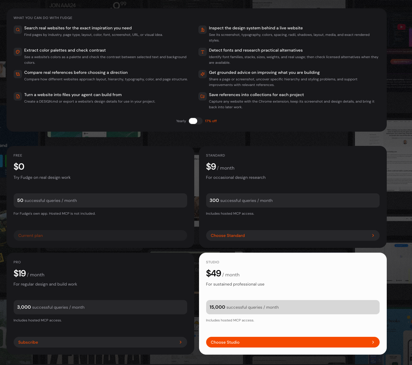
Design improvement guidance Hierarchy & composition Pricing card CTAs are inconsistent. The four buttons use four different labels: "Current plan", "Choose Standard", "Subscribe",…
how can i improve this section
Design improvement guidance
Hierarchy & composition
Pricing card CTAs are inconsistent. The four buttons use four different labels: "Current plan", "Choose Standard", "Subscribe", "Choose Studio". Pick one pattern. Either all are action verbs ("Choose Free", "Choose Standard", "Choose Pro", "Choose Studio") or all are status labels ("Current plan", "Choose Standard", "Subscribe", "Choose Studio"). The current mix reads as accidental.
The "STUDIO" highlight is too quiet. A white card on a dark background is good, but it competes with the orange CTA rather than leading the eye. Add a small "Most popular" or "Recommended" badge above the price, and let the orange button do the work of pulling focus. Right now the eye lands on the white card first, then has to re-find the orange button.
The "Yearly 17% off" toggle is orphaned. It floats between the features grid and the pricing grid with no visual relationship to either. Move it directly above the pricing grid, right-aligned to the grid's right edge, and give it a thin divider above so it reads as a pricing control, not a stray setting.
The features grid feels disconnected from pricing. There's no visual cue that these capabilities are what the tiers unlock. Consider a thin connector (a vertical line, a small arrow, or simply tighter vertical rhythm) so the eye flows from "what you can do" into "what it costs."
Typography
The query limits are buried. "50 successful queries / month" sits in a small grey bar that looks like metadata. This is one of the most important comparison points between tiers. Increase its weight by one step and consider giving each tier's limit a small label like "Quota" so the comparison reads as a table, not a list.
The "/month" suffix is correctly subordinate to the price — keep that. But the price itself ($0, $9, $19, $49) could go one step larger to anchor each card.
Feature descriptions are too small relative to titles. The titles are bold and confident; the descriptions feel like footnotes. Either bring descriptions up one step, or shorten them so they read as supporting copy rather than fine print.
Color & emphasis
Orange is doing too many jobs. It marks icons, the primary CTA, and the "Current plan" pill. Reserve orange strictly for the primary action of each context. Icons can be a softer accent (muted orange, or a neutral with an orange dot), and the "Current plan" state should be a neutral outline, not orange — orange there competes with the actual CTA.
The dark cards have no internal contrast structure. The price, description, and quota bar all sit at similar luminance. Introduce a subtle surface lift for the quota bar (slightly lighter card background) so it reads as a distinct data zone, not just a line of text.
Spacing & rhythm
Vertical rhythm between sections is uneven. The gap from features to the yearly toggle, then to pricing, then between pricing rows, is inconsistent. Pick a single spacing scale (e.g., 24 / 48 / 72) and apply it strictly.
Card internal padding is generous but the gap between cards is tight. The cards feel like they want to breathe individually but are pressed against each other. Increase the gap between cards by ~50% so each tier reads as a distinct choice.
Shape & components
The quota bar is a flat pill with no meaning. It looks decorative. If it represents a usage gauge, fill it proportionally (Free nearly empty, Studio nearly full) so it becomes a visual comparison. If it's purely decorative, remove it — it's adding noise without information.
The "Includes hosted MCP access" line is easy to miss. It's small grey text under the quota bar. Either promote it to a small badge with a subtle border, or move it next to the price as a feature tag.
Quick wins to try first
- Unify the four CTA labels to one pattern.
- Add a "Most popular" badge to the STUDIO card.
- Move the yearly toggle directly above the pricing grid with a divider.
- Make the query limit text one weight heavier.
- Reserve orange for the primary CTA only; neutralize icons and the "Current plan" pill.
Want me to implement any of these as a Tailwind v4 component, or would you like to iterate on the direction first?
could you find inspiration ?
I'll search your saved references for pricing pages with similar structure and dark aesthetic.
Let me inspect the strongest candidates visually.
Inspiration from your saved references
I pulled five pricing pages with similar structure. Here are the patterns worth borrowing, mapped to your section.
1. Add a "Most Popular" badge to the STUDIO card
HeroUI Pro places a small "Most Popular" pill in the top-right corner of the highlighted tier. Framer puts a "POPULAR" badge in the top-left. Both use the badge as the primary signal that this tier is recommended, rather than relying on a card color change alone.
Your STUDIO card currently relies on a white background to signal "recommended." A small badge above the price would make the recommendation explicit and conventional.
2. Replace the standalone yearly toggle with a segmented control
HeroUI Pro uses a three-option segmented control: Pay Yearly [Save 25%] | Pay Quarterly. The discount lives inside the active option as a small inline tag, not as a separate floating toggle.
Your "Yearly 17% off" toggle floats awkwardly between the features grid and pricing. A segmented control with the discount embedded would tie it directly to the pricing and remove the orphan element.
3. Use a top accent line instead of (or alongside) a card color swap
Standards puts a thin colored line across the top of each card — orange for Plus and Pro, white for Enterprise. The line is subtle but immediately differentiates tiers at a glance.
Your STUDIO card uses a full white background, which is a heavier treatment. A thin orange or white top border would differentiate it more elegantly and let the orange CTA do the work.
4. Unify CTA labels to one pattern
Every reference uses a consistent pattern: - HeroUI: "Continue with Free" / "Get started" / "Contact us" - Standards: "Choose Plan" / "Choose Plan" / "Schedule call" - Framer: "Get started" / "Get started" / "Get started" - Linear: "GET STARTED FOR FREE" / "TRY FOR FREE" / "CONTACT SALES"
Your mix of "Current plan", "Choose Standard", "Subscribe", "Choose Studio" is the outlier. Pick one verb and apply it across all tiers.
5. Consider a comparison table for the query limit
Linear and Sanity use a table format when there are 4+ tiers with comparable metrics. Your four tiers differ mainly by query count (50 / 300 / 3,000 / 15,000) — a table row showing "Successful queries / month" with values across all four tiers would make the comparison scannable in one glance, rather than forcing the eye to jump between cards.
6. Borrow the "Detailed plan comparison" escape hatch
Standards includes a small "Detailed plan comparison ↗" link next to the billing toggle. This signals that there's a deeper comparison available without cluttering the main pricing view. Useful if your features grid above is meant as a summary and a full feature matrix exists elsewhere.
Recommended combination for your section
- Add a "Most popular" badge to STUDIO
- Replace the yearly toggle with a segmented control (
Monthly | Yearly [Save 17%]) - Add a thin orange top border to STUDIO instead of (or with) the white background
- Unify CTAs to one pattern (e.g., all "Choose [tier]" except current plan)
- Keep the cards, but consider a small comparison row beneath them showing the query limits in a single line
Captured pages
Want me to implement any of these as a Tailwind v4 component, or would you like to narrow the direction first?