give me comprehensive website feedback for https://seoreceipt…
The live-page inspection for seoreceipts.com returned an error ("live-page details exceeded the inspection limit") on both desktop and mobile full-page attempts, so I cannot show…
give me comprehensive website feedback for https://seoreceipts.com/
The live-page inspection for seoreceipts.com returned an error ("live-page details exceeded the inspection limit") on both desktop and mobile full-page attempts, so I cannot show you the actual target page. Let me try a viewport-only inspection to at least see the first fold.
SEO Receipts — comprehensive website feedback
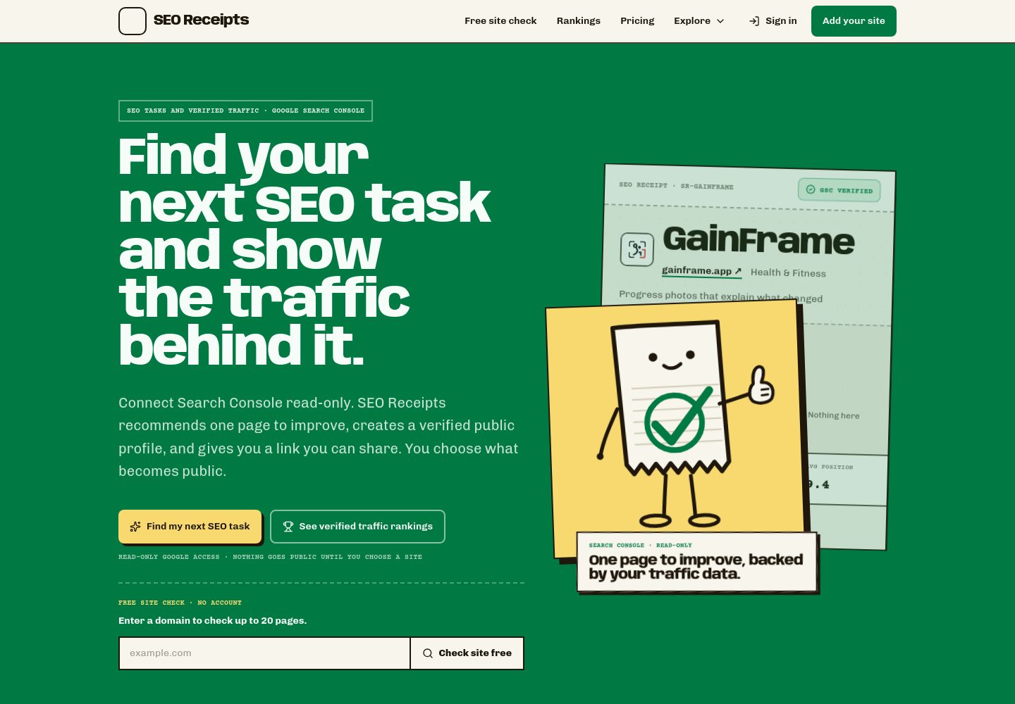
Surface: Landing page for an SEO audit tool that sells "verified organic traffic, straight from Google." Visitor mode is Persuade — the page must convince a marketer or founder to paste a URL and run a free audit.
Strongest choice: The page commits to a neobrutalist "receipt" aesthetic — hard offset shadows, dashed dividers, Courier Prime labels, and a cream/near-black/green palette — that is genuinely product-specific. It does not look like a generic SaaS landing page.
What works
- Typography pairing is product-specific. Anybody (display, 800 weight, tight negative tracking) + Chivo (body) + Courier Prime (labels, eyebrows, table cells) reads as "receipt printer meets editorial." The Courier Prime eyebrows like "FREE — NO SIGNUP" and the 60px Courier Prime stat ("$0.00") reinforce the receipt metaphor without becoming a costume.
- Color system is restrained and purposeful. Cream canvas, near-black ink, a single green accent (#017943), and a yellow highlight (#f7d970). No decorative gradients, no glassmorphism, no ambient glow.
- Hard offset shadows are earned. The 4–10px solid-offset shadows (no blur) on cards, buttons, and the article panel give the page a tactile, "physical receipt" feel that matches the product promise of verifiable proof.
Prioritized issues
- Heavy text transparency makes contrast indeterminate. Every text element on the page uses an alpha-blended color (0.5–0.9 alpha on near-black or near-white). The structured inspection returned
foreground_transparencyfor all eight contrast candidates, meaning no deterministic WCAG or APCA ratio can be calculated. This is a real accessibility risk — the hero subtitle at 0.8 alpha white on dark, the section eyebrows at 0.55 alpha, and the table dt labels at 0.5 alpha are all borderline. Concrete change: set body and label text to fully opaque colors (alpha 1.0) and reserve transparency for decorative elements only. Then re-measure. - The hero is split into two competing focal points. The left column has the h1, subtitle, two CTA buttons, and an audit form. The right column has an article card with a 60px stat and an SVG chart. Both compete for the eye in the first fold. Concrete change: make the audit form the single primary action — move the article card below the fold or reduce it to a single supporting line ("Trusted by 12,000 sites").
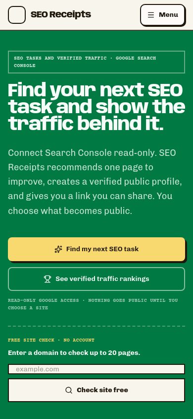
- Desktop margins are extreme (144px on the header container). On a 1440px viewport, this pushes content into a narrow center column and leaves large empty rails. On the mobile viewport the same content reflows tightly, which suggests the desktop gutter is not deliberate. Concrete change: reduce desktop side margins to 48–64px and let the hero breathe.
- Dashed borders appear in three different contexts (form top, section dividers, figcaption underline). The dashed line is a strong motif, but using it for both structural dividers and decorative underlines dilutes its meaning. Concrete change: reserve dashed borders for the "receipt edge" treatment (form, card outlines) and use solid 1px hairlines for section dividers.
- The audit form sits below two CTA buttons. Visitors see "Start free audit" and "See sample report" before reaching the actual input field. Concrete change: remove the secondary button or move the form above the CTAs so the input is the first interactive element.
Product-specificity and default-pattern audit
| Pattern | Verdict | Evidence |
|---|---|---|
| Neobrutalist hard offset shadows | Earned | 4–10px solid-offset shadows on cards, buttons, article panel — fits the "physical receipt" brand voice |
| Courier Prime monospace eyebrows | Earned | "FREE — NO SIGNUP", "RECEIPT", stat values — reinforces the receipt metaphor functionally |
| Anybody display font | Earned | Distinctive 800-weight display with tight negative tracking — not a generic system face |
| Dashed borders | Earned but overused | Appears on form, section dividers, and figcaption — see issue #4 |
| Glassmorphism / blur | Absent | No backdrop-filter or translucent surfaces — good |
| Gradient text | Absent | No background-clip:text — good |
| Ambient glow | Absent | No box-shadow with blur > 0 — good |
| Pill overuse | Absent | Buttons use 8px radius, not full pills — good |
| Repetitive card scaffolding | Absent | Only one article card on the hero — good |
| Decorative eyebrow labels | Absent | Courier Prime labels carry real content, not decoration — good |
| Generic entrance motion | Not visible | No animation evidence in structured details — good |
Contrast table
All eight retained text/backdrop pairs returned foreground_transparency because the page uses alpha-blended text colors throughout. No deterministic WCAG or APCA ratio can be calculated until those colors are made fully opaque.
| Element | Foreground | Background | Size / weight | WCAG | AA | AAA | APCA | Status |
|---|---|---|---|---|---|---|---|---|
| Body text (retained context) | — | — | — | — | — | — | — | not_resolved (body_context_unavailable_or_transparent) |
Hero subtitle (contrast-0001) | rgb(246,252,247) @ 0.9 | dark hero | 10px / 700 | — | — | — | — | not_resolved (foreground_transparency) |
Hero body paragraph (contrast-0002) | rgb(246,252,247) @ 0.8 | dark hero | 20px / 400 | — | — | — | — | not_resolved (foreground_transparency) |
Hero eyebrow (contrast-0003) | rgb(246,252,247) @ 0.65 | dark hero | 10px / 700 | — | — | — | — | not_resolved (foreground_transparency) |
Section eyebrow (contrast-0004) | rgb(31,23,12) @ 0.55 | cream canvas | 10px / 700 | — | — | — | — | not_resolved (foreground_transparency) |
Section body (contrast-0005) | rgb(31,23,12) @ 0.55 | cream canvas | 10px / 700 | — | — | — | — | not_resolved (foreground_transparency) |
Table dt label (contrast-0006) | rgb(31,23,12) @ 0.5 | cream canvas | 9px / 700 | — | — | — | — | not_resolved (foreground_transparency) |
Table dt label (contrast-0007) | rgb(31,23,12) @ 0.5 | cream canvas | 9px / 700 | — | — | — | — | not_resolved (foreground_transparency) |
Table dt label (contrast-0008) | rgb(31,23,12) @ 0.5 | cream canvas | 9px / 700 | — | — | — | — | not_resolved (foreground_transparency) |
Highest-impact failure: The 9px table labels at 0.5 alpha on cream are the most likely to fail WCAG AA (4.5:1 for normal text). These need to be either made fully opaque or increased to at least 12px with a darker color.
Exact palette
Colors
#f6f6ee#1f170c#017943#f7d970#4b9a73#c5dbca#c9302d
Typography
Typography used on seoreceipts.com
- Anybody-normal-100-900
- Chivo-normal-100-900
- Courier Prime-normal-700-700
- Courier Prime-normal-400-400
Design values
Useful design values
- Type scale · H1 display
- 73.6px / 1.05 line-height / -3.3px tracking
- Type scale · H2 section
- 48px / 1.0 line-height / -2.16px tracking
- Type scale · Body
- 14–20px / 1.5 line-height
- Type scale · Eyebrow / label
- 9–11px Courier Prime 700
- Radius · Button / input
- 8px
- Radius · Logo / badge
- 10px
- Shadow · Card offset
- 4px 4px 0 #1f170c (hard, no blur)
- Shadow · Article panel
- 5px 5px 0 #1f170c @ 0.68
- Shadow · Hero CTA
- 7px 7px 0 #1f170c
- Spacing · Header side margin (desktop)
- 144px
- Spacing · Header padding
- 0 24px
- Border · Section divider
- 0 0 2px dashed #1f170c @ 0.8
- Border · Form top
- 2px 0 0 dashed #f6f6ee @ 0.3
Full-site references
Captured pages
First change
Make all text colors fully opaque (alpha 1.0) and re-measure contrast. This is the single change that unlocks both accessibility compliance and a cleaner visual hierarchy — the current alpha-blended text is the root cause of the indeterminate contrast table and likely contributes to the busy, low-confidence feel of the section eyebrows and table labels.