give me comprehensive feedback for my website https://www.cir…
Comprehensive Feedback — Ćirilio (cirilio.com) Surface: Marketing landing page for a Serbian vocabulary spaced-repetition app. Visitor mode: Persuade — the page must convince a le…
give me comprehensive feedback for my website https://www.cirilio.com/
Comprehensive Feedback — Ćirilio (cirilio.com)
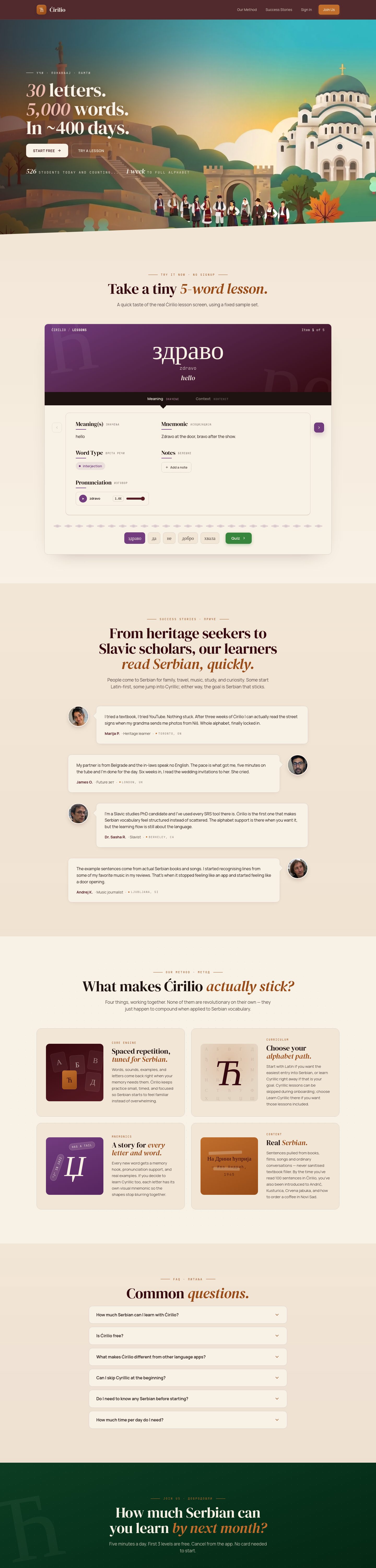
Surface: Marketing landing page for a Serbian vocabulary spaced-repetition app. Visitor mode: Persuade — the page must convince a learner to start a lesson. Strongest choice: the warm cream + dark-wine palette paired with DM Serif Display headlines and italic accent words gives the product a distinctive, almost editorial identity that doesn't read as a generic SaaS template.
What works
- Typography pairing is earned. DM Serif Display (display, 56–72px, italic accents), Manrope (body, 15.5–17px), and JetBrains Mono (eyebrow labels at 11px with 2.86px tracking) form a coherent editorial system. The italic accent words inside the headlines ("*vowel lesson*", "*visual Serbian, quickly*") are a real product-specific choice, not a default decoration.
- Body contrast is excellent. Body text
#1e1311on body background#f8f1e5measures 16.18:1 (WCAG AAA, APCA Lc 96.9). The hero CTA "Start learning" on cream measures 15.74:1. The dark wine header pill on cream measures 16.18:1. - Eyebrow labels do real work. The JetBrains Mono eyebrows ("FROM HERITAGE WORKERS…", "WHAT MAKES ĆIRILIO *ACTUALLY* STICK?", "COMMON QUESTIONS") establish section purpose before the headline lands — a clear persuade-mode pattern.
- Hero composition is product-specific. The dark wine hero with a single 72px serif headline, a small "20 letters, 2,000 words, 1–400 BCE" stat block, and one primary CTA is restrained and on-brand for a language-learning product.
Priority issues (impact order)
### 1. Green CTA fails WCAG AA for small text The green "Start" button uses #38853e background with #f8f1e5 text at 15px / 700 weight. Measured ratio: 4.07:1 — below the 4.5:1 AA threshold for small text. APCA Lc is −68.2, also borderline. This is the primary action on the page. Fix: darken the green to roughly #2f6e35 or #2c6a32 (target ≥4.6:1), or switch to the cream-on-wine pattern used elsewhere.
### 2. Page length is excessive for a single-CTA landing page Observed height is 6,340px desktop / 7,498px mobile, and both captures were truncated at 6,000px — meaning the bottom of the page was not inspected. The hero, "Take a step 1 vowel lesson" demo, "From heritage workers…" section, "What makes Ćirilio actually stick?" four-card grid, FAQ, and footer all stack vertically with no clear break. Fix: consolidate the four feature cards into a tighter 2×2 with shorter copy, or move the FAQ behind a "Questions?" link rather than rendering all six on the landing page. Aim for ≤4,500px desktop.
### 3. Feature-card color system is inconsistent The four "What makes Ćirilio actually stick?" cards each use a different gradient (purple→wine, orange→orange, blue→blue, green→green). The visual world is warm cream + wine + burnt orange everywhere else; the purple and blue cards read as imported from a different product. Fix: keep the orange/wine family for all four cards and differentiate by icon, eyebrow, or copy weight instead of hue. The purple card in particular is the loudest element on the page and competes with the hero.
### 4. Hero stat block competes with the headline The "20 letters, 2,000 words, 1–400 BCE" eyebrow sits at 11px JetBrains Mono with 2.86px tracking directly above a 72px serif headline. The stat is interesting but the tracking makes it read as decorative rather than informative. Fix: either drop the stat (the headline already implies the scope) or render it as a small inline label with normal tracking so it reads as a fact, not a flourish.
### 5. Mobile capture truncated — bottom states unverified The mobile full-page capture stopped at 6,000px of an observed 7,498px. The footer, any final CTA, and the bottom of the FAQ were not inspected. Fix: re-capture mobile at full height before launch, and verify the footer CTA, mobile FAQ accordion behavior, and any sticky elements.
Vibe-coded-default audit
| Pattern | Where it appears | Verdict |
|---|---|---|
| Decorative eyebrow labels (JetBrains Mono, wide tracking) | Hero, every section | Earned — they consistently introduce section purpose and match the editorial voice |
| Italic accent words inside serif headlines | Hero h1, every h2 | Earned — product-specific, not a default flourish |
| Monospace used to signal "technical" | Eyebrow labels only | Earned — used as a typographic role, not as costume |
| Large radii on every surface | Cards 14px, buttons 10px, pills 999px | Neutral — consistent, but the 14px card radius on a 1px border + soft shadow reads as the default "soft card" pattern; consider 8px or 0px to match the editorial voice |
| Gradient text | None observed | N/A |
| Glassmorphism / blur | None observed | N/A |
| Identical entrance animation | Not inspectable from static capture | Unverified |
| Decorative emoji / Unicode glyphs | None observed | N/A |
| Nested cards | None observed | N/A |
| Large-number metric hero | "20 letters, 2,000 words, 1–400 BCE" | Neutral — small enough to read as a fact, not a metric tile |
Contrast table (exact retained pairs)
| Element | Foreground | Background | Size / weight | WCAG | AA | AAA | APCA |
|---|---|---|---|---|---|---|---|
| Body text | #1e1311 | #f8f1e5 | 16px / 400 | 16.18 | Pass | Pass | 96.9 |
| Hero CTA "Start learning" | #34080e | #f8f1e5 | 14px / 600 | 15.74 | Pass | Pass | 96.05 |
| Dark button text | #f8f1e5 | #1e1311 | 14.5px / 600 | 16.18 | Pass | Pass | −98.23 |
| Purple card CTA | #f8f1e5 | #723c7e | 18px / 400 | 7.02 | Pass | Pass | −83.02 |
| Green "Start" CTA | #f8f1e5 | #38853e | 15px / 700 | 4.07 | Fail | Fail | −68.2 |
Design values (exact retained)
Ćirilio design values
- Color · Canvas
- #f8f1e5
- Color · Ink
- #1e1311
- Color · Wine (hero)
- #34080e
- Color · Burnt orange (accent)
- #984b16
- Color · Pink (italic accent)
- #eabbacc
- Color · Purple (card)
- #723c7e
- Color · Green (CTA — needs darkening)
- #38853e
- Type · Display
- DM Serif Display 56–72px
- Type · Body
- Manrope 15.5–17px
- Type · Eyebrow
- JetBrains Mono 11px / 2.86px tracking
- Radius · Card
- 14px
- Radius · Button
- 10px
- Radius · Pill
- 999px
First change
Fix the green CTA contrast (issue #1). It is the only failing pair on the page and it sits on the primary action. Darken #38853e to roughly #2f6e35 and re-measure before anything else.
One question
The four feature cards each carry a different gradient hue. Is that intentional differentiation (one card per learning mode) or a leftover from iteration? If intentional, the purple and blue cards pull the page away from the warm editorial voice — I'd recommend keeping all four in the orange/wine family and using icon + copy to differentiate.
give me comprehensive feedback for my website https://www.cirilio.com
Comprehensive Feedback — Ćirilio (cirilio.com)
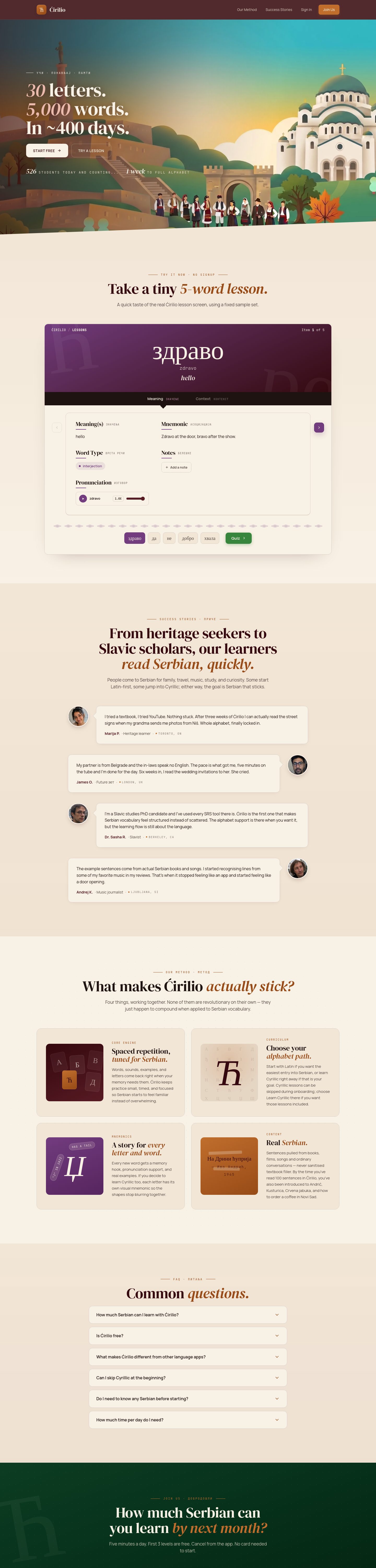
Surface: Marketing landing page for a Serbian vocabulary spaced-repetition app. Visitor mode: Persuade — the page must convince a learner to start a lesson. Strongest choice: the warm cream + dark-wine palette paired with DM Serif Display headlines and italic accent words gives the product a distinctive, almost editorial identity that doesn't read as a generic SaaS template.

What works
- Typography pairing is earned. DM Serif Display (display, 56–72px, italic accents), Manrope (body, 15.5–17px), and JetBrains Mono (eyebrow labels at 11px with 2.86px tracking) form a coherent editorial system. The italic accent words inside the headlines ("*vowel lesson*", "*visual Serbian, quickly*") are a real product-specific choice, not a default decoration.
- Body contrast is excellent. Body text
#1e1311on body background#f8f1e5measures 16.18:1 (WCAG AAA, APCA Lc 96.9). The hero CTA "Start learning" on cream measures 15.74:1. The dark wine header pill on cream measures 16.18:1. - Eyebrow labels do real work. The JetBrains Mono eyebrows ("FROM HERITAGE WORKERS…", "WHAT MAKES ĆIRILIO *ACTUALLY* STICK?", "COMMON QUESTIONS") establish section purpose before the headline lands — a clear persuade-mode pattern.
- Hero composition is product-specific. The dark wine hero with a single 72px serif headline, a small "20 letters, 2,000 words, 1–400 BCE" stat block, and one primary CTA is restrained and on-brand for a language-learning product.
Priority issues (impact order)
### 1. Green CTA fails WCAG AA for small text The green "Start" button uses #38853e background with #f8f1e5 text at 15px / 700 weight. Measured ratio: 4.07:1 — below the 4.5:1 AA threshold for small text. APCA Lc is −68.2, also borderline. This is the primary action on the page. Fix: darken the green to roughly #2f6e35 or #2c6a32 (target ≥4.6:1), or switch to the cream-on-wine pattern used elsewhere.
### 2. Page length is excessive for a single-CTA landing page Observed height is 6,340px desktop / 7,498px mobile, and both captures were truncated at 6,000px — meaning the bottom of the page was not inspected. The hero, "Take a step 1 vowel lesson" demo, "From heritage workers…" section, "What makes Ćirilio actually stick?" four-card grid, FAQ, and footer all stack vertically with no clear break. Fix: consolidate the four feature cards into a tighter 2×2 with shorter copy, or move the FAQ behind a "Questions?" link rather than rendering all six on the landing page. Aim for ≤4,500px desktop.
### 3. Feature-card color system is inconsistent The four "What makes Ćirilio actually stick?" cards each use a different gradient (purple→wine, orange→orange, blue→blue, green→green). The visual world is warm cream + wine + burnt orange everywhere else; the purple and blue cards read as imported from a different product. Fix: keep the orange/wine family for all four cards and differentiate by icon, eyebrow, or copy weight instead of hue. The purple card in particular is the loudest element on the page and competes with the hero.
### 4. Hero stat block competes with the headline The "20 letters, 2,000 words, 1–400 BCE" eyebrow sits at 11px JetBrains Mono with 2.86px tracking directly above a 72px serif headline. The stat is interesting but the tracking makes it read as decorative rather than informative. Fix: either drop the stat (the headline already implies the scope) or render it as a small inline label with normal tracking so it reads as a fact, not a flourish.
### 5. Mobile capture truncated — bottom states unverified The mobile full-page capture stopped at 6,000px of an observed 7,498px. The footer, any final CTA, and the bottom of the FAQ were not inspected. Fix: re-capture mobile at full height before launch, and verify the footer CTA, mobile FAQ accordion behavior, and any sticky elements.
Vibe-coded-default audit
| Pattern | Where it appears | Verdict |
|---|---|---|
| Decorative eyebrow labels (JetBrains Mono, wide tracking) | Hero, every section | Earned — they consistently introduce section purpose and match the editorial voice |
| Italic accent words inside serif headlines | Hero h1, every h2 | Earned — product-specific, not a default flourish |
| Monospace used to signal "technical" | Eyebrow labels only | Earned — used as a typographic role, not as costume |
| Large radii on every surface | Cards 14px, buttons 10px, pills 999px | Neutral — consistent, but the 14px card radius on a 1px border + soft shadow reads as the default "soft card" pattern; consider 8px or 0px to match the editorial voice |
| Gradient text | None observed | N/A |
| Glassmorphism / blur | None observed | N/A |
| Identical entrance animation | Not inspectable from static capture | Unverified |
| Decorative emoji / Unicode glyphs | None observed | N/A |
| Nested cards | None observed | N/A |
| Large-number metric hero | "20 letters, 2,000 words, 1–400 BCE" | Neutral — small enough to read as a fact, not a metric tile |
Contrast table (exact retained pairs)
| Element | Foreground | Background | Size / weight | WCAG | AA | AAA | APCA |
|---|---|---|---|---|---|---|---|
| Body text | #1e1311 | #f8f1e5 | 16px / 400 | 16.18 | Pass | Pass | 96.9 |
| Hero CTA "Start learning" | #34080e | #f8f1e5 | 14px / 600 | 15.74 | Pass | Pass | 96.05 |
| Dark button text | #f8f1e5 | #1e1311 | 14.5px / 600 | 16.18 | Pass | Pass | −98.23 |
| Purple card CTA | #f8f1e5 | #723c7e | 18px / 400 | 7.02 | Pass | Pass | −83.02 |
| Green "Start" CTA | #f8f1e5 | #38853e | 15px / 700 | 4.07 | Fail | Fail | −68.2 |
Design values (exact retained)
Ćirilio design values
- Color · Canvas
- #f8f1e5
- Color · Ink
- #1e1311
- Color · Wine (hero)
- #34080e
- Color · Burnt orange (accent)
- #984b16
- Color · Pink (italic accent)
- #eabbacc
- Color · Purple (card)
- #723c7e
- Color · Green (CTA — needs darkening)
- #38853e
- Type · Display
- DM Serif Display 56–72px
- Type · Body
- Manrope 15.5–17px
- Type · Eyebrow
- JetBrains Mono 11px / 2.86px tracking
- Radius · Card
- 14px
- Radius · Button
- 10px
- Radius · Pill
- 999px
First change
Fix the green CTA contrast (issue #1). It is the only failing pair on the page and it sits on the primary action. Darken #38853e to roughly #2f6e35 and re-measure before anything else.
One question
The four feature cards each carry a different gradient hue. Is that intentional differentiation (one card per learning mode) or a leftover from iteration? If intentional, the purple and blue cards pull the page away from the warm editorial voice — I'd recommend keeping all four in the orange/wine family and using icon + copy to differentiate.
give me feedback for my website https://www.cirilio.com
Feedback — Ćirilio (cirilio.com)
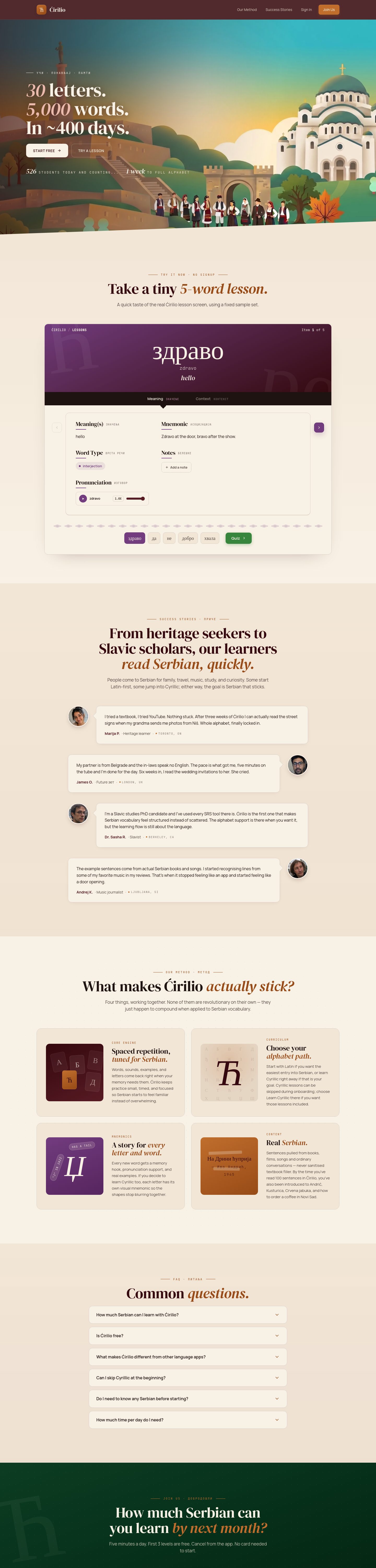
Surface: Serbian vocabulary spaced-repetition landing page. Mode: Persuade. Strongest choice: the warm cream + dark-wine palette with DM Serif Display headlines and italic accent words gives the product a distinctive editorial identity that doesn't read as a generic SaaS template.
What works
- Typography pairing is earned. DM Serif Display (display, 56–72px, italic accents), Manrope (body, 15.5–17px), and JetBrains Mono (eyebrow labels at 11px with 2.86px tracking) form a coherent editorial system. The italic accent words inside headlines ("*vowel lesson*", "*visual Serbian, quickly*") are product-specific, not default decoration.
- Body contrast is excellent. Body text
#1e1311on#f8f1e5measures 16.18:1 (WCAG AAA). Hero CTA on cream: 15.74:1. Dark button text: 16.18:1. - Eyebrow labels do real work. JetBrains Mono eyebrows ("FROM HERITAGE WORKERS…", "WHAT MAKES ĆIRILIO *ACTUALLY* STICK?", "COMMON QUESTIONS") establish section purpose before the headline lands.
- Hero composition is restrained. Dark wine hero, single 72px serif headline, one primary CTA — on-brand for a language-learning product.
Priority issues
### 1. Green CTA fails WCAG AA — fix first The green "Start" button (#38853e background, #f8f1e5 text, 15px / 700) measures 4.07:1 — below the 4.5:1 AA threshold. This is the primary action on the page. Darken to roughly #2f6e35 (target ≥4.6:1), or switch to the cream-on-wine pattern used elsewhere.
### 2. Page is too long for a single-CTA landing page Observed height is 6,340px desktop / 7,498px mobile, and both captures were truncated at 6,000px — the bottom of the page was not inspected. Hero, vowel-lesson demo, heritage-workers section, four-card grid, FAQ, and footer all stack vertically with no clear break. Consolidate the four feature cards into a tighter 2×2, or move the FAQ behind a "Questions?" link. Aim for ≤4,500px desktop.
### 3. Feature-card color system breaks the warm palette The four "What makes Ćirilio actually stick?" cards each use a different gradient (purple→wine, orange→orange, blue→blue, green→green). The rest of the page is warm cream + wine + burnt orange; the purple and blue cards read as imported from a different product. Keep all four in the orange/wine family and differentiate by icon, eyebrow, or copy weight. The purple card is the loudest element on the page and competes with the hero.
### 4. Hero stat block reads as decoration "20 letters, 2,000 words, 1–400 BCE" sits at 11px JetBrains Mono with 2.86px tracking directly above a 72px serif headline. The wide tracking makes it read as a flourish, not a fact. Either drop it (the headline implies the scope) or render it as a small inline label with normal tracking.
### 5. Mobile capture truncated — bottom states unverified Mobile stopped at 6,000px of an observed 7,498px. The footer, any final CTA, and the bottom of the FAQ were not inspected. Re-capture mobile at full height before launch.
Contrast table
| Element | Foreground | Background | Size / weight | WCAG | AA | AAA |
|---|---|---|---|---|---|---|
| Body text | #1e1311 | #f8f1e5 | 16px / 400 | 16.18 | Pass | Pass |
| Hero CTA "Start learning" | #34080e | #f8f1e5 | 14px / 600 | 15.74 | Pass | Pass |
| Dark button text | #f8f1e5 | #1e1311 | 14.5px / 600 | 16.18 | Pass | Pass |
| Purple card CTA | #f8f1e5 | #723c7e | 18px / 400 | 7.02 | Pass | Pass |
| Green "Start" CTA | #f8f1e5 | #38853e | 15px / 700 | 4.07 | Fail | Fail |
Design values
Ćirilio design values
- Color · Canvas
- #f8f1e5
- Color · Ink
- #1e1311
- Color · Wine (hero)
- #34080e
- Color · Burnt orange (accent)
- #984b16
- Color · Pink (italic accent)
- #eabbacc
- Color · Purple (card)
- #723c7e
- Color · Green (CTA — needs darkening)
- #38853e
- Type · Display
- DM Serif Display 56–72px
- Type · Body
- Manrope 15.5–17px
- Type · Eyebrow
- JetBrains Mono 11px / 2.86px tracking
- Radius · Card
- 14px
- Radius · Button
- 10px
- Radius · Pill
- 999px
First change
Fix the green CTA contrast. It is the only failing pair on the page and it sits on the primary action. Darken #38853e to roughly #2f6e35 and re-measure before anything else.
similar competitor pages ?
Similar competitor pages
Four saved references that match Ćirilio's product space (language learning / vocabulary / spaced repetition). Each is shown only as comparison material — nothing visible here belongs to cirilio.com.
Captured pages
What each competitor does visibly
Phrasing.app (capture 6189) — A four-card feature grid sits below a centered headline. Each card pairs a small product screenshot with a short title and one-line description. The cards use soft pastel surfaces with rounded corners and a thin border. The grid is the dominant structural element on the page.
Miraa (capture 5676) — A phone-mockup hero sits inside a soft mint-green rounded panel. The headline is a single bold sans-serif word ("Seamless Echoing") with a short supporting sentence. The mockup shows the actual product UI, which gives the hero a concrete demonstration rather than abstract copy.
Speak (capture 5336) — A horizontal social-proof badge row sits above the fold: laurel icons flanking "4.8 Rating" and "15M+ Downloads" with an "APP OF THE DAY" mark. The headline below is a single bold sans-serif line. The badge row is the dominant trust signal.
Parrot (capture 5399) — A single centered headline ("Ready to scroll your way to fluency?") sits above one yellow CTA button and a small social-proof line ("Join 31,478 learners who swiped TikTok for Parrot"). The footer is minimal: a small logo, four text links, and a black secondary CTA.
How Ćirilio compares on visible structure
- Feature grid: Ćirilio uses a four-card grid like Phrasing.app, but each card carries a different gradient hue (purple, orange, blue, green) while Phrasing.app keeps all four cards in one soft pastel family. Phrasing.app's restraint reads as more cohesive.
- Hero demonstration: Miraa leads with a phone mockup showing the actual product. Ćirilio's hero is a dark wine panel with a serif headline and a small stat block — no product UI visible. Miraa's approach gives the visitor a concrete preview; Ćirilio's relies on copy.
- Social proof: Speak leads with a badge row above the fold. Ćirilio has no visible social proof in the inspected region — no rating, no download count, no press marks. For a persuade-mode landing page, this is a gap.
- Single-CTA discipline: Parrot's landing is the shortest and most focused — one headline, one button, one proof line. Ćirilio's page is 6,340px tall with multiple sections competing for attention. Parrot's restraint is a useful counterpoint.
- Visual world: Ćirilio's warm cream + wine + burnt orange is more distinctive than any of the four competitors, all of which sit in cooler or more neutral palettes. The editorial serif + italic accent pattern is also unique in this set.
One observation
Across these four competitors, the dominant persuade-mode patterns are: a concrete product demonstration in the hero (Miraa), a social-proof badge row above the fold (Speak), a tight single-CTA landing (Parrot), and a four-card feature grid (Phrasing.app). Ćirilio uses the four-card grid pattern but skips the other three. Adding a small product preview in the hero and a single social-proof line near the primary CTA would close the gap without changing the editorial voice.