https://mappit.ai/ Give me comprehensive website feedback for…
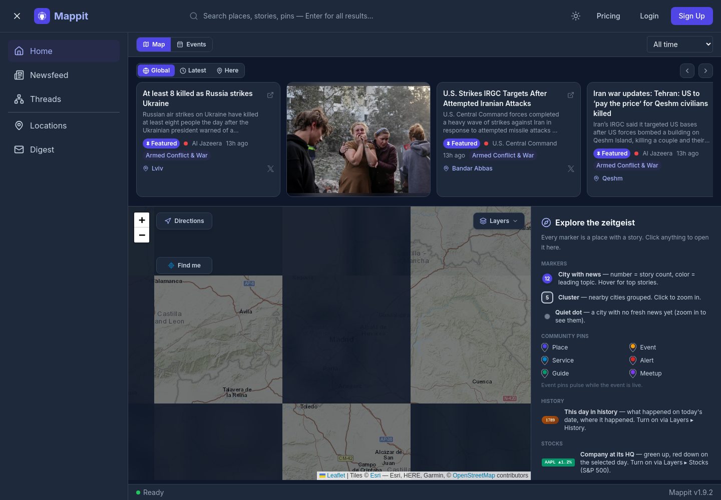
I waited for the homepage to finish settling before reviewing it on desktop and mobile. Executive assessment Mappit currently reads as an operate-mode news and location workspace…
https://mappit.ai/ Give me comprehensive website feedback for mappit find similar pages and competitors to compare.
you should wait for the homepage to load before capturing it in the browser
I waited for the homepage to finish settling before reviewing it on desktop and mobile.
Executive assessment
Mappit currently reads as an operate-mode news and location workspace: dark application chrome, persistent navigation, search, filters, and a dense information area make the product feel substantial. The main weakness is that the homepage does not immediately explain who Mappit is for, what it tracks, and why the map is better than a normal news feed.
First change: add a concise orientation layer above the workspace—one sentence describing the product, one example of the map-to-story relationship, and one primary action—then preserve that same core task on mobile.

Similar pages worth comparing
These are the most useful visual and product-adjacent references for Mappit—not all are direct competitors.
Captured pages
How to use the references
- Ground News: borrow the clarity of comparison and source context. Mappit should make the relationship between location, story, source, and relevance explicit.
- Perplexity Discover: borrow the sense of guided discovery. Mappit’s feed should feel curated rather than like an undifferentiated stream of small metadata blocks.
- Rest of World: borrow stronger editorial hierarchy. A location-based product still needs compelling headlines and readable story summaries.
- Google Earth: borrow the feeling that the map itself is the product. Mappit should make moving through regions, events, and time feel central.
- Saaspo: use as a marketing-page reference if the homepage is meant to acquire users. The current application shell is more suitable after the visitor already understands the product.
Priority issues
1. The homepage begins in product mode before it establishes the product promise
What is happening: the page opens with a dense application shell: navigation, search, controls, filters, and content regions. That is appropriate for an authenticated workspace, but it is not a strong first explanation for a new visitor.
Why it matters: visitors have to infer whether Mappit is:
- a consumer news discovery product,
- a map-based media monitoring tool,
- a location intelligence platform, or
- an editorial research workspace.
Change to make: add a compact orientation band above the workspace:
> Track what is happening, where it is happening, and how the story is spreading.
Pair that with three concrete use cases such as:
- Follow an emerging event by location
- Compare coverage from different sources
- Build a digest around a region or topic
Keep the existing workspace below it for returning users.
Reference: Ground News for clarity of news comparison; Saaspo for explaining a complex product before showing the interface.
---
2. Mobile does not preserve the primary product experience
The mobile frame shows a login surface rather than the desktop news-and-map workspace.
Why it matters: for a location-based news product, mobile is likely to be a natural use case. A visitor should not lose the core value proposition simply because the viewport is narrow.
Change to make: design a deliberate mobile operating model:
- A compact top bar with search and account state
- A Map / Feed toggle
- A bottom navigation with only the essential destinations
- Story cards that open into a focused detail view
- A persistent location or date filter that can be expanded on demand
If login is intentionally required before access, make the post-login destination explicit instead of presenting the authentication surface as the entire mobile experience.
Reference: Google Earth for map-first mobile interaction; Perplexity Discover for compact feed browsing.
---
3. The information hierarchy is too flat for the amount of content
The desktop layout uses a 256px sidebar, a large main workspace, many controls, and numerous small metadata elements. The live page details show frequent use of 12px / 16px text for metadata and 16px / 24px as the base text scale.
Why it matters: users scanning news need to recognize the important story, location, source, and time almost instantly. When many labels, buttons, chips, and metadata rows have similar visual weight, the interface feels busy even when the underlying information is well organized.
Change to make: establish three clear levels:
- Story headline: 24–28px, semibold
- Story summary or key detail: 14px / 22px
- Metadata: 11–12px / 16px
Then reduce the number of simultaneously visible controls. Keep one primary action per story or region; move secondary actions into an overflow menu or expandable detail row.
The map and feed should also have a clear relationship:
- Selecting a map region filters the feed
- Selecting a story highlights its location
- A timeline or “latest” control explains the time dimension
Reference: Rest of World for editorial hierarchy; Perplexity Discover for controlled feed density.
---
4. The visual language is polished but not yet specific enough to Mappit
The rendered page uses a dark slate foundation, indigo accents, Inter, rounded bordered surfaces, pills, and gradients. This is coherent, but it is also close to a familiar AI-dashboard pattern.
Colors
#0f172a#1e293b#334155#4f46e5#a5b4fc#f1f5f9#94a3b8#cbd5e1#b45309#78350f
Why it matters: the strongest differentiator appears to be geographic context, but the visual identity currently communicates “dark SaaS dashboard” more strongly than “location-aware news intelligence.”
Change to make: make geography and provenance visible in the design system:
- Use distinct marker treatments for story, event, source, and region
- Introduce a restrained timeline or route language
- Give location labels stronger visual priority
- Use source identity and confidence as structured information rather than decorative badges
- Reserve the orange gradient for a meaningful state such as breaking, live, or high-priority—not general decoration
The indigo accent is a good foundation. The next step is not more effects; it is making the interface’s visual grammar belong to maps, events, and sources.
---
5. The pricing and acquisition story should connect more directly to the operating experience
Mappit has a pricing route, but the application-style homepage and pricing experience need to answer the same question: what job does Mappit make easier?
Change to make: organize pricing around workflows rather than a generic feature list:
- Monitoring a region
- Tracking a developing story
- Comparing sources
- Creating a digest or report
- Sharing findings with a team
Show a small product example beside each plan so the visitor can connect the price to the actual map-and-news experience.
Product-specificity audit
| Visible occurrence | Mark | Consequence | Recommendation |
|---|---|---|---|
| Persistent location/news workspace | Earned | Gives Mappit a credible operating-product character | Make the map-to-story relationship even more central |
| Dark navy and indigo system | Neutral | Clear and coherent, but familiar in AI/SaaS products | Add geographic and source-specific visual cues |
| Rounded bordered surfaces throughout the main area | Generic/default when overused | Can make every object feel like another interchangeable dashboard card | Use borders for meaningful objects: story, region, source, or saved view |
| Pill-shaped metadata and filters | Neutral | Appropriate for compact filters and tags | Avoid using pills for every piece of descriptive metadata |
| Orange gradient treatment | Generic/default unless semantic | Adds attention but may read as decorative | Reserve it for a meaningful live, urgent, or featured state |
| Inter as the dominant typeface | Neutral | Highly readable and functional | Add stronger size and weight contrast for editorial headlines |
| Mobile login-only surface | Needs attention | The mobile product promise is not visible in the reviewed frame | Preserve the map/feed task on small screens |
Typography and layout direction
The current
Refine Mappit’s typography and colors toward a map-first identity
Mappit’s current rendered system—Inter, deep slate chrome, indigo actions, and pale indigo highlights—is coherent but reads as a generic AI dashboard. A map-first identity should feel geographic, calm, layered, and editorial: dark navigation chrome around a lighter cartographic surface, with color reserved for location, event status, and selection.
Captured pages
1. Typography: create a map layer and an editorial layer
Recommended direction
Keep Inter for controls and dense application UI initially, but stop using it identically for every layer.
- Map labels: compact, medium-weight sans
- Controls and navigation: neutral sans
- Story headlines: more expressive editorial face
- Coordinates, dates, counts: tabular numerals with restrained tracking
A proposed editorial pairing is Inter + Source Serif 4. Use the serif only for story titles, digest headlines, or expanded article context—not for controls or map labels.
Proposed map-first typography
- UI · Navigation and controls
- Inter 14px / 20px, weight 500
- Map · Location labels
- Inter 11px / 14px, weight 600, letter-spacing 0.02em
- Map · Secondary geographic metadata
- Inter 12px / 16px, weight 400
- Editorial · Story headline
- Source Serif 4 24px / 29px, weight 600
- Editorial · Selected story headline
- Source Serif 4 32px / 36px, weight 600
- Metadata · Source, time, coordinates
- Inter 11px / 16px, weight 500, tabular numerals
- Navigation · Primary section label
- Inter 13px / 18px, weight 600
Specific changes
- Do not use 12px text for substantial story summaries. Reserve it for metadata and supporting labels.
- Increase headline contrast. One selected story should be visibly larger than adjacent stories.
- Avoid all-caps headlines. Use uppercase only for compact map labels, categories, or live-status indicators.
- Use tabular numerals for counts, dates, coordinates, and time ranges so columns scan cleanly.
- Give map labels more air. Labels should not compete with roads, markers, and boundaries; use fewer labels at each zoom level.
- Use a serif only where the interface becomes editorial. The contrast between a precise map UI and a readable story headline will make the product feel more like “news in place,” rather than another dashboard.
Rest of World and The New York Times are useful here because they give a dominant story clear editorial weight instead of presenting every item as an equal card.
2. Color: move from “AI indigo” to “cartographic signal”
Mappit’s current colors include:
- Body:
#0f172a - Slate chrome:
#334155 - Indigo action:
#4f46e5 - Pale indigo highlight:
#a5b4fc - Muted text:
#94a3b8 - Primary text:
#f1f5f9
Keep the dark foundation, but change the semantic roles:
- Deep navy for the application shell
- Warm pale map surface for geography
- Muted teal for spatial selection and primary interaction
- Amber for live or notable events
- Coral for urgent or negative status
- Indigo only for focus, links, or a secondary product action
Colors
#0b1720#10232c#16333d#e4ddcb#b9d8d6#4f9a90#e6a84d#d86752#edf3f1#9db1b0
Proposed map-first color roles
- Chrome · App canvas
- #0B1720
- Chrome · Primary panel
- #10232C
- Chrome · Raised panel
- #16333D
- Map · Land surface
- #E4DDCB
- Map · Water surface
- #B9D8D6
- Interaction · Spatial selection
- #4F9A90
- Status · Live or notable event
- #E6A84D
- Status · Urgent event
- #D86752
- Text · Primary text
- #EDF3F1
- Text · Muted text
- #9DB1B0
How the palette should behave
- The map should not be another dark card. Give the central map a lighter, paper-like surface so geography is immediately recognizable.
- Use teal for:
- selected regions
- active routes
- map focus
- primary spatial controls
- Use amber for:
- “live”
- developing
- recently updated
- high-attention events
- Use coral sparingly for:
- warnings
- disruption
- conflict
- severe changes
- Use indigo only for interaction focus or links. Removing it from every action will make Mappit feel less like a standard AI product.
- Avoid gradients on general buttons. If the existing orange gradient remains, it should represent a meaningful event state rather than decoration.
3. Give the interface three distinct visual layers
Application chrome
Keep the dark navy shell for:
- sidebar
- top navigation
- account controls
- global search
- persistent filters
Use thin, low-contrast dividers rather than many bordered cards.
Cartographic workspace
The map should have:
- a light land/water treatment
- restrained boundary lines
- one clear selected-region color
- marker clusters that change by zoom level
- a visible but subtle coordinate or grid logic
- minimal shadows
The grid should communicate scale, position, or navigation. Avoid adding a decorative technical grid that has no relationship to the map.
Editorial story layer
Story cards and digests should feel more like journalism than dashboard records:
- larger headline
- clear location line
- source and timestamp beneath it
- short summary
- one obvious relationship to the map
Use the Ground News reference as inspiration for explicit status signals, but avoid copying its red/blue political-spectrum language. Mappit’s color signals should describe place, time, source, and event state instead.
4. Recommended hierarchy for the main workspace
- Map title or current geographic context
- Map itself as the dominant surface
- Selected location or event summary
- Related story list
- Secondary filters and metadata
On desktop, let the map occupy the visual center rather than treating it as one panel among several equal panels. On mobile, preserve the same relationship through a Map / Stories switch rather than collapsing the map into an inaccessible background.
5. The identity in one sentence
> Mappit should feel like a calm cartographic instrument for understanding live stories—not a dark AI dashboard with a map inside it.
The highest-impact refinement is therefore: lighten and simplify the map surface, reserve teal/amber/coral for geographic and event semantics, and introduce an editorial headline style that contrasts with the precise sans-serif map UI.
Show a revised Mappit color palette with semantic map and event states
Here’s a revised map-first Mappit palette, with spatial and event colors separated from the application chrome.
Colors
#0b1720#10232c#16333d#e4ddcb#b9d8d6#4f9a90#77b8ae#6f8790#e6a84d#d88a2d#d86752#7b6fd0#7aa66d#edf3f1#9db1b0
| Role | Color | Use |
|---|---|---|
| App canvas | #0b1720 | Global shell and navigation |
| Primary panel | #10232c | Sidebars, tool panels, story drawers |
| Raised panel | #16333d | Selected cards and elevated controls |
| Map land | #e4ddcb | Main geographic surface |
| Map water | #b9d8d6 | Oceans, lakes, and waterways |
| Selected region | #4f9a90 | Active territory or selected area |
| Active route | #77b8ae | Routes, boundaries, and connected locations |
| Map boundary | #6f8790 | Neutral borders and geographic divisions |
| Live event | #e6a84d | Recently updated or currently unfolding |
| Developing event | #d88a2d | Growing importance or active monitoring |
| Urgent event | #d86752 | Critical, severe, or disruptive events |
| Informational event | #7b6fd0 | Context, analysis, or non-urgent updates |
| Resolved event | #7aa66d | Closed, verified, or completed events |
| Primary text | #edf3f1 | Text on dark chrome |
| Muted text | #9db1b0 | Secondary metadata and timestamps |
Usage rule
- Teal describes place and spatial focus.
- Amber describes attention and recency.
- Coral describes urgency.
- Violet describes context or analysis.
- Green describes resolution.
- Keep event colors out of general buttons and decorative surfaces so they retain semantic meaning.