I am looking for a feature bento grid layout with backgrounds…
For a feature bento grid with visual backgrounds inside each tile , these are the strongest references: 1. Pop Site — closest match Pop Site reference Why it works: each feature c…
I am looking for a feature bento grid layout with backgrounds within them
For a feature bento grid with visual backgrounds inside each tile, these are the strongest references:
1. Pop Site — closest match
Captured pages
Why it works: each feature card has its own contained background area, image, or product UI preview. The repeated card structure keeps the layout organized while the different visuals create variety.
2. Anytype — structured product bento
Captured pages
Why it works: the large feature tile establishes hierarchy, while the smaller tiles below use their own dark UI backgrounds and compact visual modules.
3. WordPress.com — image-led tile backgrounds
Captured pages
Why it works: the tiles feel like separate canvases. Full-bleed imagery, strong crops, and varied visual treatments make the grid feel more editorial and expressive.
Recommended structure
Use a grid like:
For each tile:
- Give the visual background its own contained region.
- Use
overflow: hiddenand rounded corners. - Add a subtle gradient overlay when text sits on the image.
- Keep the title and description anchored consistently—usually bottom-left.
- Mix tile sizes, but keep the internal padding and typography consistent.
- Use product screenshots, abstract gradients, illustrations, video stills, or UI fragments as the backgrounds.
- On mobile, collapse into a single column while preserving the larger feature tile first.
A good formula is:
The Pop Site reference is the best starting point if you want a clean SaaS/product presentation. The Anytype reference is better if you want a more distinctive, editorial bento composition.
find more inspo like this
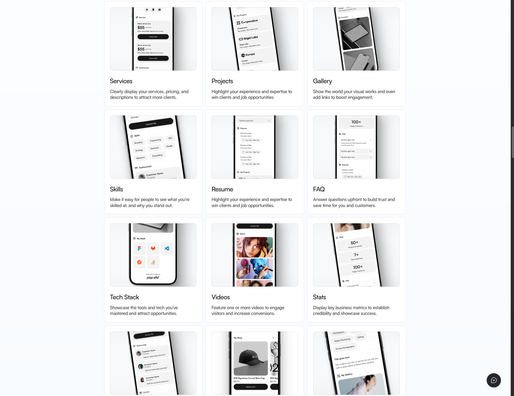
Here are more references in the same direction—modular feature cards with an image, mockup, or visual scene contained inside each tile.
Closest matches
Framer — colorful visual bento
Captured pages
Useful for: a bold, colorful version of the layout. Use one oversized lead card and four smaller supporting cards with different background colors.
---
With Supafast — tall visual feature cards
Captured pages
Useful for: portfolio, agency, or service pages. The cards feel like large visual posters rather than standard content boxes.
---
Kree8 Studio — simple service grid
Captured pages
Useful for: a restrained version close to your screenshot. Keep the cards white, use subtle borders, and let the image area carry the visual interest.
More expressive variations
Baked Design — floating product visuals
Captured pages
Useful for: making each feature feel more dimensional. Instead of placing one image neatly inside each card, allow mockups to overlap or extend beyond the tile.
---
Lovable — template gallery cards
Captured pages
Useful for: a product or template showcase where every card represents a different use case, theme, or outcome.
---
Pop Site — strongest match to your screenshot
Captured pages
Useful for: keeping the exact logic of your reference—consistent image frame, phone mockup, heading, and explanatory copy.
Layout directions worth exploring
Option A — Clean 3-column grid
Best match: Pop Site or Kree8.
Option B — One large card plus four small cards
Best match: Framer or Lovable.
Option C — Tall editorial cards
Best match: With Supafast.
My recommendation
For your design, I’d combine:
- Pop Site’s consistent phone mockup framing
- Kree8’s clean card spacing
- Framer’s varied tile sizing
- Baked Design’s occasional floating or oversized visual
That would preserve the clear, organized 3-column grid while making the section feel less repetitive.