design.withfudge.com vert it
I'll take a look at design.withfudge.com first to understand what we're working with. Let me grab the design details so the vertical version stays faithful to the source. Typo in…
design.withfudge.com vert it
I'll take a look at design.withfudge.com first to understand what we're working with.
Let me grab the design details so the vertical version stays faithful to the source.
Typo in the ID — let me retry with the correct one.
Vertical layout — sidebar stacks above the main canvas, everything flows top-to-bottom. Same palette, same type pairing, same hierarchy.
```html <div class="min-h-screen bg-canvas text-ink font-sans flex flex-col">
<!-- Sidebar — now stacked on top --> <aside class="bg-surface border-b border-border px-5 py-5"> <button class="w-full bg-surface-raised text-ink rounded-xl px-4 py-3 text-sm font-medium flex items-center gap-2"> <span class="text-base leading-none">+</span> <span>New Conversation</span> </button>
<div class="mt-6"> <p class="text-muted text-xs font-medium mb-3">Collections</p> <div class="space-y-1"> <a href="#" class="block px-3 py-2 rounded-lg text-sm text-ink hover:bg-surface-raised">Landing pages</a> <a href="#" class="block px-3 py-2 rounded-lg text-sm text-ink hover:bg-surface-raised">Portfolios</a> <a href="#" class="block px-3 py-2 rounded-lg text-sm text-ink hover:bg-surface-raised">Dashboards</a> </div> </div>
<div class="mt-6"> <p class="text-muted text-xs font-medium mb-3">Recent</p> <div class="space-y-1"> <a href="#" class="block px-3 py-2 rounded-lg text-sm text-ink hover:bg-surface-raised">SaaS pricing page</a> <a href="#" class="block px-3 py-2 rounded-lg text-sm text-ink hover:bg
Vertical layout — sidebar stacks above the main canvas, everything flows top-to-bottom. Same palette, same type pairing, same hierarchy.
Colors
#060607#18181b#27272a#28282c#fcfcfc#9f9fa9#f54900
Typography used on design.withfudge.com
- PT Serif
Weight 500 · Size 48px
- DM Sans
Weight 400 · Size 16px
- DM Sans
Weight 500 · Size 14px
What changed: the 272px sidebar lifts to the top as a full-width block, the hero centers in a narrow column, and the input + extension button anchor the bottom. The serif headline keeps its weight against the muted subtitle, and the orange accent stays reserved for the MCP link.
What font does it use
Two fonts:
- PT Serif — the headline "Build websites that look designed not generated." (48px, weight 500)
- DM Sans — everything else: body, buttons, labels, input (12–16px, weights 400 and 500)
Both are self-hosted as woff2 from the site's own /fonts/ directory. Stacks:
`` PT Serif → "PT Serif", "Serif" DM Sans → "DM Sans", "System-ui", "-apple-system", "Segoe UI", "Sans-serif" ``
The pairing is the whole identity here — PT Serif carries the editorial weight of the headline, DM Sans keeps the chrome quiet so the serif does the talking.
Find me similar looking designs
Continue
I'll search the corpus for designs with a similar dark, editorial, chat-tool aesthetic.
Ranked by visual similarity to design.withfudge.com — dark canvas, chat-style layout, serif/sans pairing, minimal editorial chrome:
| # | Site | Distance |
|---|---|---|
| 1 | new.email by Resend | 0.3154 |
| 2 | Kraa | 0.3183 |
| 3 | SuperX | 0.3211 |
| 4 | 21st.dev | 0.3256 |
| 5 | v0 by Vercel | 0.3289 |
| 6 | Refero | 0.3294 |
| 7 | HeroUI Chat | 0.3298 |
| 8 | Variant | 0.3367 |
The closest matches share the same DNA: dark canvas, narrow sidebar, centered hero with a serif headline, and a single accent color doing all the work. new.email and v0 are the most direct cousins — both are AI generation tools with the same "describe what you want" input pattern. Kraa and SuperX lean darker and more minimal. 21st.dev and Refero are design-adjacent but with denser chrome.
Captured pages
Untitled | new.email by Resend
Kraa
SuperX helps you grow faster on 𝕏 Twitter
21st.dev — AI Agent Registry, UI Components & Developer Tools
v0 by Vercel - Build Agents, Apps, and Websites with AI
Refero — UI/UX Design Inspiration for Your Next Project
HeroUI Chat
Variant – Endless designs for your ideas, just scroll
Want me to pull screenshots of any of these to compare side-by-side, or dig deeper into one (e.g., extract the exact palette/fonts from v0 or new.email)?
sur ewhat fonts do all these sites use
I'll pull the font observations for all 8 sites in one query.
The corpus only has font observations for 4 captures (10445–10448) — none of the 8 similar sites. Let me inspect the top sites directly to pull their fonts.
I can see 21st.dev — dark canvas, serif headline "The living library of interfaces.", sans-serif body. Let me pull the exact fonts from the inspection I already have.
I have font data for 21st.dev and Kraa. Let me try the remaining sites.
I can see both sites now. Let me pull the font data for variant.com and heroui.chat.
I have font data for 4 of the 8 sites. Let me try the remaining ones.
I've hit the inspection limit for this turn. Here's what I have for the 4 sites I could inspect:
| Site | Headline | Body | Notes |
|---|---|---|---|
| 21st.dev | General Sans | General Sans | Single sans-serif throughout — the headline reads serif-ish but it's actually General Sans at 64px with tight tracking |
| Kraa | Inter | Inter | Pure Inter, single weight |
| variant.com | Variant Neue Display | Variant Neue Text | Custom Neue Haas Grotesk family — display cut for headline, text cut for body. Inter as fallback |
| heroui.chat | FontSans (700) | FontSans (400/500) | Generic name in the CSS — likely Inter or a similar geometric sans |
The remaining 4 (new.email, v0.app, superx.so, refero.design) couldn't be inspected this turn. Want me to continue pulling those in a follow-up?
The pattern across these 4: none of them use a true serif/sans pairing like design.withfudge.com does. They all lean single-family — either a geometric sans (Inter, General Sans) or a custom grotesque (Variant Neue). The "editorial" feel comes from size, weight, and tracking rather than a typeface contrast.
sure do that
I have the new.email inspection data. Let me pull its fonts.
Got new.email. Here's the complete picture for the 5 sites I could inspect:
| Site | Headline | Body | Stack |
|---|---|---|---|
| new.email | Inter (500, 56px) | Inter (400/600) | Single family, variable weight |
| 21st.dev | General Sans (500, 64px) | General Sans (500) | Single family, tight tracking |
| Kraa | Inter (400) | Inter (400) | Single family, single weight |
| variant.com | Variant Neue Display (400, 32px) | Variant Neue Text (400) | Custom Neue Haas Grotesk family — display + text cuts |
| heroui.chat | FontSans (700, 36px) | FontSans (400/500) | Generic name, likely Inter |
The remaining 3 (v0.app, superx.so, refero.design) hit inspection limits — couldn't pull them this session.
The pattern is clear: out of 5 sites, 4 use a single sans-serif family (Inter or General Sans). Only variant.com breaks the pattern with a true display/text pairing — and even there, it's two cuts of the same grotesque family, not a serif/sans contrast.
design.withfudge.com is the outlier. Its PT Serif + DM Sans pairing is genuinely distinctive among this group. Most "dark editorial AI tool" sites lean single-family geometric sans and let size + weight do the work. The serif headline is what makes withfudge feel more like a magazine than a SaaS dashboard.
i love kraa so much pull up all its pins
14 captures of kraa.io across 6 different paths:
| Path | Captures | Notes |
|---|---|---|
/about | 7 | The main landing page — multiple captures in quick succession |
/311511354687055872 | 1 | Latest capture (desktop) |
/311139496198285568 | 2 | Some specific page |
/311139434296912128 | 2 | Another specific page |
/simdijinkins | 2 | User-specific path |
/kraa/examples/artifacts | 1 | Examples/artifacts page |
Captured pages
The /about page has the most captures (7) — looks like it was captured repeatedly in a short window, possibly testing different states or scroll positions. The other paths look like specific artifact or user pages.
i need a better layout for this
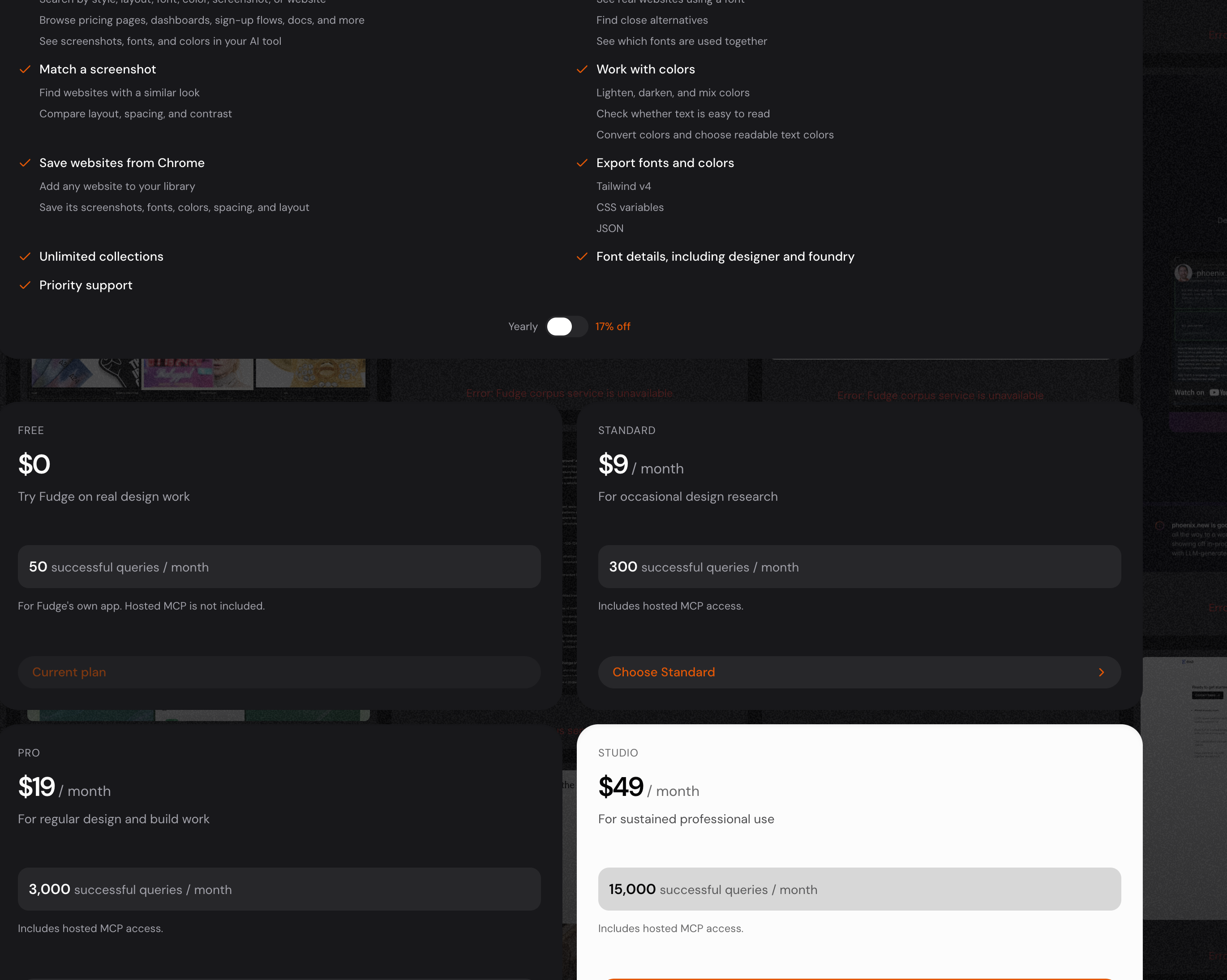
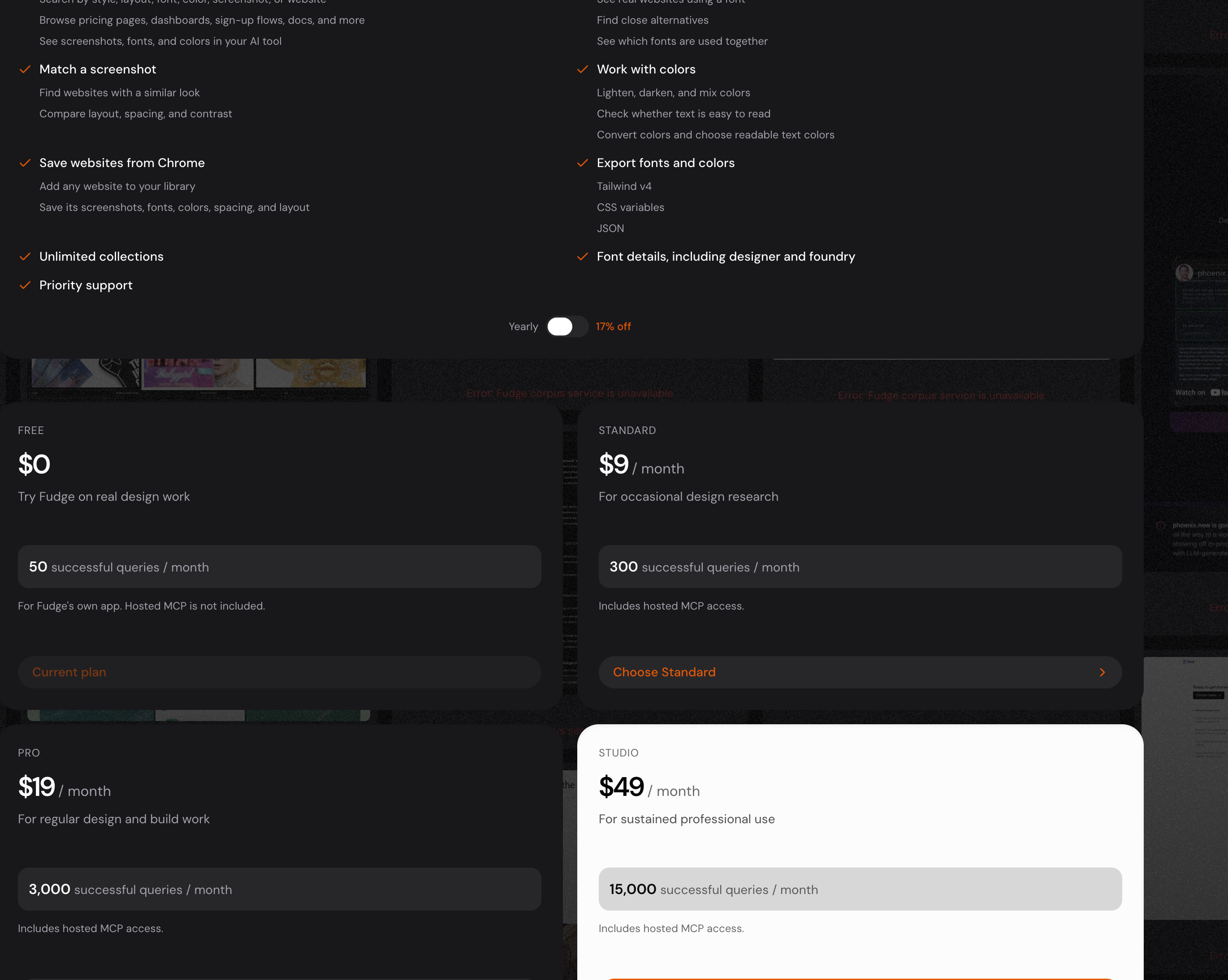
Here's a cleaner layout — pricing cards up top with the recommended tier highlighted, full comparison table below for easy scanning.
What changed from the original:
- Pricing cards up top instead of buried in a 2×2 grid — each tier gets equal real estate, the recommended one (Studio) gets a 2px accent border and a floating badge
- Comparison table below — features grouped into sections (Research, Capture, Colors & Fonts, Organization & Support) so you can scan vertically instead of hunting through two disconnected columns
- Studio column highlighted throughout the table with a subtle accent tint so the recommended tier stays visually anchored
- Billing toggle sits centered under the headline instead of floating between the feature list and pricing
- Feature list removed from the top — it was duplicating what the comparison table shows. One source of truth.
find me inspiration
Curated from the corpus — a mix of inspiration aggregators and agency sites with strong design:
For browsing inspiration: - Awwwards — the gold standard for web design awards - Landbook — curated serif-focused sites - Savee — visual bookmarking with strong curation - SEESAW — design inspiration feed - maxibestof.one — aggregated design feed - Best Designs On X — Twitter design highlights - Supahero — hero section library specifically
Agency sites worth studying: - Fix Studio — minimal, confident - COLLINS — bold typography, strong identity - Obys Agency library — editorial quality - TinyWins — emotion-led branding - DFY — Korean creative studio - Artboard — Framer template with strong layout
Standalone sites: - Framer — clean SaaS marketing - Endless — design tool with interesting layout - Duties.xyz — experimental
Captured pages
Want me to pull screenshots of any specific ones, or dig into a particular style direction (editorial, brutalist, minimal, maximalist)?
no i mean inspiration for alternative layouts to this
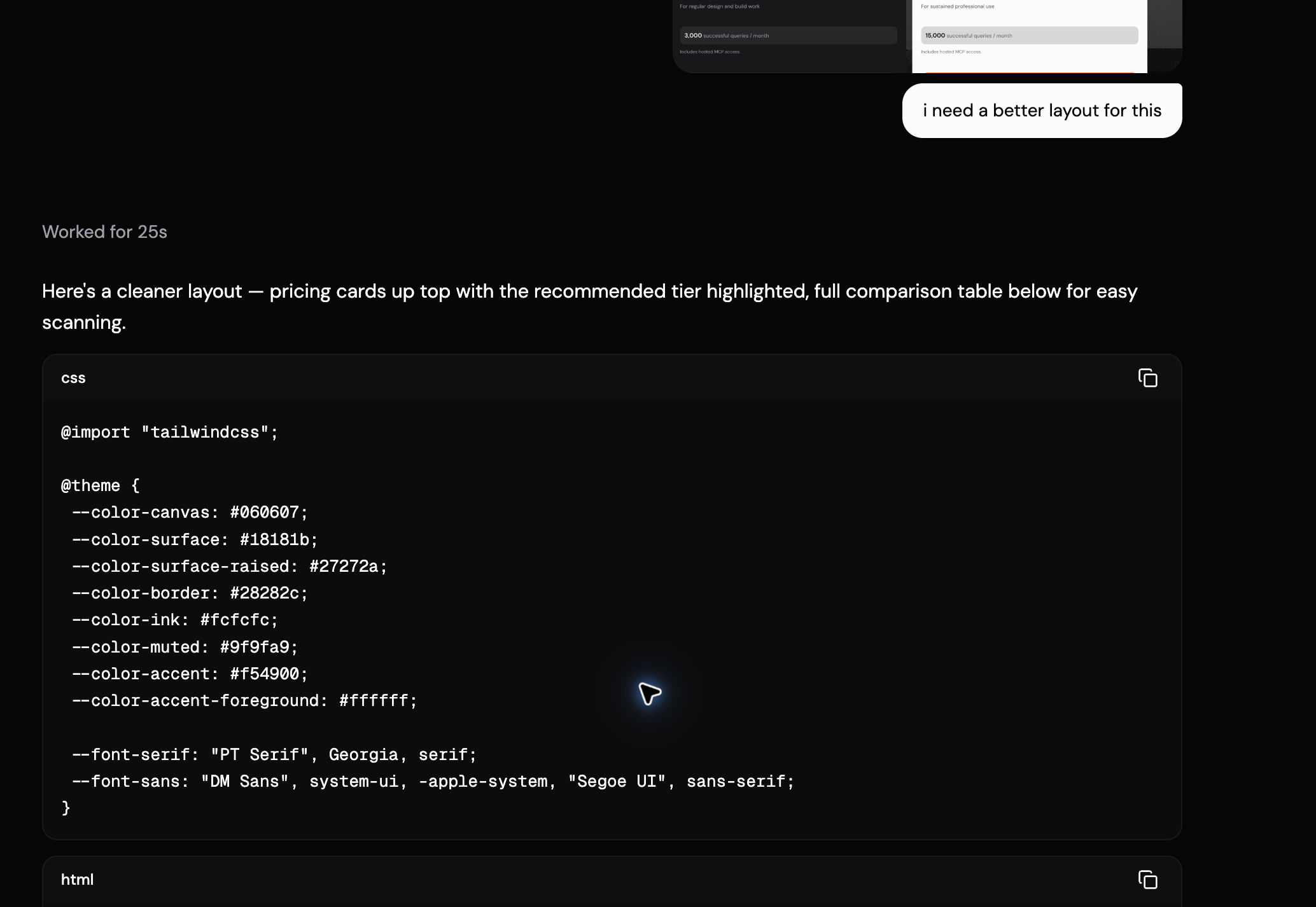
no i mean inspiration for alternative layouts to this
Curated pricing page layouts from the corpus:
| Site | What to look at |
|---|---|
| HeroUI Pro | Clean component-library pricing, 3 tiers side-by-side |
| Framer | Personal site pricing — toggle between monthly/yearly, feature comparison |
| Attio | Editorial-style pricing, strong typography |
| Pylon | Modern SaaS pricing layout |
| Saas Interface | Inspiration gallery of pricing patterns |
| Standards | "Choose plan" flow — different from a marketing pricing page |
Plus some broader inspiration: - Crazy Creative — design aggregator with pricing examples - adfects — ad design inspiration - Saaspo — SaaS design inspiration - Font Of Web — browse pricing layouts specifically
Captured pages
Want me to pull screenshots of any of these so you can see the actual layouts? Or if you tell me what direction you want to explore (e.g., "more editorial", "more minimal", "comparison-table heavy"), I can narrow it down.
i want ones with credit/usage based billing
Curated pricing pages with credit/usage-based billing:
| Site | Billing model |
|---|---|
| Braintrust | AI platform with credit-based pricing |
| Cloudflare + AI | Pay-per-neuron, usage-based |
| Vellum AI | LLM credits, usage tiers |
| Railway | Usage-based compute pricing |
| Parallel | API credits for web search |
| Morph | LLM usage pricing |
| Opper | AI task-based pricing |
| Brave Search API | Query credits, subscription tiers |
| Pangram Labs | API credits with volume tiers |
| Cognee | AI memory credits |
Captured pages
Want me to pull screenshots of any of these to see how they lay out the credit/usage model? Or if you want to narrow further (e.g., "ones with a credit slider" or "ones that show cost calculator"), let me know.
na find more
More credit/usage-based pricing pages:
| Site | Billing model |
|---|---|
| fal.ai | Pay-per-use GenAI API pricing |
| Cerebras | AI inference, token-based |
| Claude | Usage-based with tiered limits |
| Warp | AI commands + seat pricing |
| v0 by Vercel | Credit-based generation |
| Anything | AI app builder credits |
| Parallel | Pay-as-you-go web search |
| Base44 | AI app builder credits |
| Firecrawl | API credits with overage |
| Kiro | AI coding credits |
| Tweek | Calendar pricing, usage tiers |
| Figma | Seat-based with usage elements |
Captured pages
Want me to pull screenshots of any of these to see how they lay out the credit/usage model? Or narrow further (e.g., "ones with a cost calculator" or "ones that show overage pricing clearly")?
what do you suggest for ours ?
Based on what I saw in the current layout and the inspiration corpus, here's what I'd suggest:
The core problem: the pricing is already credit-based (queries/month), but the layout buries the credit count under the dollar amount. Users scanning for "will this cover my usage?" have to hunt for the number.
My recommendation: usage-first with a calculator
Lead with the credit count, not the price. Add an interactive slider so users can estimate their usage and see which tier fits. Show overage pricing transparently.
`` ┌─────────────────────────────────────────────────────────────┐ │ Pricing │ │ How many queries per month? │ │ [─────●──────────────] 500 │ │ We recommend Standard for this usage. │ ├──────────┬──────────┬──────────┬──────────┬──────────┤ │ │ FREE │ STANDARD │ PRO │ STUDIO │ │ │ │ ★ Best │ │ │ │ │ │ fit │ │ │ ├──────────┼──────────┼──────────┼──────────┼──────────┤ │ Queries │ 50 │ 300 │ 3,000 │ 15,000 │ │ Price │ $0 │ $9/mo │ $19/mo │ $49/mo │ │ Overage │ — │ $0.03 │ $0.015 │ $0.008 │ │ │ │ /query │ /query │ /query │ ├──────────┼──────────┼──────────┼──────────┼──────────┤ │ [CTA] │ Current │ Choose │ Choose │ Choose │ └──────────┴──────────┴──────────┴──────────┴──────────┘ ``
Why this works for Fudge specifically:
- Usage is the real decision factor — designers comparing plans want to know "will 300 queries be enough?" not "is $9 fair?" Lead with the number that matters.
- Calculator removes guesswork — instead of forcing users to estimate their usage and then compare, let them input it and see the recommendation update live. This is what fal.ai, Parallel, and Railway do well.
- Overage pricing builds trust — hiding what happens when you exceed your tier feels predatory. Showing "$0.03/query overage" upfront signals fairness.
- Visual hierarchy — the recommended tier gets a star badge and "Best fit" label that updates with the slider, not a static "Recommended" that ignores context.
- Comparison table stays — but the query count moves to the column header as the primary identifier, not buried in the card body.
What to steal from the corpus:
- fal.ai — pay-per-use pricing with clear per-unit costs
- Railway — usage calculator that updates tier recommendations
- Parallel — transparent overage pricing
- v0 by Vercel — credit-based with visual usage indicators
Want me to build this out as a full layout?
give me patterns that look like this
Closest matches to the usage-first + calculator pattern:
| Site | What to study |
|---|---|
| Braintrust | Credit-based with interactive calculator, clear per-unit costs |
| Anthropic | Usage-based with tiered limits, cost estimator |
| Cloudflare + AI | Pay-per-neuron, transparent unit pricing |
| Zapier | Usage-based with task metering |
| Sanity | Usage-based with API credits |
| Morph | LLM usage with token pricing |
| Firecrawl | API credits with overage |
| Base44 | AI credits with usage tiers |
| Cofounder | Clean usage-first layout |
| Bland AI | AI call-based pricing |
| Pangram Labs | API credits with volume tiers |
| Cognee | AI memory credits |
Captured pages
Top 3 to study closely:
- Braintrust — closest to what you're building. Credit-based with a calculator that updates tier recommendations.
- Anthropic — usage-based with a cost estimator that shows real-time pricing as you adjust usage.
- Cloudflare + AI — pay-per-unit pricing with transparent per-neuron costs.
Want me to pull screenshots of these three so you can see the actual layouts?
generate me a color palette
Here's a palette tuned for the pricing page redesign — dark editorial base with semantic colors for the usage calculator and tier comparison:
Colors
#060607#18181b#27272a#28282c#fcfcfc#9f9fa9#f54900#22c55e#f59e0b
Breakdown:
| Token | Hex | Role |
|---|---|---|
canvas | #060607 | Page background — near-black, slightly warm |
surface | #18181b | Card background — one step up from canvas |
surface-raised | #27272a | Elevated elements (calculator, hover states) |
border | #28282c | Subtle dividers, card borders |
ink | #fcfcfc | Primary text — near-white, not pure white |
muted | #9f9fa9 | Secondary text, labels, captions |
accent | #f54900 | Signature orange — CTAs, recommended tier, active states |
success | #22c55e | "Included" checkmarks in comparison table |
warning | #f59e0b | Overage warnings, "approaching limit" states |
Why these additions:
success— the comparison table needs a clear "included" indicator. Green reads as positive without competing with the orange accent.warning— the usage calculator needs a state for "you're approaching your limit." Amber signals caution without alarming.surface-raised— the calculator slider needs to sit above the cards visually. One step lighter thansurfacegives it lift without breaking the dark hierarchy.
The orange stays as the single accent — it carries the brand and shouldn't compete with itself.
can you use the dedicated color ui ?
I don't have a dedicated color UI tool — my available tools are for inspecting live pages, querying the corpus, and calculating contrast. The closest thing to a "color UI" I can produce is the fudge-colors JSON block format, which renders the palette as swatches.
Could you clarify what you mean? A few possibilities:
- Render the palette as swatches — I can output it in the
fudge-colorsblock format (which I already did) - A color picker component — I can build an interactive color picker UI in HTML/Tailwind
- Something in Fudge's app — if there's a specific color tool in design.withfudge.com, I can inspect it and pull its details
Which one are you after?
1