Give me comprehensive website feedback for https://mectrics.app.
mectrics.app — comprehensive review A free macOS menu-bar system monitor landing page in Persuade mode. The strongest choice is the warm cream canvas with a single oversized displ…
Give me comprehensive website feedback for https://mectrics.app.
mectrics.app — comprehensive review
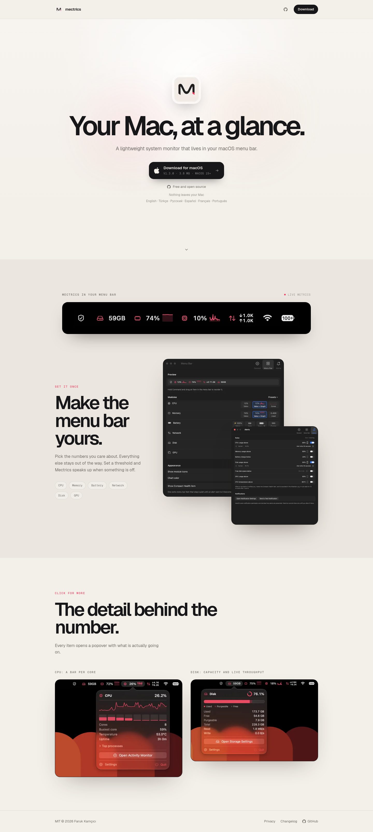
A free macOS menu-bar system monitor landing page in Persuade mode. The strongest choice is the warm cream canvas with a single oversized display headline and real product screenshots — it reads as a deliberate editorial product page, not a template.
What works
- Product specificity is high. The hero shows the actual app icon, the actual menu-bar readout (CPU, battery, RAM, network, etc.), and the actual settings panel. A visitor can tell in three seconds what this is and where it lives. Compare to generic "AI-powered productivity" pages.
- Typography pairing is earned. Geist for display/body and Geist Mono for the small uppercase eyebrow labels (
DESIGNED FOR YOUR MAC,LIVE IN THE BAR,CPU · RAM · FAN,BUILT AROUND THE COMPONENTS) signals "system utility" without leaning on emoji or fake icons. The 103px H1 with -7.8px tracking and the 72px H2s give the page a confident editorial scale. - The hero composition is distinctive. A radial highlight on the app icon, a soft linear gradient warming the top of the canvas, and two faint radial color washes (pink at 28%/58%, warm orange at 72%/45%) create depth without resorting to glassmorphism or gradient text. The screenshot card sits on a real drop shadow (
rgba(40,31,29,0.45) 0 22px 55px -24px), not a decorative glow.
Priority issues, ranked
- Eyebrow accent color fails AA at 11px. The pink
#f43b5don the card surface#ebe6dfmeasures 3.0:1 (APCA Lc 48.9). It passes WCAG large-text AA only because it's uppercase tracking — at 11px / weight 500 it is small text and fails. This is the most repeated color pair on the page (four eyebrow labels). Darken to roughly#d63350or#c92a4ato clear 4.5:1, or bump the eyebrow to 12px / weight 600. - Secondary body text fails AA on the card surface.
#706b66on#ebe6dfmeasures 4.25:1 (APCA Lc 61.8). The 16px paragraph under "Make the menu bar yours" and the 16px paragraph under "The detail behind the number" both sit on this surface. Darken to roughly#5a5550to clear 4.5:1, or move the body copy onto the lighter#f3efe9canvas. - The first feature section has a cramped text column. The "Make the menu bar yours" copy sits in a ~337px column (212–549px x), which forces the 24-character H2 "Make the menu bar yours." to break across three lines and the body paragraph to wrap awkwardly. The second feature section uses a wider ~1016px column for the same H2 ("The detail behind the number.") and reads much better. Widen the first column to ~480–520px or shorten the H2 to two lines.
- No trust signals for a free download. The page asks the visitor to download a binary with zero social proof — no download count, no star rating, no testimonial, no "as seen in" line, no GitHub stars link in the hero. For a free macOS utility competing with iStat Menus and MenuMeter, this is the highest-impact missing element. Add a one-line proof strip directly under the CTA: e.g., "Free forever · No account · Open source on GitHub · 12k installs."
- The two feature sections are visually identical. Same eyebrow → H2 → paragraph → two-up screenshot grid, same card border treatment, same shadow recipe. The page reads as one pattern repeated twice. Vary the second section: swap to a single full-width screenshot with a caption, or flip the text/image sides, or introduce a small inline metric ("<2% CPU at idle") to break the rhythm.
Contrast table
| Element | Foreground | Background | Size / weight | WCAG | AA | AAA | APCA |
|---|---|---|---|---|---|---|---|
| Body text | #171719 | #f3efe9 | 16px / 400 | 15.62 | Pass | Pass | 95.4 |
| Primary CTA | #f3efe9 | #171719 | 13px / 600 | 15.62 | Pass | Pass | -96.7 |
| Eyebrow accent | #f43b5d | #ebe6df | 11px / 500 | 3.00 | Fail | Fail | 48.9 |
| Section body | #706b66 | #ebe6df | 16px / 400 | 4.25 | Fail | Fail | 61.8 |
The two failing pairs are the highest-impact items because they appear on every feature section.
Vibe-coded defaults audit
- Eyebrow labels in monospace with wide tracking — earned. The product is a system monitor; the monospace eyebrows reinforce that without becoming a costume.
- Display scale (103px H1) — earned. Single-product landing, no competing headlines, the scale matches the editorial cream canvas.
- Pill primary CTA — earned. One action, one button, fully rounded. Not a pill reflex.
- Cards with subtle 10%-opacity borders — earned. Used to frame real screenshots, not as template scaffolding for icon-heading-copy trios.
- Radial color washes in the hero — earned. They create depth on the cream canvas without becoming decorative gradient text or glassmorphism.
- No emoji icons, no gradient text, no glassmorphism, no identical entrance animations, no vague controls — clean.
Palette
Colors
#f3efe9#ebe6df#171719#706b66#98918a#f43b5d
Typography
Typography used on mectrics.app
- Geist
Weight 600 · Size 103.68px
- Geist
Weight 600 · Size 72px
- Geist
Weight 400 · Size 16px
- Geist Mono
Weight 500 · Size 11px
Design values
Useful design values
- Spacing · Section vertical rhythm
- ~1152px between feature sections
- Spacing · Header padding
- 0 32px
- Spacing · Nav gap
- 24px
- Radius · Primary CTA
- 18.4px
- Radius · Screenshot card
- 20px
- Radius · App icon
- 25% (rounded square)
- Type scale · Display H1
- 103.68px / 1.05 / -7.8px tracking
- Type scale · Section H2
- 72px / 0.95 / -4.7px tracking
- Type scale · Eyebrow
- 11px / 1.5 / 1.76px tracking / uppercase
- Shadow · Hero screenshot
- rgba(40,31,29,0.45) 0 22px 55px -24px
- Shadow · Settings screenshot
- rgba(28,24,22,0.7) 0 28px 70px -36px
Reference directions
Captured pages
First change
Fix the eyebrow accent contrast. Darken #f43b5d to roughly #c92a4a (or shift the eyebrow to 12px / weight 600) so the four repeated eyebrow labels clear WCAG AA. This is the highest-leverage edit because it touches every feature section at once and removes the only accessibility failure on the page.