Give me feedback on my whole website: https://launchreceipts.com/
Launch Receipts is a startup launch directory in Read mode — visitors browse a feed of product launches and traction posts. Its strongest choice is restraint: a pure monochrome pa…
Give me feedback on my whole website: https://launchreceipts.com/
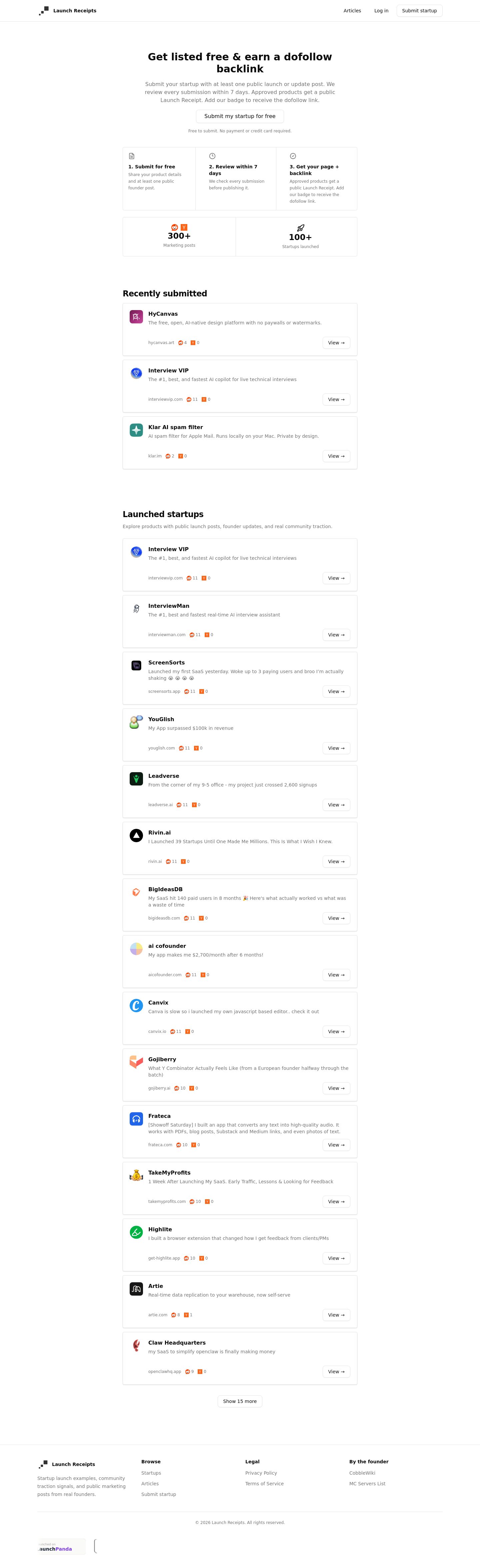
Launch Receipts is a startup launch directory in Read mode — visitors browse a feed of product launches and traction posts. Its strongest choice is restraint: a pure monochrome palette, system font stack, and subtle 1px borders that let the product thumbnails and copy carry the page.
What works
- Body text contrast is excellent. #0a0a0a on #ffffff scores 19.81:1 — well past AAA. The primary reading experience is unambiguous.
- The "Featured" row breaks the feed rhythm. Three columns (Latest Posts, Top Voted, Top Comments) give visitors three different discovery paths before the long list begins. This is the one moment the page feels curated rather than dumped.
- Card anatomy is consistent and scannable. Thumbnail → product name → one-line description → vote/comment counts → "Visit" button. Every card follows the same shape, so the eye learns the pattern after two rows.
Priority issues
- The product feed is a 15-card wall of identical rows. Every card is the same height, same 40×40 thumbnail, same button position, same spacing. The page is 4,703px tall on desktop and the majority is this repeating pattern. There is no visual rhythm, no category grouping, no "trending" or "new" badge, no featured highlighting. This is the classic repeated same-sized icon-heading-copy card pattern — generic/default for a directory site. Why it matters: visitors scanning 15 identical rows lose the signal of which products matter. The "Featured" row above promises curation, but the feed below delivers a flat list.
- No visual identity or brand differentiation. The site uses Tailwind's default
ui-sans-serif, system-ui, sans-serifstack and a pure monochrome palette (white, near-black, one muted gray, one light border). There is no accent color, no custom typeface, no logo treatment beyond a small icon. For a site about "Startup Marketing Posts and Traction Proof," there is no visual personality that signals startup culture, marketing energy, or social proof. Why it matters: the page could be any directory site — the visual language does not belong to this product.
- Thumbnails are too small to create visual interest. Product logos render at 40×40px. At that size they are barely recognizable and contribute almost no visual texture to the page. A grid layout with larger thumbnails (80–120px) would let the products themselves create the page's visual rhythm.
- The hero is weak. The H1 reads "Launch Receipts | Startup Marketing Posts and Traction Proof" — this is a page title, not a compelling hero. There is no social proof number ("147 launches this month"), no compelling imagery, no secondary CTA. The "Submit Yours" button is the only action above the fold.
- No filtering or categorization in the product feed. The nav has "Articles" and "Submit" but there is no way to filter the 15-product list by category, tag, date, or sort order. For a directory, this is a discoverability gap.
First change
Break the monotonous card wall. Replace the single-column repeating list with a two- or three-column grid that groups products by category (e.g., "AI Tools," "Productivity," "Design") with section headers, and increase thumbnail size to 80–96px. Add a small accent badge — a green dot for "trending" or a blue dot for "new" — to break the monochrome and give the eye anchor points. This single change addresses issues 1, 2, and 3 simultaneously: it creates visual rhythm, introduces brand differentiation through the accent, and makes thumbnails large enough to contribute texture.
Contrast pairs
| Element | Foreground | Background | Size / weight | WCAG | AA | AAA | APCA |
|---|---|---|---|---|---|---|---|
| Body text | #0a0a0a | #ffffff | 16px / 400 | 19.81 | Pass | Pass | 105.85 |
| Hero subtitle | #737373 | #ffffff | 16px / 400 | 4.74 | Pass | Fail | 72.95 |
| Small caption | #737373 | #ffffff | 12px / 400 | 4.74 | Pass | Fail | 72.95 |
| Button text | #171717 | #ffffff | 14px / 500 | 17.92 | Pass | Pass | 104.69 |
| Card description | #737373 | #ffffff | 14px / 400 | 4.74 | Pass | Fail | 72.95 |
All pairs pass WCAG AA. The secondary text (#737373) is borderline for AAA — acceptable for metadata but could be strengthened to #595959 (7:1) if you want full AAA compliance on descriptions and counts.
Palette
Colors
#ffffff#0a0a0a#737373#e5e5e5
Design values
Launch Receipts design values
- Typography · Font stack
- ui-sans-serif, system-ui, sans-serif
- Typography · H1
- 30px / 700
- Typography · H2
- 24px / 700, -0.6px tracking
- Typography · H3 (card title)
- 16px / 700
- Typography · Body
- 16px / 400
- Typography · Secondary text
- 14px / 400, #737373
- Typography · Caption / metadata
- 12px / 500, #737373
- Spacing · Card gap (vertical)
- ~170px
- Spacing · Header padding
- 0px 32px
- Shape · Button radius
- 8px
- Shape · Chip radius
- 4px
- Shape · Thumbnail size
- 40×40px
- Surface · Card border
- 1px solid #e5e5e5
- Surface · Card shadow
- rgba(0,0,0,0.05) 0px 1px 2px
- Surface · Button shadow
- rgba(0,0,0,0.05) 0px 1px 2px