Give me comprehensive website feedback for https://hiremara.c…
Hiremara — comprehensive website feedback Hiremara is a single-product AI email marketer whose strongest choice is the "Mara writes them all" headline: it names the three lifecycl…
Give me comprehensive website feedback for https://hiremara.com/
here are some screenshots. find similar pages and competitors to compare with as well.
continue
Hiremara — comprehensive website feedback
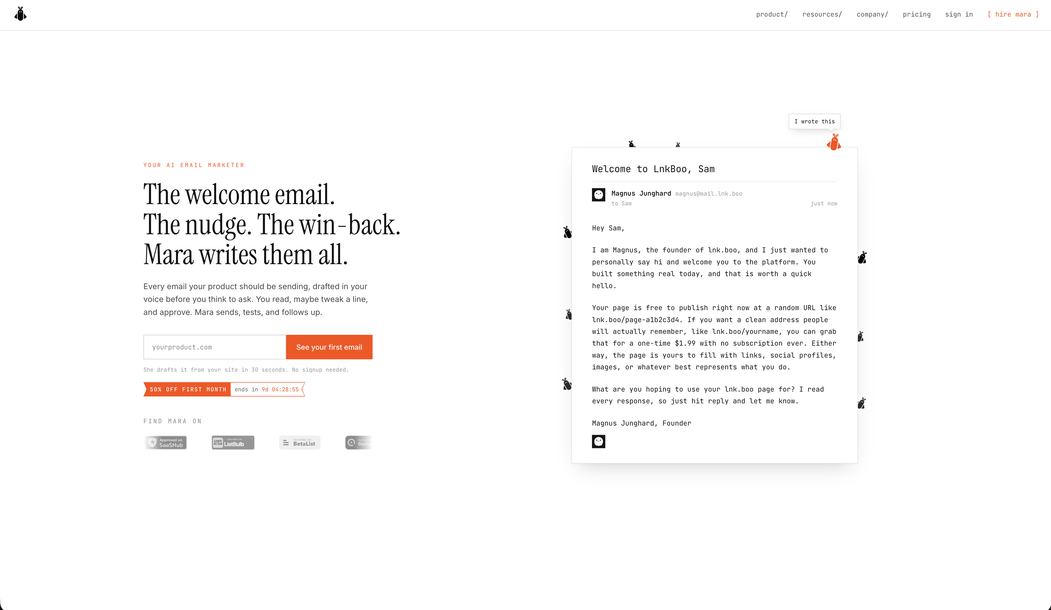
Hiremara is a single-product AI email marketer whose strongest choice is the "Mara writes them all" headline: it names the three lifecycle moments (welcome, nudge, win-back) and turns the product into a person, which is exactly what an AI tool needs to do to feel less like a feature list. The Instrument Serif headline paired with JetBrains Mono eyebrows and Inter body is a confident, distinctive voice that does not look like a default Next.js template.

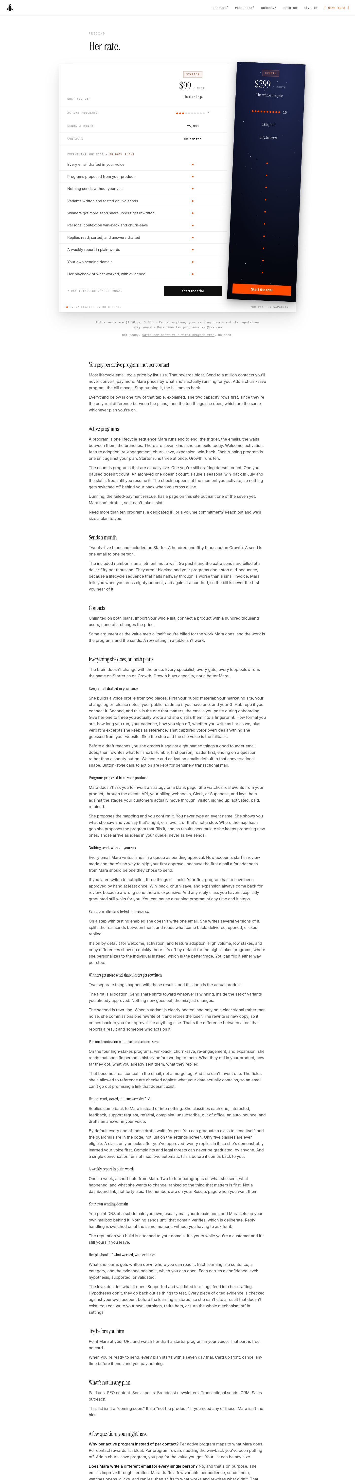

> Capture note: the desktop full-page sweep was truncated at 6,000 px of an observed 18,287 px and the settling state is indeterminate, so the lower sections (footer, dark "Auth/Billing/Lifecycle" panel) are partially captured. The pricing page and mobile sweep completed cleanly.
What works
- The hero is doing real persuasion work. "The welcome email. The nudge. The win-back. Mara writes them all." is a three-beat promise that names the visitor's actual job. The supporting paragraph ("Every email your product should be sending, drafted in your voice before you ask") is unusually specific for a SaaS hero — it tells the visitor what they will and will not do.
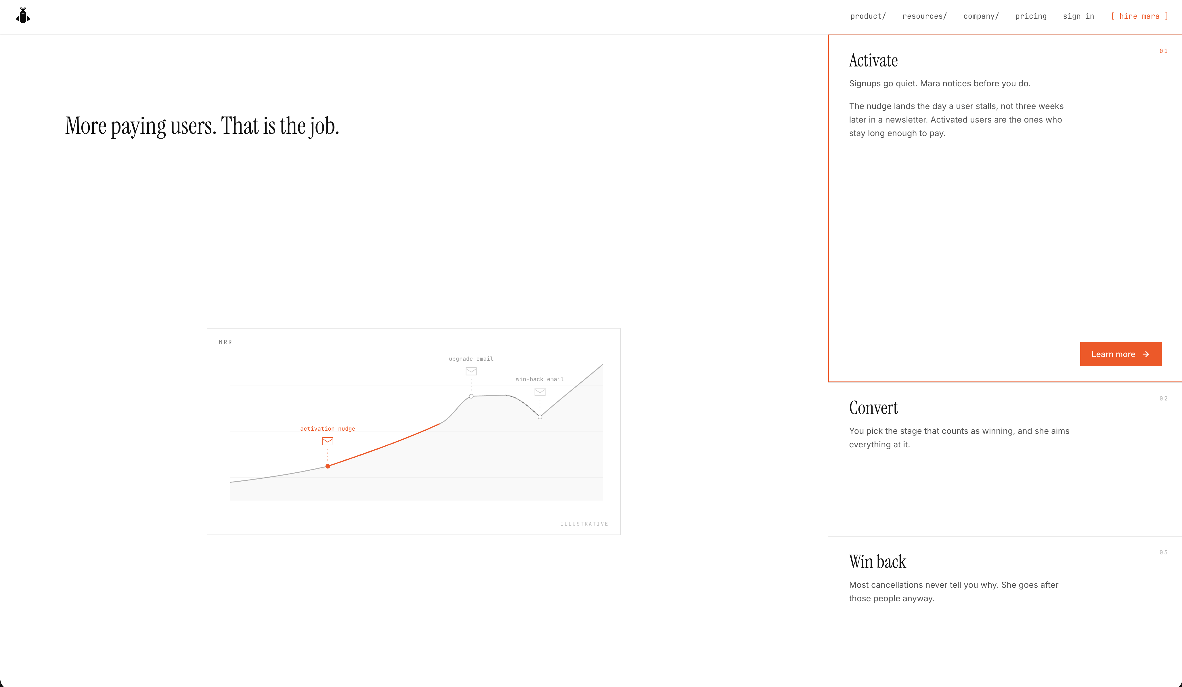
- The "More paying users. That is the job." line is a strong value-prop anchor. It is the rare homepage that names the business outcome before the feature list. The line chart underneath (activation nudge, win-back impact) is a smart, restrained proof point.
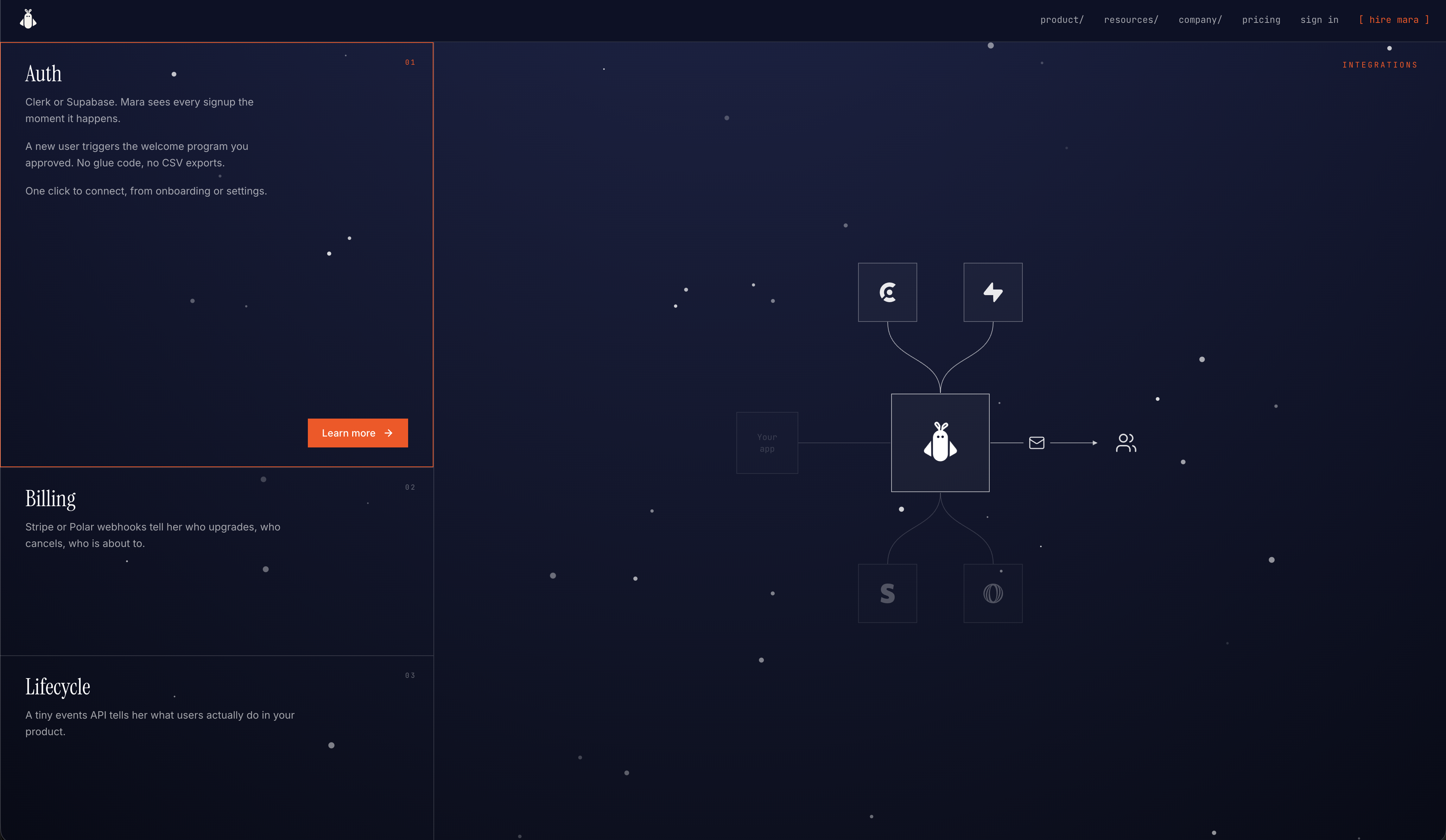
- The dark navy footer with the starfield and the integration constellation is genuinely memorable. It earns its visual weight because the integrations are real (Stripe, events API, etc.) and the diagram is functional, not decorative.
Priority issues
### 1. The orange accent fails WCAG AA on every small-text use The brand orange #ff4a00 against the off-white canvas measures 3.37:1 — below the 4.5:1 AA threshold for body text. It is used for the "Get your first email" button label (white on orange, also 3.37:1), the "YOUR AI EMAIL MARKETER" eyebrow, the "Try Mara free" nav link, and the inline "Mara" word inside the hero paragraph. The hero CTA is the single most important conversion surface on the page and it is the lowest-contrast element on it.
Colors
#ff4a00#111111#fdfdfd#0d0e1e
### 2. The "No credit card. Cancel anytime. No signup needed." micro-copy is unreadable That reassurance line under the email field is #9a9a9a on white — 2.81:1, well below AA. It is exactly the copy that exists to lower purchase anxiety, so failing contrast here is doubly costly: visitors who need the reassurance most are the ones least likely to read it.
### 3. The pricing page is a wall of text with no visual plan comparison The pricing page renders as a single 4,617 px article column with H2/H3 headings and paragraphs. There is no tier card, no feature matrix, no "what's included" comparison, no FAQ. The visitor mode on this page is Operate (decide whether to buy), and the page treats it as Read. The $99/month number is buried in a paragraph rather than anchored as a price card.
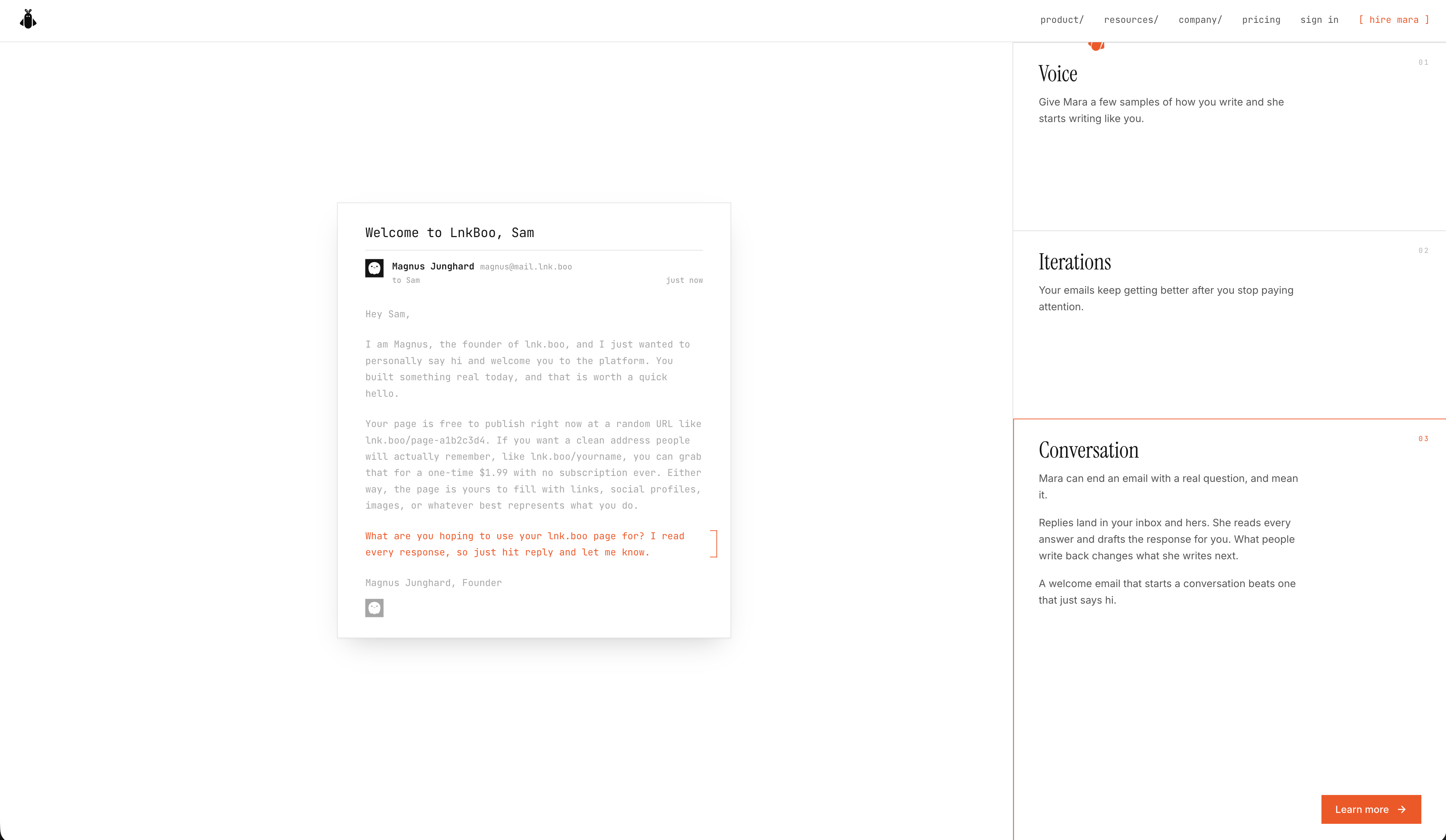
### 4. The "programs" section on the homepage is a feature dump, not a journey Welcome, Activation, Convert, Win back, Billing, Lifecycle, Auth — eight programs listed in a flat grid with the same icon-heading-copy template. The visitor cannot tell which program they should start with, what order to run them in, or how they relate to each other. Compare to a lifecycle diagram that shows the programs as a connected sequence (signup → activation → conversion → retention).
### 5. The footer "integration constellation" is decorative, not informative The starfield diagram with the central Mara icon and surrounding integration logos is visually striking but does not communicate which integrations are supported, what they do, or how to connect them. The same real estate could carry a labeled integration grid (Stripe, Segment, Postmark, etc.) with one-line descriptions.
Contrast evidence
| Element | Foreground | Background | Size / weight | WCAG | AA | AAA | APCA |
|---|---|---|---|---|---|---|---|
| H1 hero "The welcome email…" | #111111 | #ffffff | 56px / 400 | 18.88 | ✅ | ✅ | 105.4 |
| Body paragraph | #4a4a4a | #ffffff | 15.5px / 400 | 8.86 | ✅ | ✅ | 90.3 |
| "YOUR AI EMAIL MARKETER" eyebrow | #ff4a00 | #ffffff | 11px / 400 | 3.37 | ❌ | ❌ | 59.6 |
| "Get your first email" button label | #ffffff | #ff4a00 | 14px / 500 | 3.37 | ❌ | ❌ | -65.1 |
| "No credit card. Cancel anytime…" | #9a9a9a | #ffffff | 11px / 400 | 2.81 | ❌ | ❌ | 54.1 |
| "Try Mara free" nav link | #ff4a00 | #ffffff | 13px / 400 | 3.37 | ❌ | ❌ | 59.6 |
The body text and headline pass AAA comfortably. The accent color fails AA on every small-text use. The first change is to darken the orange to at least #d63d00 (≈4.6:1) for text and outline uses, and reserve the brighter #ff4a00 for the button background only.
Typography
Typography used on hiremara.com
- Instrument Serif
- Inter
- JetBrains Mono
The Instrument Serif / Inter / JetBrains Mono trio is a strong, distinctive voice. The eyebrow labels in JetBrains Mono with 2.4 px letter-spacing are a recognizable signature — keep them. The H1 at 56 px is appropriately large for a serif headline; the H2 at 24 px on the pricing page is too small for a serif display face and reads as body text.
Design tokens
Useful design values from hiremara.com
- Color · Canvas
- #fdfdfd
- Color · Primary text
- #111111
- Color · Accent (fails AA on text)
- #ff4a00
- Color · Footer surface
- #0d0e1e
- Color · Footer text
- #fdfdfd
- Typography · Display H1
- Instrument Serif 56px / 1.05
- Typography · Section H2
- Instrument Serif 24px / 1.33
- Typography · Body
- Inter 15.5px / 1.62
- Typography · Eyebrow label
- JetBrains Mono 11px / 2.4px tracking
- Typography · Nav link
- JetBrains Mono 13px
- Shape · Button radius
- 0px (square)
- Shape · Card radius
- 0px (square)
- Shape · Pill radius
- 9999px (used on tag chips)
- Effects · Hero card shadow
- rgba(16,16,16,0.04) 0 1px 2px + rgba(16,16,16,0.06) 0 12px 24px + rgba(16,16,16,0.1) 0 32px 64px
- Effects · Body radial wash
- radial-gradient(70% 50% at 50% 0%, rgba(201,121,97,0.05) 0%, transparent 55%)
Comparison references
Captured pages
First change to make
Darken the orange accent to #d63d00 for all text and outline uses (eyebrow labels, nav link, inline "Mara" word in the hero paragraph), and reserve the brighter #ff4a00 for the primary button background only. This single change brings every failing contrast pair above AA without altering the brand's orange identity, and it makes the hero CTA — the page's most important element — measurably more legible.