check this for me https://ziggle.art/
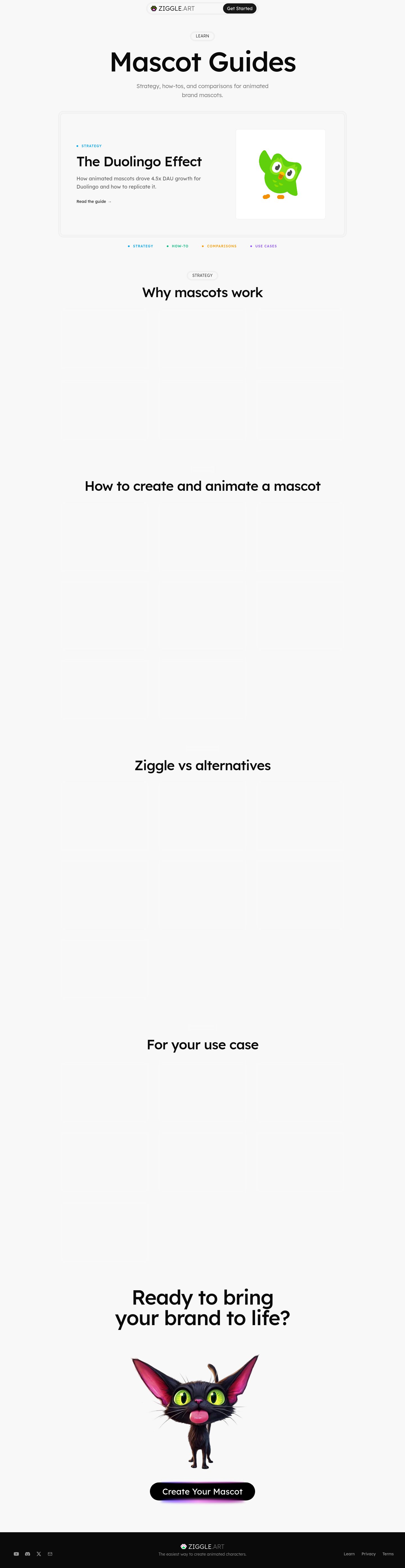
This is a Read-mode guide index , and its strongest choice is the clear editorial hierarchy: a featured guide, category cues, oversized headings, and mascot imagery that immediate…
check this for me https://ziggle.art/
This is a Read-mode guide index, and its strongest choice is the clear editorial hierarchy: a featured guide, category cues, oversized headings, and mascot imagery that immediately connect the page to Ziggle’s product.
Captured pages
What works
- The featured guide is the right opening move. The split layout gives one article priority instead of presenting an undifferentiated archive.
- The category colors are useful. The blue, green, orange, and purple labels create a simple taxonomy that fits the subject without overwhelming the neutral palette.
- The brand personality is specific. The mascot illustrations, playful logo mark, and rounded Lexend typography make this feel like a mascot product rather than a generic blog.
- The typography has a strong scale. The rendered page uses Lexend consistently, with a large guide title and substantially smaller supporting copy, creating a recognizable editorial voice.
Priority issues
1. First change: resolve the large blank content areas
After “Why mascots work,” “How to create and animate a mascot,” and the later sections, the screenshot shows very large outlined regions with little or no visible content. In a reading journey, that makes the page feel unfinished and forces visitors to scroll through empty space before finding useful guides.
If those blocks are still loading, show a compact loading state and avoid reserving such tall areas. If they are meant to contain article cards, make the cards visibly render in the initial settled state.
The capture’s reveal state was not fully determinate, so confirm this in a settled browser before treating every blank region as a production defect.
2. Put the article inventory closer to the first feature
The page introduces the content categories well, but the actual guide list appears visually delayed. Follow the featured article with a compact, immediately visible grid of guides—perhaps three cards per row on desktop—with title, category, short description, and reading time.
The saved references above are useful here because they create more visible content rhythm without relying on repeated giant headings.
3. Reduce the amount of empty vertical rhythm
The oversized section headings are attractive individually, but the combination of large headings, generous gaps, and empty card areas makes the page feel much longer than its information density justifies.
Keep the generous top-level spacing around the hero, then tighten the spacing within each guide category. A better rhythm would be:
- category label
- section heading
- one-line explanation
- visible article grid
- moderate transition to the next category
4. Make the header more useful for a guide library
The centered floating header is polished, but “Get Started” competes with the reading task. On this page, the primary utility should be finding and filtering guides.
Consider giving the header or category row a clearer “All guides” state, search, or persistent category navigation. Keep “Get Started” as a secondary action rather than the dominant control.
5. Make the final CTA feel less generic
The black CTA with a purple/pink glow is visually noticeable, but the glow reads as a familiar startup-marketing effect rather than something tied to Ziggle’s mascot system.
Keep the mascot and the invitation, but connect the CTA more directly to the guide experience—for example, “Turn one of these ideas into your mascot” or a small preview of the creation workflow. That would make the conversion moment feel like a natural continuation of the page.
Vibe-coded appearance check
Overall verdict: mixed. The mascot language and category system are product-specific, but several surface decisions drift toward familiar AI/startup defaults.
| Visible occurrence | Judgment | Consequence |
|---|---|---|
| Mascot mark in the header and mascot artwork in the feature/CTA areas | Earned | Gives the page a distinctive Ziggle identity and makes the subject immediately legible. |
| Blue, green, orange, and purple category labels | Earned | Turns taxonomy into a visual navigation aid rather than decoration. |
| Oversized rounded title and small outlined category pills | Neutral | Coherent with the friendly tone, though not especially distinctive by themselves. |
| Large empty outlined content blocks | Generic/default | Looks like unfinished template scaffolding and interrupts the reading journey. |
| Black CTA with a purple/pink glow | Generic/default | Adds attention but not much product meaning; the glow feels interchangeable with many modern landing pages. |
| Centered pill-shaped navigation | Neutral | Polished and compact, but it should provide more reading-oriented utility on this page. |
The page has a strong identity underneath it. The biggest improvement is not a visual restyle; it is making the guide content visibly present, reducing dead space, and letting the mascot-specific material carry more of the experience.
Give me comprehensive website feedback for ziggle.art find similar pages and competitors to compare.
Comprehensive website feedback for ziggle.art
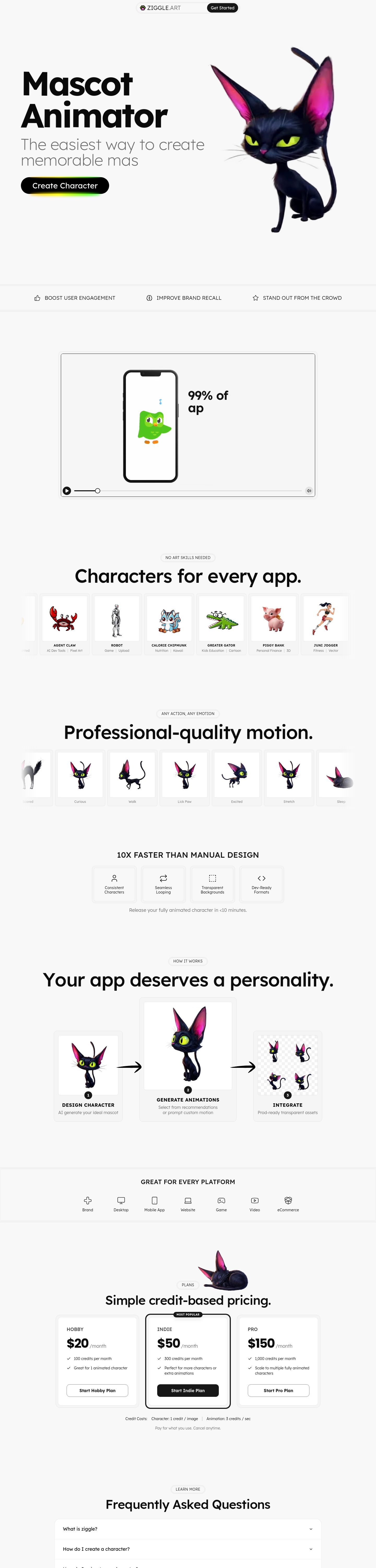
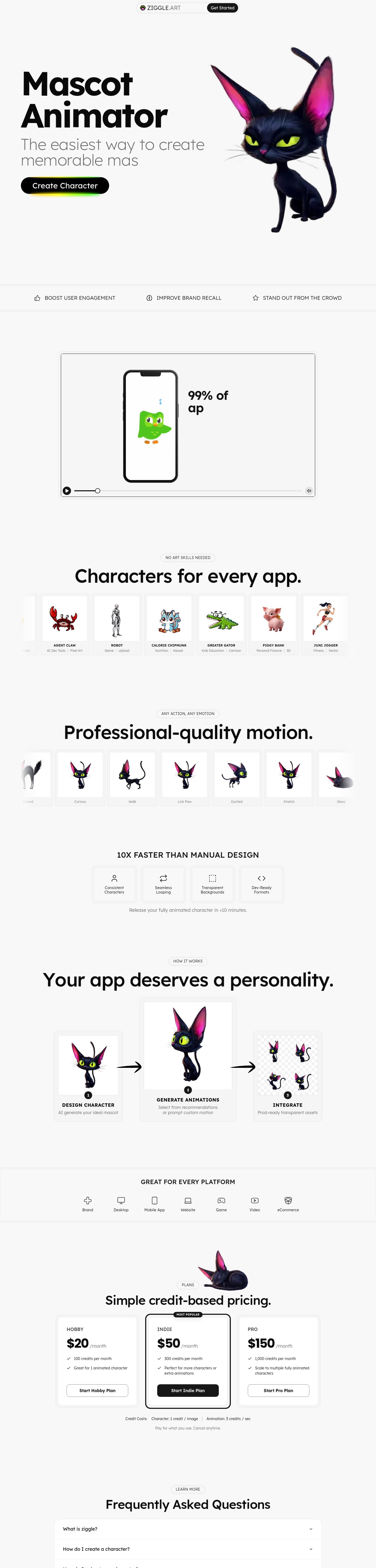
Ziggle is a persuade-first product landing page for creating and animating mascots, with a secondary job of helping visitors understand the workflow. Its strongest choice is showing the same character across multiple poses, actions, and stages rather than relying only on abstract product UI.
Captured pages
The homepage capture is limited to the first 6000px of a longer page, so conclusions about the lowest sections are directional. The /learn page was also reviewed as part of the site journey.
What is working
1. The product has a recognizable visual subject
The black cat mascot is not just decoration: it demonstrates the central promise. The homepage shows the character in different poses, sizes, and motion contexts, which makes the product more tangible than a generic “AI creation” landing page.
2. The visual system is coherent
The rendered site consistently uses:
- Soft off-white background
- Near-black typography
- Rounded outlined cards
- Lexend as the primary typeface
- Small category labels and compact UI icons
- Bright accent colors for categorization and emphasis
The neutral foundation gives the mascot artwork room to carry the personality.
Colors
#f8f8f8#0a0a0a#171717#00a6f4#00bc7d#fe9a00#8e51ff
The rendered details show Lexend across the homepage and Learn page, with a 128px desktop hero heading, 72px section headings, and 16px body text. The design has a strong typographic scale, but it uses the same broad formula repeatedly.
Rendered design values from ziggle.art
- Color · Page background
- #f8f8f8
- Color · Primary text
- #0a0a0a
- Color · Dark surface
- #171717
- Typography · Desktop hero heading
- 128px / 121.6px, weight 700
- Typography · Section heading
- 72px / 72px, weight 500
- Typography · Body text
- 16px / 24px, weight 400
- Shape · Content card radius
- 12px
- Shape · Small content card radius
- 8px
- Border · Card border
- 1px
3. The workflow is understandable
The “design character → generate animations → integrate” progression is one of the clearest parts of the site. It gives visitors an understandable mental model instead of presenting the product as a mysterious AI black box.
4. The Learn page gives the brand more depth
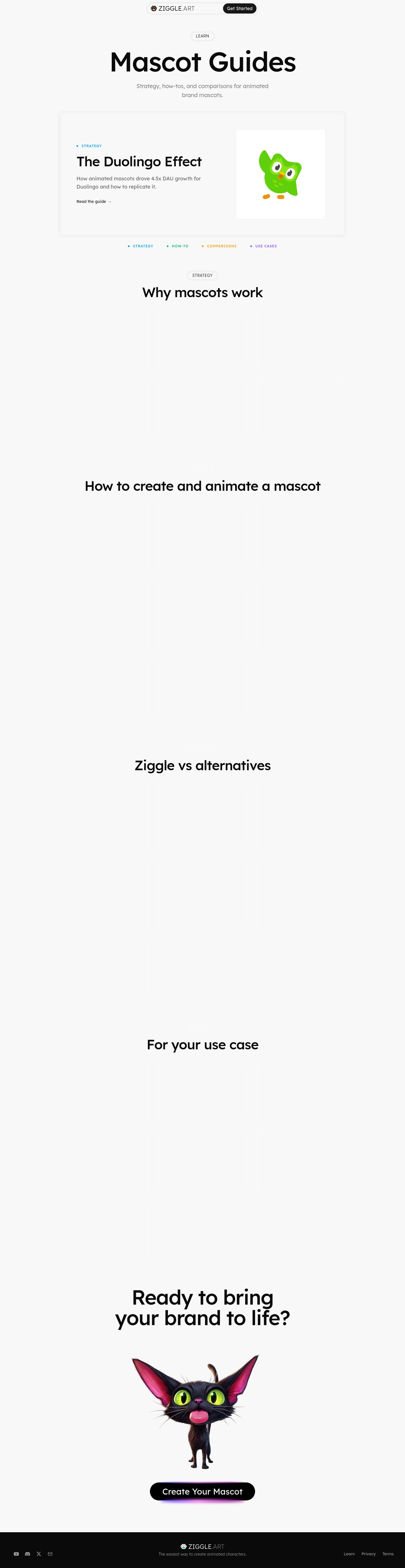
The Learn page has a more editorial structure than the homepage: featured content, category labels, and an article grid. That is a good foundation for building trust and helping visitors understand mascot strategy beyond the tool itself.
Priority improvements
1. First change: make the product demo immediately legible
On mobile, the large media frame below the benefit strip appears mostly blank while still showing playback controls.

This is the most important issue because the demo should be the strongest proof of an animation product. A blank player creates uncertainty before the visitor has understood what Ziggle produces.
Change it to:
- A visible poster frame showing the cat changing pose
- A short muted loop that starts without requiring interaction
- A caption such as “One character, multiple ready-to-use actions”
- A visible fallback image if video loading fails
- A compact “Watch how it works” control if autoplay is not desired
Use the motion-first direction of Jitter as the benchmark: motion should feel like the product, not an empty container waiting to be activated.
2. Make the hero promise more specific
“ Mascot Animator” identifies the category, but it does not yet explain the distinctive result. The supporting line is friendly but broad.
The hero should answer three questions within one viewport:
- What can I create?
- What makes the output useful?
- What happens after I click?
A stronger direction would be to frame the promise around one consistent character with a library of production-ready actions, then let “Create Character” remain the primary CTA.
The cat artwork is already doing much of the explanatory work. The copy should catch up to it.
3. Reduce the repeated section formula
Several homepage sections use the same pattern:
- Small outlined eyebrow label
- Large centered heading
- Short gray paragraph
- Rounded card or media row
This makes the site cohesive, but over a long scroll it becomes predictable. The visitor receives many similar “resets” instead of one escalating story.
The labels such as “NO ART SKILLS NEEDED,” “ANY ACTION, ANY EMOTION,” “HOW IT WORKS,” and “PLANS” are useful individually, but collectively they begin to feel like decorative scaffolding.
Recommended rhythm:
- Hero: emotional promise and mascot proof
- Demo: show the product in action
- Use cases: show where the character goes
- Workflow: explain the three steps
- Pricing: connect cost to output
- Final CTA: return to the product
Remove or combine any section that does not add a new type of proof.
4. Replace generic benefit statements with output-based proof
The benefit strip communicates ideas such as engagement, recall, and standing out, but these are abstract outcomes. The later sections are stronger because they show characters, animations, and formats.
Move the product closer to concrete output language:
- Consistent character identity
- Transparent animated assets
- Multiple actions from one design
- Export formats for specific destinations
- Faster iteration from concept to usable asset
This would make the page feel less like a broad creative-services landing page and more like a focused product.
Holo and InVideo AI are useful adjacent benchmarks here: they represent creation tools where the workflow and output should be understood quickly. Ziggle should make the “input → generated character → animation set → integration” chain even more explicit.
5. Improve the example gallery’s information hierarchy
The horizontal character cards are visually appealing, but the examples are small and the cropped neighboring cards on mobile make the interaction ambiguous.
On mobile, either:
- Show one complete card at a time with a clear swipe affordance, or
- Use a two-column grid with all cards fully visible, or
- Add explicit previous/next controls and a visible position indicator
Also add more context to each example. Instead of only showing a character name or category, pair each item with:
- Character type
- Intended platform
- Available action
- Export or integration context
That would turn the gallery from decoration into product proof.
6. Clarify what the pricing units buy
The pricing section is visually clean, but credit-based pricing requires a direct explanation of what a visitor receives for those credits.
The cards should connect credits to concrete creation scenarios:
- One new character
- A set of animations
- Additional actions
- Regeneration or variation costs
- Export or download limits
The goal is not to add more pricing copy. It is to eliminate the mental calculation between “credits” and “finished mascot assets.”
7. Make the homepage and Learn page feel more connected
The Learn page is a useful content destination, but the relationship between education and product activation could be stronger.
Add contextual bridges such as:
- A relevant “Create this kind of mascot” CTA inside article pages
- Related guides beside product examples
- A “Learn first” path for visitors who are not ready to create
- A “See the tool” link from every major educational category
This would create a clearer journey between reading, imagining, and creating.
Comparison: where Ziggle should borrow and where it should stay distinct
| Benchmark | What it helps explain | What Ziggle should borrow |
|---|---|---|
| Jitter | Motion is the product experience | Put a visible animation loop or transformation earlier and make the demo impossible to miss. |
| Holo | AI creation tools need a compact value proposition | Reduce abstract benefit language and state the creation workflow more directly. |
| InVideo AI | Creation products benefit from an obvious input-to-output story | Show the complete journey from prompt or concept to usable asset. |
| Fix Studio | Visual storytelling can carry a long page | Use more varied compositions instead of repeating centered heading/card sections. |
| Endless | Long pages need controlled pacing and density | Tighten the transitions and remove any section that does not add new proof. |
| Artboard | Featured work benefits from editorial prioritization | Give one or two mascot examples more depth instead of presenting many small examples equally. |
These are adjacent benchmarks rather than all being direct mascot competitors. Jitter is the closest comparison for motion-tool presentation; Holo and InVideo AI are useful for AI creation-product positioning; the others are layout and storytelling references.
Mobile-specific feedback
The mobile version preserves the brand well, but several details deserve attention:
- The hero is strong and centered, but it occupies a lot of vertical space before the first meaningful product demonstration.
- The media player needs a visible poster or loaded animation.
- Horizontal card rows show partial neighboring cards, but the page does not strongly communicate that they are swipeable.
- The repeated large headings create a long scroll with relatively little visible content per section.
- The pricing cards are readable, but the page would benefit from a compact comparison treatment before the full stacked cards.
- The workflow cards work well on mobile because the numbered progression is explicit and vertically ordered.
The mobile experience should prioritize demo → use case → workflow before asking visitors to absorb all benefits and pricing details.
Typography direction
Lexend is a sensible choice for the friendly, approachable character of the product. I would not replace it immediately. The bigger improvement is to vary its usage more deliberately:
- Keep heavy Lexend for the product name and primary promise.
- Use a more restrained weight for section headings.
- Reserve all-caps labels for true metadata or navigation.
- Increase the distinction between product claims, descriptive copy, and UI labels.
- Avoid making every section heading feel like a new hero.
For optional experiments, the saved font comparison surfaced these families as visually adjacent to Lexend under the current experimental descriptor:
Typography alternatives for Ziggle
- Lexend
Weight 700
- Nb International Pro
- Kanchenjunga
- Lettera Mono Ll
Contrast check
The page inspector retained exact color pairs, but the contrast calculator did not return a usable observation for this inspection. I therefore won’t assert WCAG ratios or APCA values.
| Element | Foreground | Background | Size / weight | WCAG | AA | AAA | APCA |
|---|---|---|---|---|---|---|---|
| Body text | #0a0a0a | #f8f8f8 | 16px / 400 | Unresolved — contrast observation unavailable | Unresolved | Unresolved | Unresolved |
| Secondary text | #666666 | #f8f8f8 | 12–18px / 300 | Unresolved — contrast observation unavailable | Unresolved | Unresolved | Unresolved |
| Primary dark CTA | #ffffff | #171717 | 30px / 400 | Unresolved — contrast observation unavailable | Unresolved | Unresolved | Unresolved |
Vibe-coded appearance check
Overall visible-design verdict: mixed. Ziggle has a genuinely product-specific mascot identity, but parts of the landing page rely on familiar startup and AI-product patterns.
| Visible occurrence | Judgment | Consequence |
|---|---|---|
| Repeated black cat shown in multiple poses and animation stages | Earned | Makes the product category and core output immediately understandable. |
| Consistent Lexend typography and soft neutral canvas | Earned | Creates a friendly, approachable product personality. |
| Bright category colors on the Learn page | Earned | Gives the content library a usable classification system. |
| Small outlined eyebrow pills before many sections | **Neutral → generi |
Show the saved capture and compare its layout with my image
Here’s the saved Jitter capture you asked to compare:
Captured pages
Layout comparison
| Area | Saved Jitter reference | Ziggle.art | Takeaway |
|---|---|---|---|
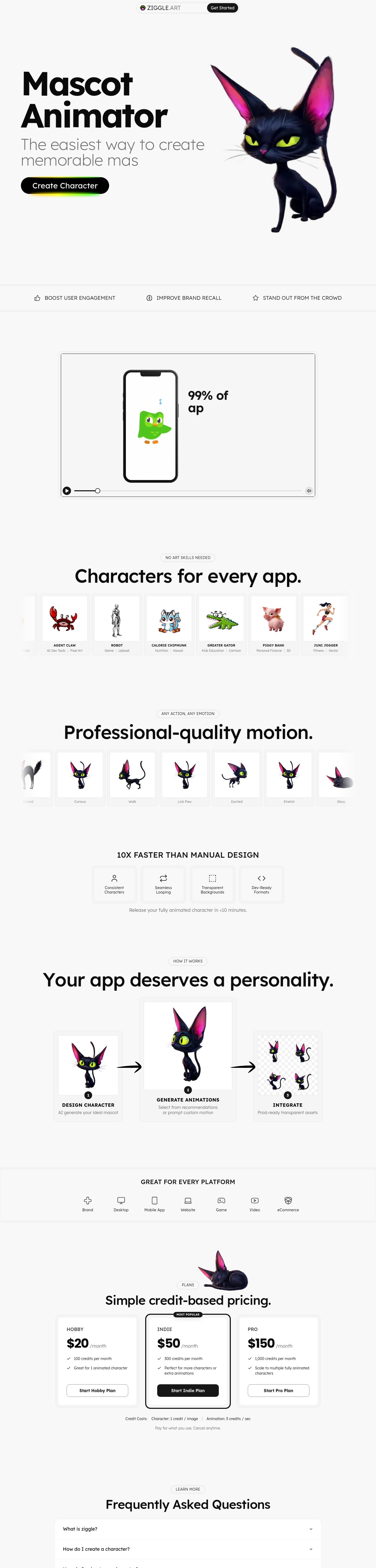
| Hero composition | Left-aligned headline with supporting copy; large visual area begins below | Large centered headline with mascot/media arranged around it | Ziggle feels more playful and promotional; Jitter feels more editorial and immediately scannable. |
| Content structure | Strong asymmetry: compact category list on the left and a dominant content/demo area on the right | Mostly centered, full-width sections stacked vertically | Ziggle’s page has less directional movement; visitors repeatedly encounter the same centered layout pattern. |
| CTA placement | CTA sits alongside the hero copy and points toward a specific next step | CTA is more separated from the main explanatory content | Bring Ziggle’s primary action closer to the first concrete product demonstration. |
| Use-case presentation | Use cases are treated as a navigation structure, not just decoration | Use cases and benefits appear as separate promotional sections | Ziggle could combine use cases with actual mascot outputs: social, onboarding, product UI, support, and marketing. |
| Visual proof | The visual area has clear compositional priority | Ziggle has many mascot visuals, but some are distributed across later sections | Show fewer examples earlier, but make each one larger and more explanatory. |
| Page rhythm | Large blocks are visually distinct but connected by one editorial system | Repeated eyebrow label → large heading → paragraph → card/media block | Ziggle should vary section composition more often to avoid a templated scroll experience. |
What Ziggle should borrow
1. Use a split hero for the first product proof
Instead of centering the entire hero, use:
- Left: a precise promise and primary CTA
- Right: one large mascot animation or before/after transformation
- Below: a short row of concrete outputs
This would retain Ziggle’s personality while making the product easier to understand at a glance.
2. Turn use cases into a visible navigation rail
The saved reference’s strongest layout idea is the left-side use-case structure. Ziggle could adapt it as a compact rail:
- Social content
- Product onboarding
- Brand websites
- Support and help centers
- Marketing campaigns
Selecting a use case could update the mascot preview or animation example on the right. That would make the page feel like a product demonstration rather than a sequence of marketing sections.
3. Reduce the number of equally weighted headlines
Ziggle currently gives many sections large typographic emphasis. The saved reference makes one message dominant and lets the supporting content remain subordinate.
For Ziggle:
- Keep the main hero as the largest statement.
- Use smaller section headings for workflow and benefits.
- Let the mascot examples provide visual variety instead of enlarging every section title.
4. Put the CTA beside the relevant evidence
When Ziggle discusses animation, place the action immediately beside the animation preview. When it discusses character creation, place the action beside the character-generation example.
A useful structure would be:
> Create a mascot → see the mascot animate → use the output
Each step should have its own nearby action or link.
Recommended Ziggle layout direction
The key distinction is that the saved Jitter layout is editorial and directional, while Ziggle’s current layout is centered and promotional. Ziggle should not copy the reference’s visual style; it should borrow the stronger information architecture: one dominant message, one obvious proof area, clearer use-case navigation, and more varied section composition.
find me more mascot themed sites
I found four strong mascot/character-led references, plus one adjacent motion-product reference. The closest useful directions for Ziggle are character-led branding, mascot-as-product-proof, and animation-first storytelling.
Captured pages
Best references for Ziggle
Georgi Valkov Useful for the relationship between mascot and CTA. The character is not isolated in a gallery; it actively participates in the action area. Ziggle could use this idea by letting its mascot peek into or interact with the “Create Character” action.
Crazy Creative Useful for a more expressive, illustration-led direction. The mascot world feels like part of the brand universe rather than a series of product screenshots. This is a good reference if Ziggle wants to feel more like a creative character studio.
Geniestudio Probably the closest visual direction for a friendly AI product. It uses a central character, soft backgrounds, and small decorative elements without making the interface feel overly technical. Ziggle could borrow the balance between approachable mascot branding and product explanation.
Holo Useful for connecting the mascot to product capabilities. The character supports the surrounding feature messages instead of functioning only as a logo or decorative illustration. For Ziggle, each mascot pose could be paired with a concrete output: onboarding, social content, product UI, or support.
Jitter Not a mascot competitor, but a strong adjacent reference for animation-product presentation. The main lesson is to make movement visible immediately. Ziggle’s first product demonstration should show the character changing pose or performing an action, rather than leaving the visitor to infer that animation is the core output.
Recommended direction for Ziggle
Combine the references into a clearer mascot-product system:
- Use one mascot as the recurring guide through the page.
- Show the mascot in motion above the fold, not only in later sections.
- Pair every character example with a practical use case.
- Let the mascot interact with buttons, cards, or UI states so it feels like part of the product.
- Use one larger character world instead of many small, disconnected mascot previews.
- Keep Ziggle’s restrained off-white and black foundation, then use the brighter colors selectively for character actions and categories.
The strongest opportunity is to make Ziggle feel less like a general AI landing page with mascot artwork and more like a mascot creation world that happens to contain an AI tool.
Compare their hero composition and mascot-to-CTA relationships
The main difference is where the mascot sits in the hierarchy. Ziggle treats the mascot primarily as proof of the product; the strongest references make the character feel like a participant in the action.
Captured pages
Hero and CTA comparison
| Reference | Hero composition | Mascot-to-CTA relationship | Lesson for Ziggle |
|---|---|---|---|
| Ziggle | Large product headline leads, with the mascot/video functioning as visual proof alongside the message. | The mascot demonstrates the product, but the CTA is primarily a separate product action. | Bring the character closer to the action so visitors understand what they will create before clicking. |
| Georgi Valkov | More character-led and expressive; the mascot shares the hero stage with the main message. | The character feels attached to the CTA, almost like it is inviting or guiding the visitor to act. | Let the mascot point toward, overlap, react to, or visually frame “Create Character.” |
| Geniestudio | A friendly central composition where the mascot establishes tone immediately. | The character supports the product promise and makes the primary action feel approachable rather than purely transactional. | Use the mascot to reduce the distance between “AI tool” and “friendly creative partner.” |
| Crazy Creative | Illustration-first and more expansive, with the character world carrying much of the hero’s personality. | The CTA is part of a broader visual universe rather than the only focal element. | Ziggle could create a more recognizable mascot world, not just show isolated character previews. |
| Holo | Product-focused hero with a character helping explain the tool’s capabilities. | The mascot acts as a guide to the workflow and benefits. | Pair each Ziggle mascot state with a concrete result: expression, action, export, or integration. |
| Jitter | The product’s visual output and motion carry the hero composition. | No mascot relationship, but the visual proof is closely tied to the action. | Ziggle’s animation should be visible at the exact moment the CTA is introduced. |
The key difference
Ziggle: mascot as proof
Ziggle’s character answers:
> “What kind of thing can this product make?”
That is valuable, but the CTA relationship is still fairly conventional:
> headline → product explanation → CTA > mascot/video → supporting proof
The mascot is visually memorable, but it does not yet feel like a guide into the action.
Georgi Valkov and Geniestudio: mascot as participant
These references create a stronger emotional connection because the character feels involved in the hero. It is not merely displayed beside the CTA; it helps frame the decision to act.
For Ziggle, that could mean:
- The mascot leaning toward the CTA
- A speech bubble or expressive reaction near the action
- A small animation that starts when the visitor focuses on the CTA
- The character holding, pointing toward, or emerging from the creation panel
- A clear transition from “this is the mascot” to “now make your own”
Crazy Creative: mascot as world
Crazy Creative is less useful as a direct product-layout model, but it is valuable as a branding reference. The character is part of a larger visual language.
Ziggle currently has many mascot examples, but they can feel like separate demonstrations. A stronger approach would establish a consistent world:
- One recurring Ziggle guide character
- A small cast of mascot personalities
- Repeated environments or stages
- Consistent action labels
- A visual relationship between character creation and final usage
Holo: mascot as workflow explainer
Holo is a useful bridge between character personality and product clarity. The mascot should not only make the page feel friendly; it should help explain what the visitor gets.
For example:
Each step could feature the same mascot in a different state, keeping the product story visually continuous.
Recommended hero relationship for Ziggle
I would move Ziggle toward this structure:
The most important change is to make the CTA and mascot feel like one unit:
> Create your own mascot > with the mascot visually demonstrating what happens next.
Ziggle should keep its current friendly neutral canvas and strong character examples, but make the mascot more active, expressive, and spatially connected to the CTA. That would give the hero more personality than a standard AI landing page without sacrificing clarity.