teksyo.com, homepage should get people to book a discovery ca…
I'll inspect the structured details from the live pages and search for comparable agency sites in parallel. Teksyo.com — Homepage Review for Discovery-Call Conversion The homepage…
teksyo.com, homepage should get people to book a discovery call. Give me comprehensive website feedback, find similar pages and competitors to compare with as well.
I'll inspect the structured details from the live pages and search for comparable agency sites in parallel.
Teksyo.com — Homepage Review for Discovery-Call Conversion
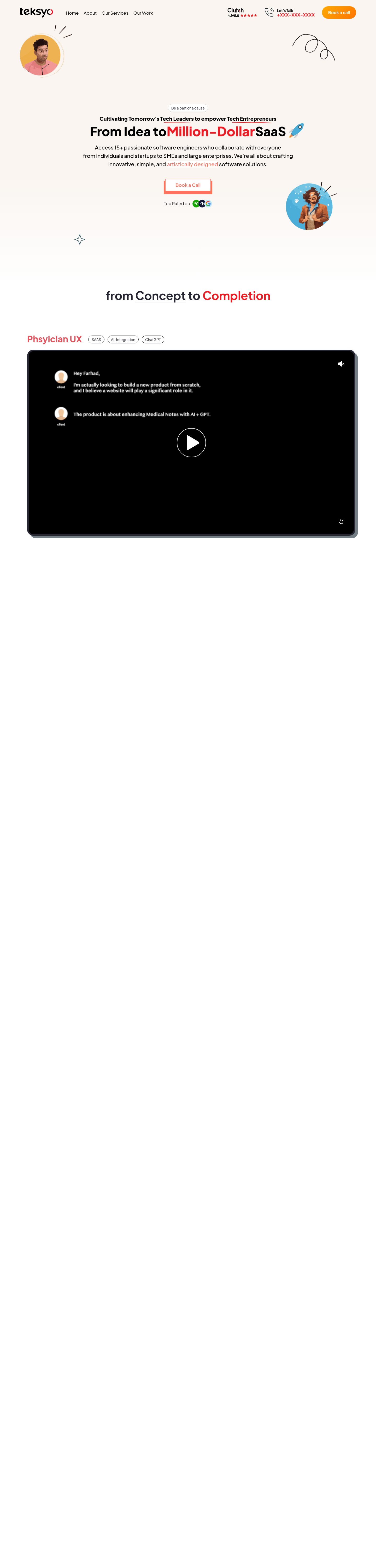
The homepage is a long-form persuasion page for a web/AI-SaaS studio, built in a warm cream + red neobrutalist style with a single sans-serif family. Its strongest choice is the bold, oversized hero headline paired with a gradient pill CTA in the header — but the page buries that momentum under a 14,000px scroll, a low-contrast coral CTA, and a dark video block that breaks the warm visual world.
What works
- Hero headline hierarchy is confident. The 48px / 800-weight "From Idea to Million-Dollar SaaS" with a red accent span reads as a clear value proposition, and the gradient pill CTA in the header is the right primary action.
- Warm cream canvas (#faf5f1) gives the brand a distinctive identity rather than the generic white SaaS look — it reads as a studio, not a template.
- Neobrutalist hard-offset shadows (5–10px solid grey, no blur) on service cards and the video block create a tactile, hand-made feel that suits a "we build your idea" positioning.
Priority issues (impact order)
- The primary "Book a Call" CTA fails WCAG AA. The coral link color #ff735d on white measures 2.67:1 at 18px/600 weight — well below the 4.5:1 minimum. Visitors who can perceive this contrast issue will hesitate at the exact moment you want them to act. Darken the CTA to a deeper red (e.g. #c8102e or #b91c1c) or switch to a dark fill with white text.
- The page is 14,484px tall with only one CTA above the fold. A visitor who scrolls past the hero sees a dark video block, then services, then team — but no second "Book a Call" until the footer. Add a mid-page CTA after the services grid and one after the team section, each with a short re-statement of the offer.
- The dark video section breaks the warm visual world. The black "From Concept to Completion" block sits between two cream sections and reads as a different site. Either re-skin it in cream with a subtle border, or commit to a dark mode for the whole lower half — the current mix feels unfinished.
- No social proof above the fold. The hero promises "Million-Dollar SaaS" but shows no client logos, no testimonial quote, no "trusted by" strip. For a studio selling $10k+ engagements, one line of social proof near the headline materially raises booking intent.
- Single typeface (Plus Jakarta Sans) carries every role — display, body, UI, footer. The 800-weight hero works, but the body and labels feel interchangeable. A serif accent for the "Million-Dollar" span, or a monospace for the service labels, would add the specificity a studio brand needs.
First change to make
Darken the "Book a Call" CTA to pass AA contrast and add a second CTA after the services grid. These two changes together address the conversion-blocking contrast failure and the scroll-length drop-off in one pass.
Contrast table (exact retained pairs)
| Element | Foreground | Background | Size / weight | WCAG | AA | AAA | APCA |
|---|---|---|---|---|---|---|---|
| Header CTA link | #ff735d | #ffffff | 18px / 600 | 2.67 | ✗ | ✗ | 51.2 |
| Hero subhead link | #ff735d | #ffffff | 20.4px / 500 | 2.67 | ✗ | ✗ | 51.2 |
| Header eyebrow | #ec1c24 | #faf5f1 | 17px / 700 | 4.08 | ✗ | ✗ | 62.8 |
| Hero headline | #000000 | complex backdrop | 48px / 800 | unresolved | — | — | — |
| Hero subhead | #000000 | complex backdrop | 20.4px / 500 | unresolved | — | — | — |
| Section heading | #272633 | complex backdrop | 45px / 700 | unresolved | — | — | — |
The two coral-on-white pairs are the highest-impact failures — they sit on the exact element you want visitors to click.
Target page

Similar pages and competitors
Captured pages
Color palette (exact retained values)
Colors
#faf5f1#ffffff#272633#ec1c24#e8505b#ff735d#375a64#1a2e35#d1d5db
Typography
Typography used on teksyo.com
- Plus Jakarta Sans
Weight 800 · Size 48px
- Plus Jakarta Sans
Weight 400 · Size 16px
Design values
Useful design values from teksyo.com
- Spacing · Header padding
- 24px 16px
- Spacing · Header horizontal margin
- 0px 60px
- Type scale · Hero H1 (desktop)
- 48px / 1.25 line-height / 800 weight
- Type scale · Hero H1 (mobile)
- 35.2px / 1.25 line-height / 800 weight
- Type scale · Section heading
- 45px / 1.5 line-height / 700 weight
- Type scale · Body
- 16px / 1.5 line-height / 400 weight
- Radius · Header CTA pill
- 9999px (full pill)
- Radius · Service card
- 24px
- Shadow · Neobrutalist card offset
- rgb(116,127,133) 5–10px solid, no blur
- Shadow · Modal/elevated surface
- rgba(0,0,0,0.1) 0 10px 15px -3px, 0 4px 6px -4px
One question
Your average project size — is the "Million-Dollar SaaS" headline a literal claim (you've shipped $1M+ products) or aspirational? That answer changes whether the hero should lead with a specific dollar figure and client name, or with a process promise.
continue
continue
Teksyo.com — Booking Page & Deeper Review
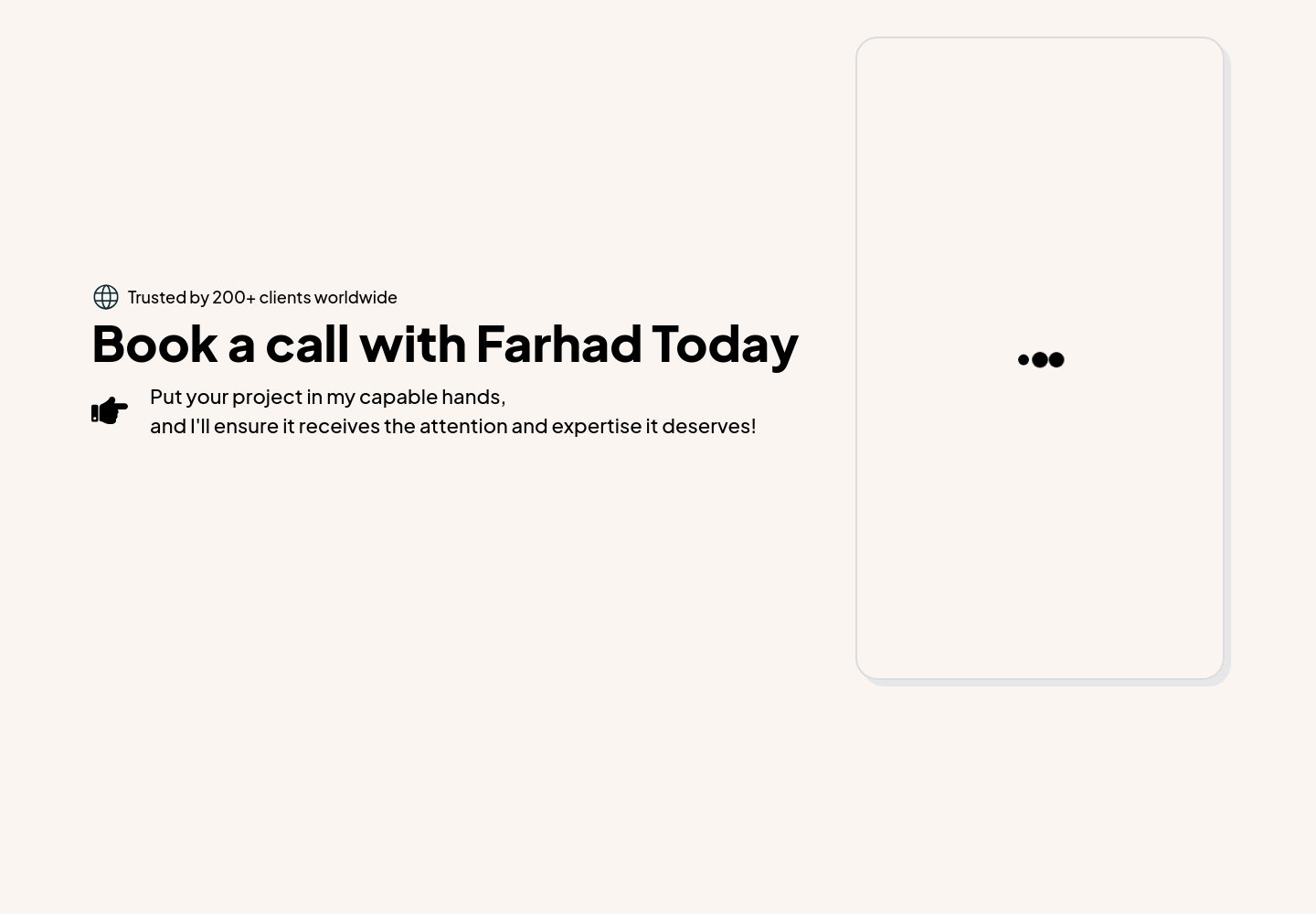
The booking page reveals the most serious conversion blocker on the site: the calendar widget hasn't rendered. Visitors who click "Book a Call" land on a page with a confident headline and then stare at a blank white card with three pulsing dots — the Calendly/scheduling embed is failing to load. This is where every homepage CTA leads, so a broken destination page silently kills every conversion.
What works on the booking page
- The headline is personal and direct. "Book a call with Farhad Today" names the founder, which is the right move for a studio selling high-touch engagements — it signals "you'll talk to a real person, not a sales rep."
- The trust line is well-placed. "Trusted by 200+ clients worldwide" sits above the headline as a small eyebrow, which is the correct hierarchy — it answers "is this legit?" before the visitor reads the ask.
- The copy is warm without being salesy. "Put your project in my capable hands, and I'll ensure it receives the attention and expertise it deserves" reads as a craftsman's pitch, not a SaaS funnel.
Priority issues (impact order)
- The calendar embed is not loading. The right-hand card is empty except for three dots — this is the entire conversion mechanism and it's broken. Check the Calendly/scheduling script, the iframe sandbox attributes, and whether the embed URL is valid. Until this renders, every homepage CTA is a dead end.
- No fallback when the embed fails. If the calendar script is slow or blocked, visitors have no way to book. Add a fallback below the embed: a direct email link, a "send me your brief" form, or a phone number. Never let the booking page be a single point of failure.
- The page is too sparse for a $10k+ engagement. A blank right column and a short headline don't justify the price. Add a short "what to expect" list (15-min call, no pitch deck, you'll get a written follow-up) and a one-line "not a fit if…" qualifier to pre-qualify visitors and reduce no-shows.
- The trust line is unverifiable. "Trusted by 200+ clients worldwide" is a strong claim with no logos, no names, no link to case studies. Either add 3–4 client logos beneath the eyebrow, or soften the claim to "Trusted by founders and operators worldwide" until you can substantiate the number.
- The megaphone icon next to the subtitle is decorative noise. It doesn't add meaning and competes with the globe icon above. Remove it or replace with a calendar icon that reinforces the booking action.
First change to make
Fix the calendar embed and add a fallback booking method. These two changes together turn the booking page from a dead end into a reliable conversion surface — and they protect every dollar of traffic the homepage is generating.
Booking page
Cross-page consistency check
The booking page uses the same Plus Jakarta Sans family and the same cream canvas (#faf5f1) as the homepage, which is correct — visitors should feel they're still on the same site. The headline weight (800) and the eyebrow pattern match the homepage's hero treatment, so the visual continuity is working. The problem isn't design consistency; it's that the page is functionally incomplete.
What I'd recommend next
- Audit the services pages. The homepage links to six service pages (web development, web redevelopment, ecommerce, SaaS, custom business solutions, AI integration). Each one is a potential landing page for a specific search intent — they should each have their own hero, proof point, and CTA, not just be rephrased versions of the homepage.
- Add a portfolio or case studies page. A studio selling "Million-Dollar SaaS" needs at least one detailed case study with metrics. Without it, the homepage's value claim is unsupported.
- Test the mobile booking flow. The mobile homepage is 13,763px tall — visitors who tap the CTA on mobile will scroll through the entire page before reaching the booking button. Consider a sticky bottom CTA bar on mobile that follows the scroll.
One question
When a visitor's calendar embed fails to load, what's your current fallback — do you have a contact form, an email address, or a Calendly direct link you can surface as a backup?