Give me feedback on my whole website: https://reel2meal.com/
Whole-site feedback Reel2Meal is a Persuade → Operate website: it sells the idea of turning cooking videos into recipes, then should move visitors quickly into pasting a link. Its…
Give me feedback on my whole website: https://reel2meal.com/
Whole-site feedback
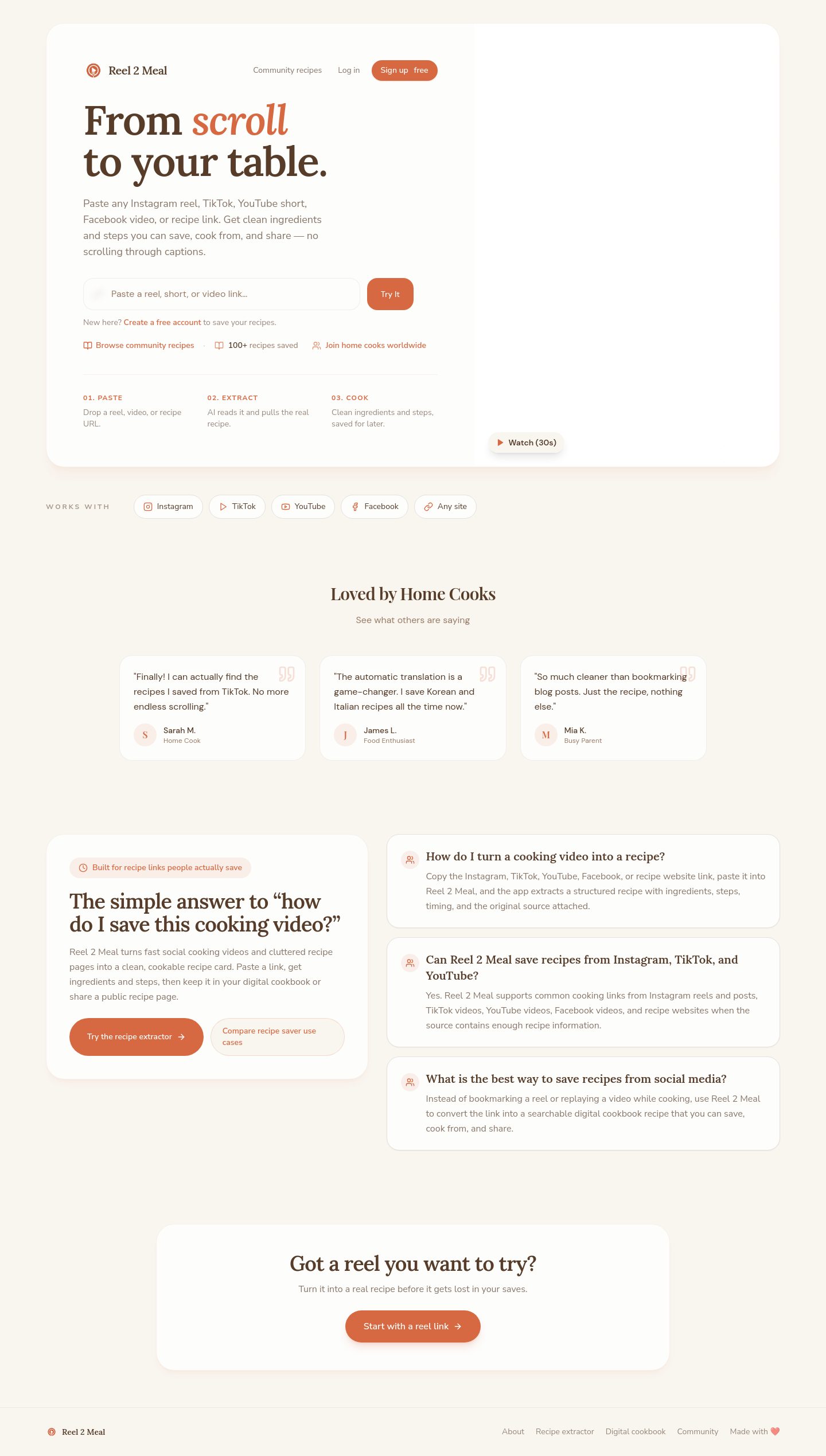
Reel2Meal is a Persuade → Operate website: it sells the idea of turning cooking videos into recipes, then should move visitors quickly into pasting a link. Its strongest choice is the warm editorial food identity—cream, brown, burnt orange, serif headlines, and recipe-focused language.
Captured pages
The strongest relevant references were concentrated in food and editorial products, so I used these rather than padding the comparison with unrelated SaaS pages.

What works
- The proposition is immediately understandable. “Turn Instagram, TikTok & YouTube cooking videos into recipes” tells visitors what the product does and where it fits.
- The visual language is cohesive and ownable. The cream canvas, brown text, burnt-orange accent, and serif display type feel appropriate for food without becoming overly rustic.
- The hero has a tangible product action. The URL input and large video area give visitors something concrete to understand, rather than relying only on abstract feature claims.
- The site has a useful breadth of entry points. Instagram, TikTok, YouTube, generic recipe extraction, cookbook, and community pages create a credible product ecosystem.
Colors
#f9f6f0#563c29#d76942#fdfdfc#997b66
These are the current page-rendered colors: warm cream background, dark brown text, burnt-orange emphasis, off-white control text, and muted brown secondary text.
Priority improvements
1. Make the paste-link action the single story
First change: restructure the homepage hero around one primary action: paste a cooking-video link and get a recipe.
At present, the hero has a strong statement, but the surrounding navigation and feature routes compete with the main action. Make the first screen answer three questions in order:
- What can I paste?
- What will Reel2Meal produce?
- What do I do now?
Use one dominant CTA such as “Turn a video into a recipe”, followed immediately by a compact visual example:
> Video link → extracted recipe → saved cookbook
Keep the platform links—Instagram, TikTok, and YouTube—as supporting reassurance rather than equal-priority destinations. TASTE’s homepage is a useful reference here: it makes the food content itself feel like the thing to explore, rather than making navigation carry the entire explanation.
2. Connect the marketing pages into a clearer product journey
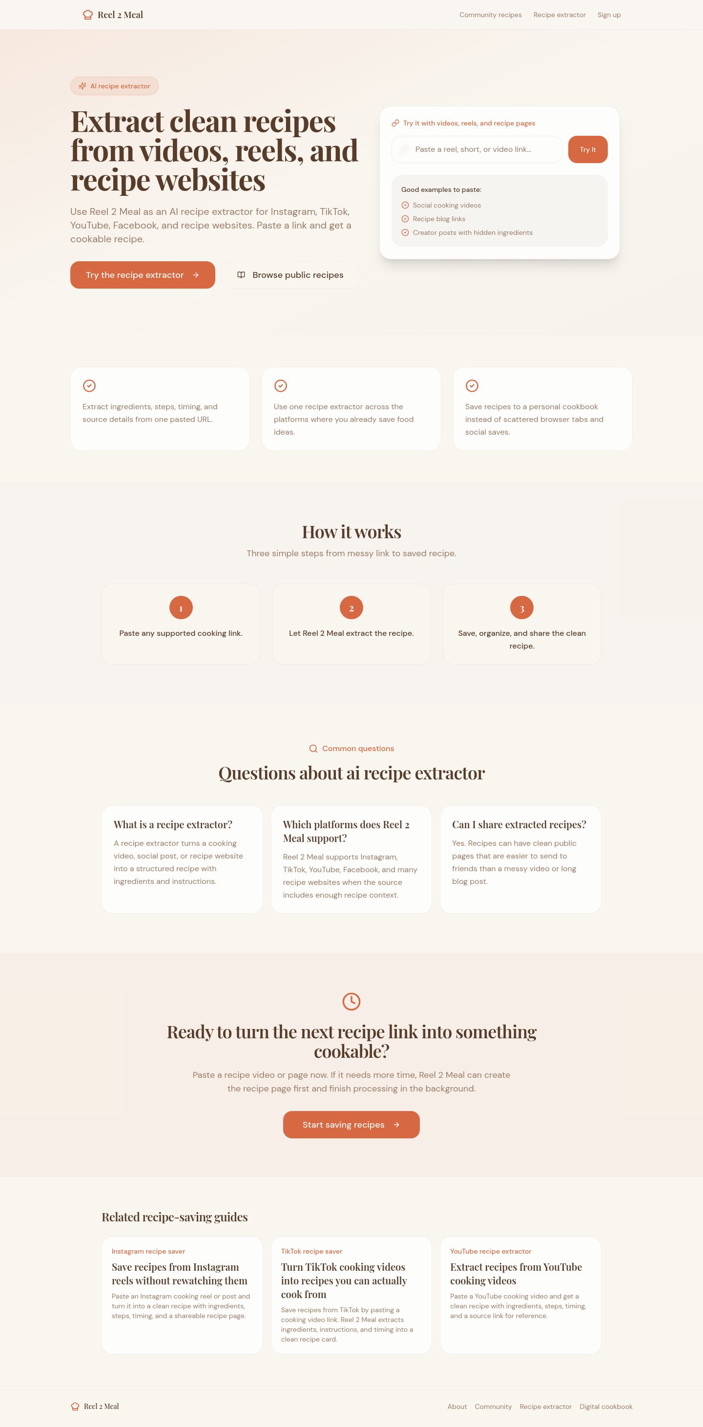
The extractor page should feel like the continuation of the homepage—not another marketing page with a form. Make the transition explicit:
- Homepage: paste a link
- Extractor: show processing and extraction
- Result: show the recipe clearly
- Cookbook: save, organize, and return later
Use consistent CTA language and a persistent secondary path back to the saved cookbook. Group the platform-specific pages under one broader concept such as Import recipes, with the individual sources underneath it. This reduces the sense that visitors must choose the “correct” feature before they understand the product.
3. Reduce typography competition
The current page uses DM Sans, Nunito Sans, Lora, and Playfair Display. The serif/sans pairing is directionally good, but four families make the system feel less deliberate.
A tighter hierarchy would be:
- Lora for hero and major editorial headlines
- Nunito Sans for body copy, navigation, and controls
- Remove or reserve Playfair Display for a genuinely special editorial treatment
- Avoid switching between DM Sans and Nunito Sans for similar interface roles
The homepage currently uses a 72px Lora hero, 36px section headings, 18px body copy, and multiple sans-serif treatments. The scale is strong; the issue is consistency, not lack of hierarchy.
Current page design values
- Typography · Hero heading
- Lora 600, 72px / 72px
- Typography · Body lead
- Nunito Sans 400, 18px / 28px
- Typography · Section heading
- Lora 600, 36px / 40px
- Typography · Primary control
- DM Sans 500, 14px / 20px
- Shape · Feature card radius
- 22px
- Shape · Pill control radius
- 9999px
- Spacing · Hero content inset
- 64px
4. Show more actual food, not only the extraction mechanism
The large video is a good product demonstration, but the rest of the site would feel more valuable if it showed more finished recipe outcomes:
- real recipe photography
- extracted ingredients
- prep and cook time
- source attribution
- saved/unsaved states
- a before-and-after example from video to recipe
The TASTE recipe page is the best reference for this direction: the food content has enough visual and editorial weight to become the experience. Logly is useful for the next step—showing how individual saved recipes become a personal collection.
5. Make the mobile version shorter and more decisive
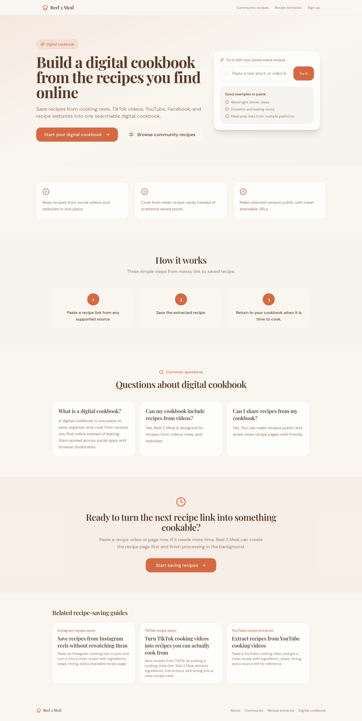
The mobile layout preserves the brand, but the long stacked journey makes the visitor work through a lot of explanation before reaching the next meaningful action.
On mobile:
- reduce the hero headline size and vertical padding
- put the input and primary CTA before secondary platform links
- turn feature sections into shorter, sharper proof points
- move cookbook/community promotion later
- repeat the main CTA after the first meaningful product demonstration
The mobile page should feel like a sequence of decisions, not a desktop landing page compressed into a long scroll.
Vibe-coded appearance check
Overall verdict: mixed. The food-editorial direction is product-specific, but several familiar patterns weaken its distinctiveness.
| Visible occurrence | Judgment | Consequence |
|---|---|---|
| Large serif hero with italic burnt-orange emphasis | Earned | Clearly supports the food/editorial identity and gives the product a recognizable voice. |
| Warm cream, brown, and orange palette | Earned | Feels relevant to recipes and creates a coherent atmosphere across pages. |
| Repeated large rounded cards with thin borders | Neutral → generic/default | Friendly, but repeated use makes feature sections feel assembled from a standard SaaS card system. Reserve cards for saved recipes, results, or meaningful collections. |
| Pill-shaped controls and links | Neutral | Appropriate for compact actions, but too many pill treatments reduce hierarchy. Use a stronger rectangular primary CTA for the main product action. |
| Very subtle orange-tinted shadows and glows | Neutral | They reinforce the accent color, but do not add much identity. Keep the effect for interactive emphasis rather than every elevated surface. |
| Four-font typography system | Generic/default risk | The editorial intent is good, but the number of families makes the brand feel less authored. Consolidate the roles. |
| Repeated feature/benefit blocks | Generic/default risk | Visitors may scan them as interchangeable marketing modules instead of understanding the distinct product workflow. Replace some with a concrete extraction example. |
One exact rendered text/background pair was available, but the deterministic contrast check could not bind it to a retained contrast observation, so I’m not assigning a ratio:
| Element | Foreground | Background | Size / weight | WCAG | AA | AAA | APCA |
|---|---|---|---|---|---|---|---|
| Body text | #563c29 | #f9f6f0 | 16px / 400 | Unresolved — retained contrast observation unavailable | Unresolved | Unresolved | Unresolved |
The highest-impact change is therefore not a visual polish pass: make the paste-link-to-recipe workflow unmistakable on the homepage, then let every major page continue that same journey.
Show the saved TASTE capture
Here’s the saved TASTE | Home capture:
Captured pages
show me more inspiration
Here are five more directions, each useful for a different part of Reel2Meal:
Captured pages
What to borrow
- TASTE: Make the extracted recipe—not the extraction technology—the star. Use recipe imagery, metadata, ingredients, and source context as the primary visual content.
- mymind: Treat saved recipes as a personal “food memory” or visual library, not just a list of utility records.
- GatherOS: Use a strong product preview showing the cookbook filled with real recipe cards, categories, and saved items.
- Bookmarkify: Borrow the clear hero composition: one concise promise, one primary action, then a large product demonstration.
- Sublime: Consider a quieter, more editorial cookbook experience with generous whitespace and a small number of meaningful collections rather than many competing feature cards.
For Reel2Meal, the most promising combination is Bookmarkify’s product-demo clarity + TASTE’s recipe-first content + mymind’s personal-library feeling.