Give me comprehensive website feedback for https://mectrics.app.
mectrics.app — comprehensive website feedback Surface: Single-page product landing for a free macOS menu bar system monitor. Visitor mode: Persuade (download decision). Strongest…
Give me comprehensive website feedback for https://mectrics.app.
mectrics.app — comprehensive website feedback
Surface: Single-page product landing for a free macOS menu bar system monitor. Visitor mode: Persuade (download decision). Strongest choice: the warm cream + coral palette and the pill-shaped CTA both echo the macOS menu bar metaphor, so the visual language is product-specific rather than generic SaaS.
Inspected views
Desktop (1440×3211, full page): 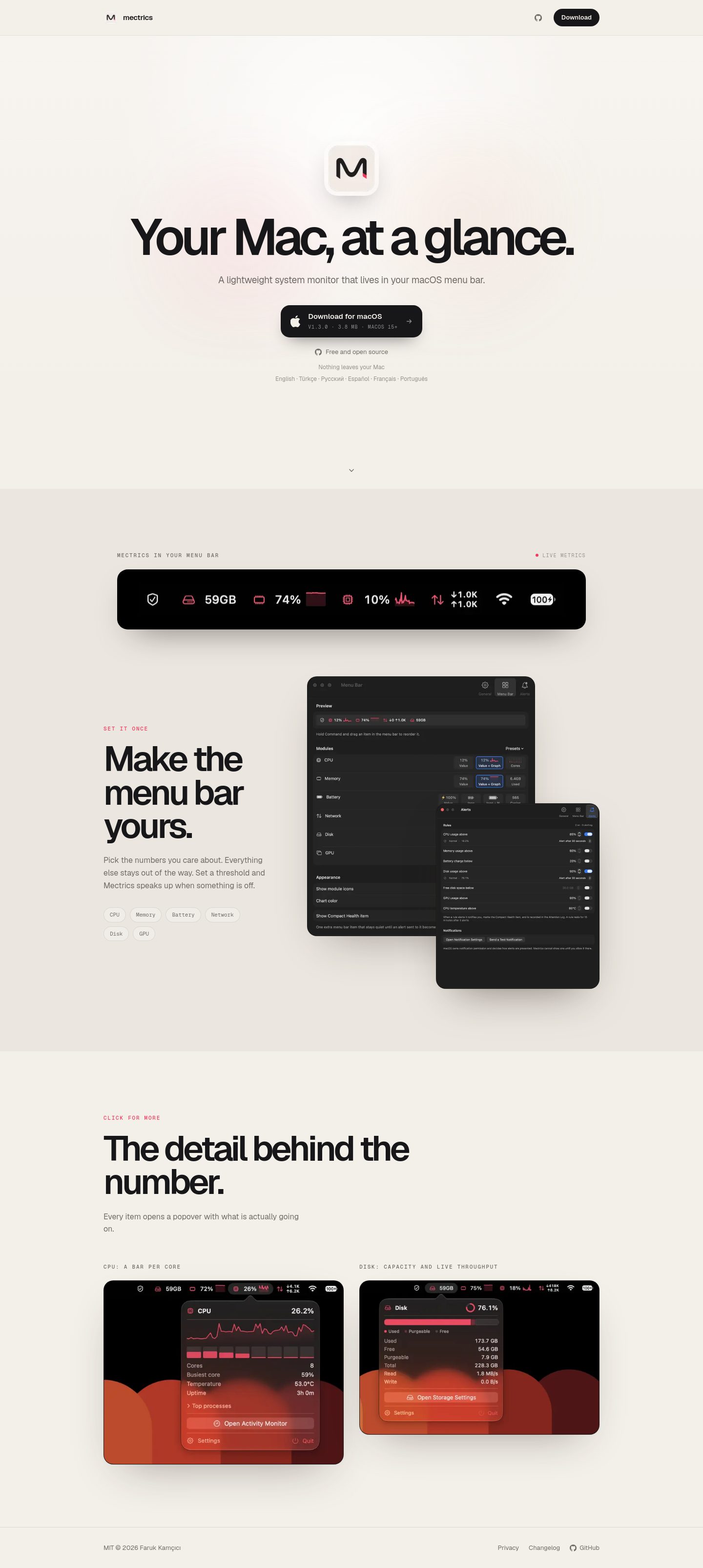
Mobile (390×3351, full page): 
What works
- Product-specific visual world. The cream canvas, coral accent, and pill-shaped controls all read as "macOS menu bar utility" rather than generic SaaS. The hero radial highlight + two soft coral/peach glows add warmth without becoming decorative noise.
- Typography pairing. Geist for body and display, Geist Mono for eyebrow labels and small UI chips. The mono eyebrows with wide tracking (1.76px) read as deliberate "system" labels, not as costume.
- Hero composition. A single large product screenshot sits centered with a subtle radial highlight above it. The composition is calm and lets the product speak.
- Restrained effects. Soft shadows on product images (
rgba(46, 37, 32, 0.45) 0px 35px 90px -42px), no glassmorphism, no gradient text, no neobrutalist offsets. The craft is consistent.
Palette
Colors
#f3efe9#ebe6df#171719#706b66#98918a#f43b5d
The cream #f3efe9 carries the page; #ebe6df is the secondary surface for the "Built for macOS" section; #171719 is body text; #706b66 and #98918a are muted and tertiary text; #f43b5d is the coral accent used for eyebrows and the download CTA.
Typography
Typography used on mectrics.app
- Geist
- Geist Mono
Geist handles the 103.68px hero h1 (line-height 0.94, letter-spacing −7.776px), the 72px section h2s (line-height 0.95, letter-spacing −4.68px), and the 16px body. Geist Mono carries the 11px eyebrows with +1.76px tracking and the 10–11px figcaption labels.
Useful design values
Useful design values
- Type scale · Hero h1
- 103.68px / 0.94 / −7.776px
- Type scale · Section h2
- 72px / 0.95 / −4.68px
- Type scale · Body
- 16px / 1.5
- Type scale · Eyebrow
- 11px mono / 1.5 / +1.76px
- Radius · CTA pill
- full pill
- Radius · Feature chip
- full pill
- Radius · Image card
- 20px
- Spacing · Header
- 73px tall, 32px horizontal padding
- Spacing · Nav gap
- 24px
- Shadow · Product image
- rgba(46,37,32,0.45) 0 35px 90px −42px
Priority issues
1. Coral eyebrow text fails AA contrast on the secondary surface. The "BUILT FOR MACOS" and "DESIGNED FOR THE MENU BAR" eyebrows sit at 11px mono on #ebe6df and measure 3.0:1 WCAG / APCA Lc 48.9 — below the 4.5:1 AA threshold for small text. The same coral on the body #f3efe9 is also borderline. This is the most concrete accessibility problem on the page. *Change:* darken the coral to roughly #d63354 for eyebrow use, or raise eyebrow size to 12px and weight 600. Keep the brighter #f43b5d for the CTA only.
2. No social proof, no FAQ, no changelog link in the main nav. The page asks the visitor to download a free app with zero credibility signals — no "as featured in," no user count, no testimonials, no FAQ about permissions/battery impact, and no visible changelog link (it exists at /changelog but is only in the footer). For a free menu bar utility, the visitor's real questions are "does it drain battery?" and "what does it actually show?" — neither is answered. *Change:* add a short FAQ section (3–5 questions) before the footer, surface a "View changelog" link in the header nav, and add one credibility line near the hero ("Free, open source, no telemetry" or a small GitHub stars badge).
3. Hero h1 at 103.68px is oversized for the content. The headline "macOS metrics in your menu bar" is only 22 characters but renders at 103.68px with −7.776px letter-spacing. On a 1440px desktop it dominates the fold; on mobile it wraps awkwardly. The visual weight competes with the product screenshot rather than supporting it. *Change:* drop the hero h1 to roughly 72–80px on desktop and 48–56px on mobile. Keep the tight letter-spacing but reduce the size so the product image remains the focal point.
4. The two side-by-side figures in "Designed for the menu bar" have uneven heights. The left figure is 412px tall, the right is 313px tall — a 100px difference that breaks the visual rhythm of a side-by-side comparison. The captions also differ in length (19 vs 34 characters), which compounds the imbalance. *Change:* crop both screenshots to the same aspect ratio (e.g., 4:3 or 16:10), or stack them vertically on desktop too if the content genuinely needs different heights.
5. The "Built for macOS" section uses a slightly darker cream (#ebe6df) that creates a subtle visual break. The shift from #f3efe9 to #ebe6df is only ~3 luminance points but reads as a band change rather than a continuous page. The section also relies entirely on pill-shaped feature chips with no supporting imagery. *Change:* either keep the same canvas and use a thin top border to separate sections, or add a small product screenshot or icon set inside the section to give it visual weight beyond the chips.
First change to make
Fix the coral eyebrow contrast (issue #1). It's a one-token change that immediately improves accessibility without touching layout or copy, and it sets the right precedent for how the accent color should be used across the page.