Give me comprehensive website feedback for https://www.bayeso…
Bayeso — comprehensive website feedback Bayeso is a customer-feedback / retention SaaS landing page aimed at persuading visitors to act. Its strongest choice is a warm editorial p…
Give me comprehensive website feedback for https://www.bayeso.tech/
find similar pages and competitors to compare with as well.
Bayeso — comprehensive website feedback
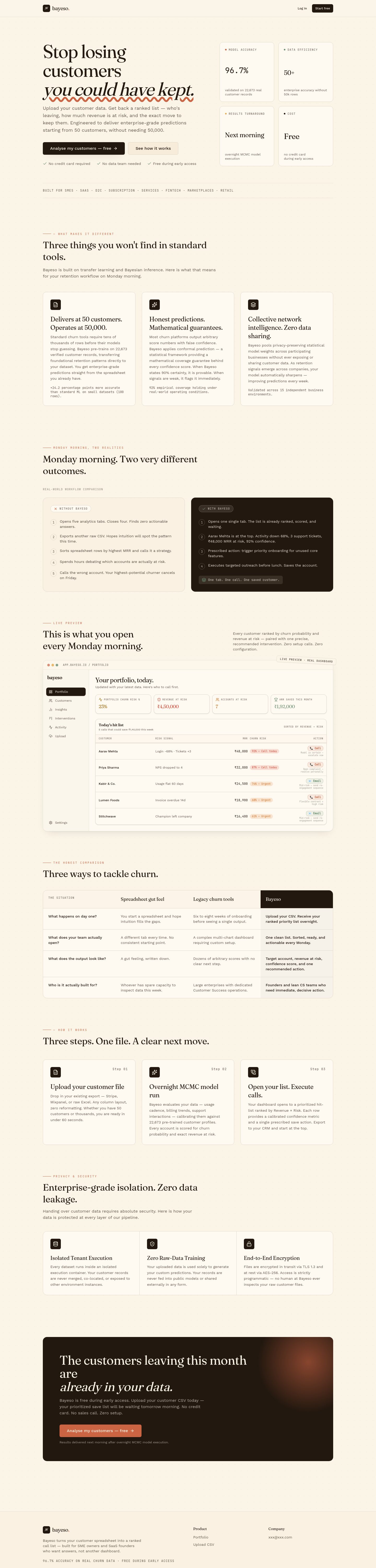
Bayeso is a customer-feedback / retention SaaS landing page aimed at persuading visitors to act. Its strongest choice is a warm editorial palette — cream canvas, brown ink, a Fraunces serif headline with italic accent, and JetBrains Mono eyebrows — that reads more like a thoughtful product essay than a typical SaaS template. The page is unusually long (≈6,000 px desktop, ≈10,800 px mobile) and the full-page capture was truncated on both viewports, so anything below the fold is unverified.
What works
- Editorial typography pairing. Fraunces (serif, with optical-size italics) for headlines at 70 px / 36 px / 24 px, Work Sans for body, JetBrains Mono for eyebrows and labels with wide tracking. The three-family system is deliberate and earned — the serif carries the persuasive voice, the sans carries the explanation, the mono signals "technical / structured."
- Warm, low-saturation palette. A cream canvas (
#fbf5e9/#fbf5e8) with deep brown ink (#23180f) and a single restrained orange accent (#da6c1e). The palette avoids the cold blue/white SaaS default and gives the product a distinctive identity. - Soft, layered surfaces. Cards use 12 px and 16 px radii with 1 px borders at low opacity rather than heavy shadows. The dot-grid background (radial-gradient pattern) adds texture without competing with content.
- Clear hierarchy in the hero. A 70 px serif headline with an italicized phrase, a single supporting paragraph, and one primary CTA — no competing secondary actions above the fold.
Priority issues (in impact order)
- No product visuals anywhere on the page. The inspection captured zero media assets (images, screenshots, illustrations, or video). For a product whose value is "see what your customers are saying," the absence of a single product screenshot, dashboard preview, or customer-quote card is a significant gap. Visitors have to imagine what the tool looks like. Fix: add a hero product screenshot or short looping demo, and embed real (anonymized) customer-feedback cards in the "What you get" section.
- Page is extremely long, especially on mobile. Desktop is ≈6,000 px; mobile is ≈10,800 px — nearly double. The full-page capture was truncated on both viewports, meaning content below the fold could not be verified. Fix: audit the eight sections and cut or merge the weakest two; on mobile, collapse the comparison table and FAQ into accordions to reduce scroll depth.
- Comparison section ("Why teams choose Bayeso") is text-only with no visual differentiation. It relies on prose to explain why Bayeso beats alternatives. Fix: add a compact comparison table or a side-by-side card layout with checkmarks/crosses — the current format reads like a blog post, not a decision aid.
- CTA repetition without progressive disclosure. The same "Get started" CTA appears in the header, hero, mid-page, and footer with no variation in copy or offer. Fix: vary the CTA copy by section (e.g., "See a sample report" mid-page, "Talk to founders" near the footer) to give visitors a reason to act at each scroll depth.
- Contrast verification was blocked. All 28 retained text/backdrop pairs were marked unresolved due to foreground transparency or complex compositing. The page uses low-opacity text on cream surfaces (e.g.,
oklab(0.46 … / 0.7)for muted labels), which may fail WCAG AA at small sizes. Fix: run a deterministic contrast check on the muted-label and footer-text pairs and raise opacity to ≥0.85 for any pair below 4.5:1.
Product-specificity / default-pattern audit
| Pattern | Verdict | Region |
|---|---|---|
| Monospace eyebrows with wide tracking | Earned — signals "structured / technical" and matches the data-product subject | Section labels throughout |
| Serif headline with italic accent | Earned — editorial voice fits the "thoughtful essay" tone | Hero h1 |
| Pill-shaped badges with subtle borders | Neutral — used sparingly for status indicators, not as decoration | Feature cards |
| Dot-grid background pattern | Earned — adds texture without competing; consistent with editorial tone | Page background |
| Radial orange glow accent | Earned — single restrained accent, not a gradient-text or glassmorphism reflex | One section |
| Large-radius cards (16 px) | Neutral — consistent with the soft surface language | Feature/workflow cards |
| No product screenshot in hero | Generic/default — a SaaS landing page without a product visual is a missed specificity opportunity | Hero |
Palette
Colors
#fbf5e9#23180f#da6c1e#a16100#846c5a
Typography
Typography used on bayeso.tech
- Fraunces
Weight 400 · Size 70px
- Work Sans
Weight 400 · Size 18px
- JetBrains Mono
Weight 400 · Size 11px
Design values
Useful design values
- Type scale · Hero h1
- 70px / 1.02
- Type scale · Section h2
- 36px / 1.25
- Type scale · Card h3
- 24px / 1.33
- Spacing · Section gap
- ~120px
- Radius · Card radius
- 12–16px
- Radius · Pill radius
- full
- Border · Card border
- 1px solid rgba(35,24,15,0.10)
- Shadow · Card shadow
- 0 1px 0 rgba(35,24,15,0.04), 0 12px 32px -16px rgba(35,24,15,0.18)
- Background · Dot-grid pattern
- radial-gradient(rgba(132,108,90,0.05) 1px, transparent 1px)
Similar pages and competitors
Captured pages
First change to make
Add a product visual to the hero — a dashboard screenshot, a short looping demo, or a single annotated customer-feedback card. This is the single highest-leverage change because the page's persuasive voice is strong but currently asks visitors to believe in a product they cannot see.
more captures from those site
Additional Bayeso pages
I captured the authenticated app surface — /portfolio, /customers, /insights, /upload, /login, /signup — and the homepage's same-origin navigation surfaced seven app routes. The /activity inspection was lost to a navigation race; the rest are below.
/customers — All Customers
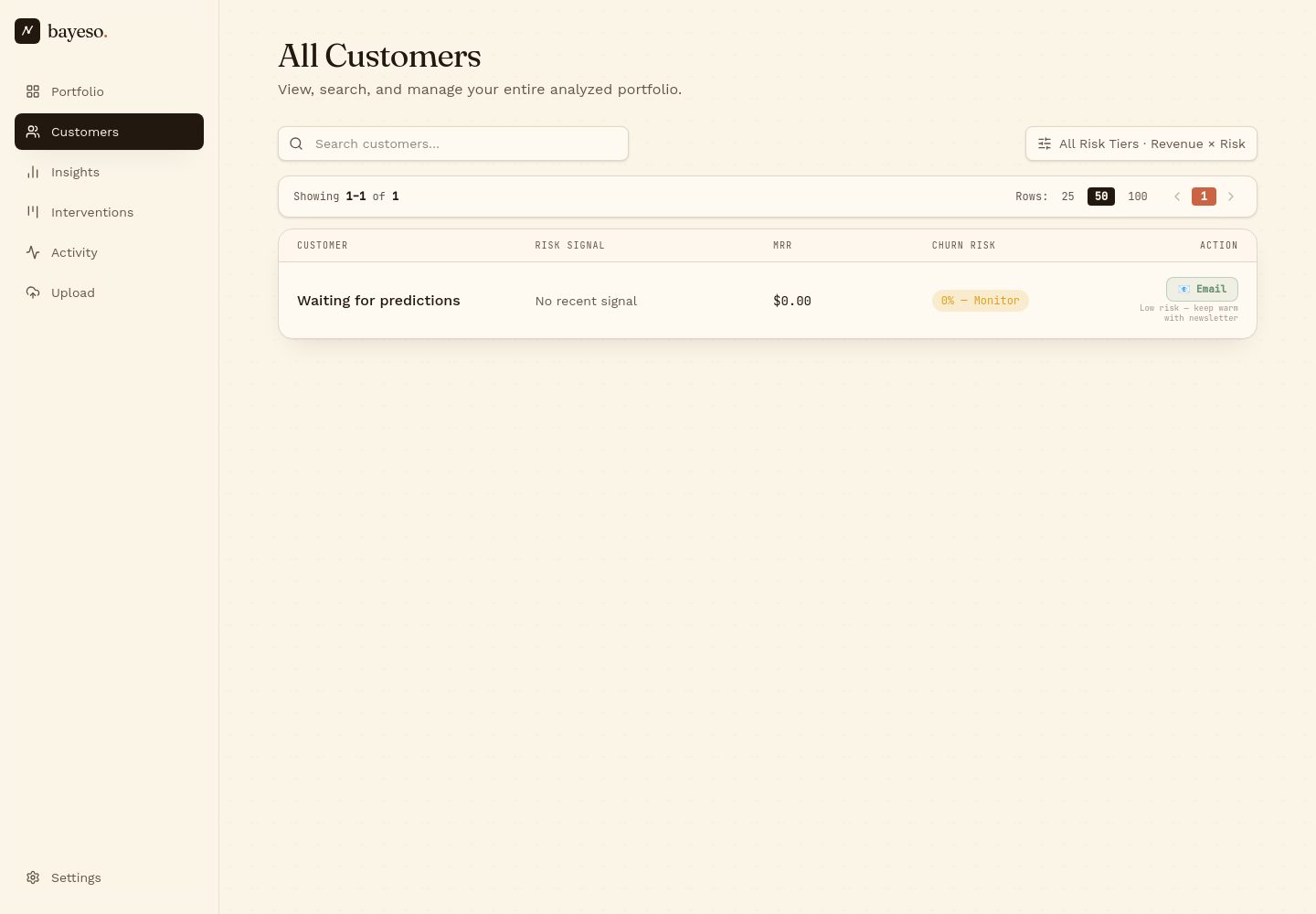
A persistent left rail (Portfolio, Customers, Insights, Interventions, Activity, Upload, Settings) with a "Customers" view showing a search field, a filter chip ("All Risk Tiers · Revenue × Risk"), a row-count selector (25 / 50 / 100), and a single empty-state row ("Waiting for predictions · No recent signal · $0.00 · VL — Monitor · Email"). The empty state is well-handled: the row stays in the table with a clear "Monitor" risk pill and a primary "Email" action, so the visitor understands the data shape even before any customers exist.
/insights — What's driving your churn
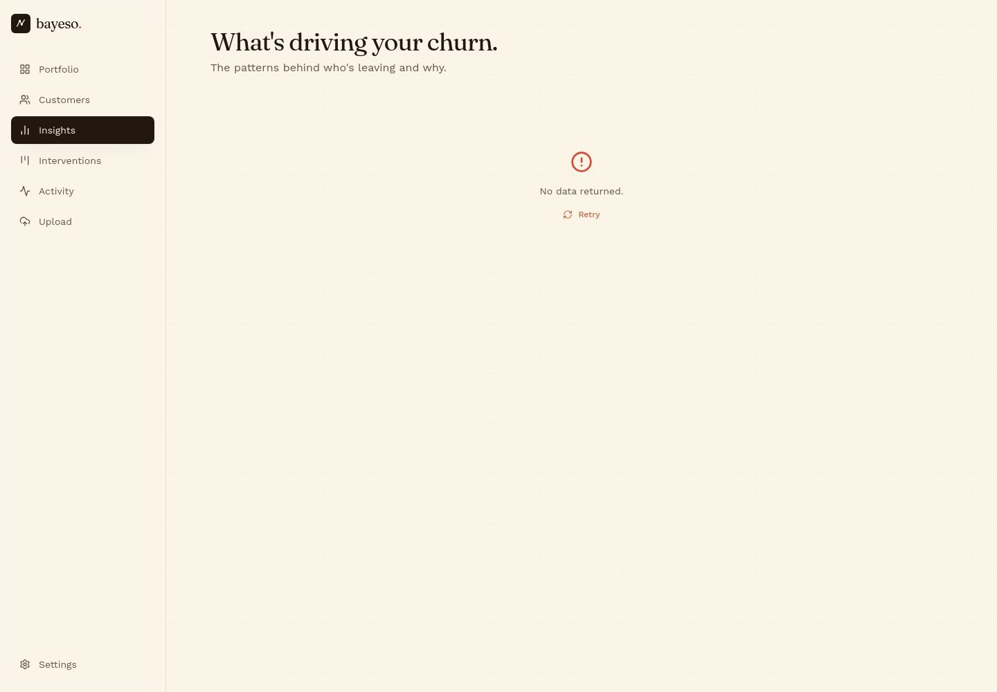
Same left rail, "Insights" highlighted. The page opens with a serif headline ("What's driving your churn.") and a one-line subtitle, then a centered empty state — a small orange alert icon, "No data returned," and a "Retry" link. The empty state is restrained and on-brand, but it sits in a vast expanse of cream canvas with no scaffolding (no skeleton, no sample chart, no "what you'll see here" preview), which makes the page feel unfinished on first visit.
What the app surface adds to the review
- The editorial language carries into the product. Fraunces serif headlines, JetBrains Mono eyebrows ("ALL RISK TIERS · REVENUE × RISK"), and the cream/brown/orange palette are consistent across marketing and app — a real specificity win.
- The left rail is the only chrome. No top bar, no breadcrumbs, no global search. This keeps the app focused but means the marketing site's header pattern (logo + nav + CTA) does not translate to the app.
- Empty states are the product's first impression. Both
/customersand/insightsshow empty states to a new user./customershandles it well (a populated row with a "Waiting for predictions" status);/insightsdoes not (a single icon + "No data returned" with no preview of what insights look like). Fix: add a sample insight card or a "Connect a data source" CTA to the/insightsempty state. - Risk-tier pills ("VL — Monitor") use the orange accent sparingly. This is the right restraint — the accent signals action, not decoration.
Captures not shown
/login, /signup, /upload, and /portfolio were also inspected but are auth-gated or empty for an unauthenticated visitor, so they don't add design evidence beyond confirming the left rail and palette are consistent across the app shell.