Give me comprehensive website feedback and similar pages and…
The highest-priority direction for Carat Business should be to make who the site serves, what buyers can source, and how to start a trade conversation unmistakable in the first sc…
Give me comprehensive website feedback and similar pages and competitors to compare. https://caratbusiness.in/
The highest-priority direction for Carat Business should be to make who the site serves, what buyers can source, and how to start a trade conversation unmistakable in the first screen.
Important limitation
I attempted to inspect https://caratbusiness.in/ on both desktop and mobile, but the live page could not be fetched, and there is no saved capture available for it. So I won’t invent target-specific findings about its current layout, copy, colors, or mobile behavior.
The review below is therefore a benchmark-led website strategy and competitor comparison, not a claim that these issues currently exist on Carat Business.
Recommended website direction
1. Make the homepage a trade-buyer entry point
The first screen should answer four questions immediately:
- What does Carat Business sell or provide?
- Is it for retailers, wholesalers, manufacturers, or consumers?
- What product categories are available?
- What should the visitor do next?
A strong B2B jewellery hero structure would be:
- Clear headline: what Carat Business enables or supplies
- Short proof-oriented description
- Primary CTA: View catalogue, Request pricing, or Talk to a trade specialist
- Secondary CTA: Download catalogue or Become a retailer
- A product or showroom image that proves the category
- Trust signals immediately below: years in business, certifications, locations served, minimum order information, or retailer count—only where accurate
Avoid leading with abstract luxury language. Trade buyers usually need clarity before aspiration.
2. Separate the visitor journeys
The navigation should probably distinguish between:
- Products / Catalogue
- Diamonds or gemstones
- Jewellery collections
- Custom manufacturing
- Wholesale / Trade account
- About / Certifications
- Contact / Enquiry
If the company serves more than one audience, expose that distinction early:
- I’m a retailer
- I’m a jewellery brand
- I need manufacturing
- I’m looking for diamonds or gemstones
This is more useful than placing every service under a generic “Our Services” menu.
3. Treat catalogue discovery as the main product
If Carat Business sells a catalogue of products, the browsing experience should be more than a gallery of images.
Useful filters could include:
- Product category
- Metal
- Stone type
- Collection
- Price range or wholesale tier
- Availability
- Minimum order quantity
- Customizable / ready-to-ship
- Certification or sourcing attributes
Each product detail page should make the next action obvious:
- Request price
- Ask about availability
- Add to enquiry
- Download specifications
- Contact sales
For a B2B site, hidden pricing can be acceptable, but hidden commercial information is not. Explain what is available after registration or enquiry.
4. Put trust beside the commercial claim
Jewellery buyers are making a high-trust decision. Trust should not be isolated on an About page.
Place relevant proof beside the claim it supports:
- Certifications near quality claims
- Factory or showroom imagery near manufacturing claims
- Shipping regions near delivery claims
- Client logos or retailer examples near partnership claims
- Ethical sourcing information near sourcing claims
- Team or location details near contact information
Use specific proof instead of generic statements such as “best quality,” “premium,” or “trusted worldwide.”
5. Use a more deliberate conversion system
Every major section should lead naturally to one of three actions:
- Browse
- Enquire
- Verify trust
Recommended CTA hierarchy:
- Primary: View wholesale catalogue or Request a quote
- Secondary: Explore collections
- Tertiary: Contact sales
Avoid using several equally strong buttons such as “Learn More,” “Get Started,” “Contact Us,” and “View Products” in the same visual area. That makes the visitor decide what the business wants them to do.
6. Design for repeat trade use
If returning buyers are important, add operational conveniences:
- Login or trade account
- Saved products
- Downloadable line sheets
- Enquiry history
- Reorder workflow
- WhatsApp or sales representative contact
- Clear response expectations
- Regional sales contacts
A B2B website should feel useful after the first visit, not only impressive during the first visit.
Competitors and comparison references
These are the closest role-adjacent benchmarks I found. They should not all be treated as direct competitors until Carat Business’s exact business model is confirmed.
1. Nivoda — closest marketplace and supply-chain benchmark
Nivoda is the strongest comparison if Carat Business is focused on sourcing, jewellery supply, gemstones, retailer tooling, or trade transactions.
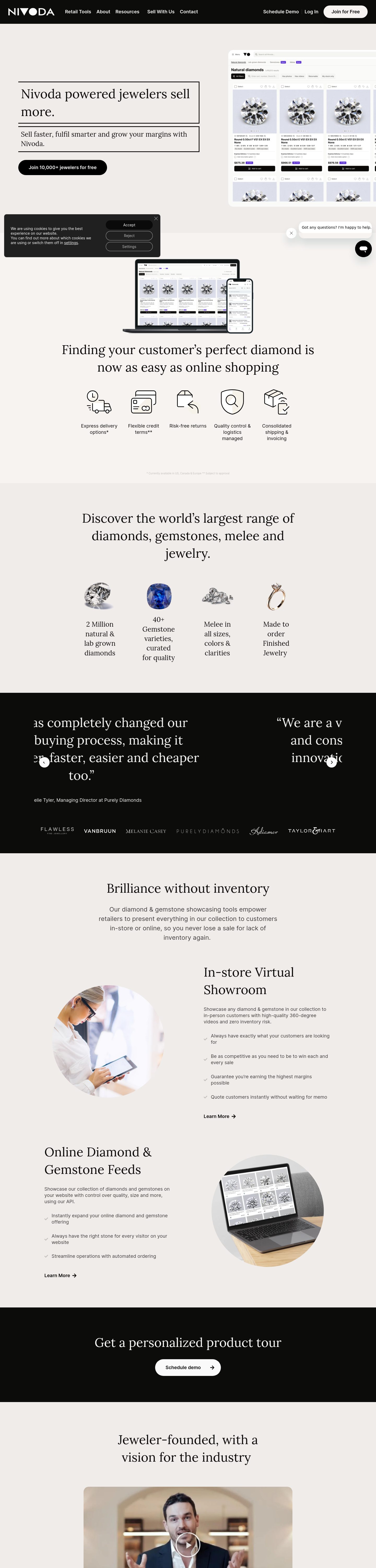
What to study:
- Audience-specific navigation such as jewellery, gemstones, sellers, and retail tools
- A clear route to a demo or sales conversation
- Separating buyer-facing value from supplier-facing value
- Educational content that reduces uncertainty
- Ethical-practice information as part of the commercial experience
Borrow: the explicit trade workflow and audience segmentation. Do not copy: a platform-style information architecture if Carat Business is primarily a manufacturer or catalogue wholesaler.
2. Rapaport Trade — strongest trust and trade-utility benchmark
Rapaport Trade is useful if Carat Business needs to compete on diamond-industry authority, buying confidence, membership, search, or professional resources.
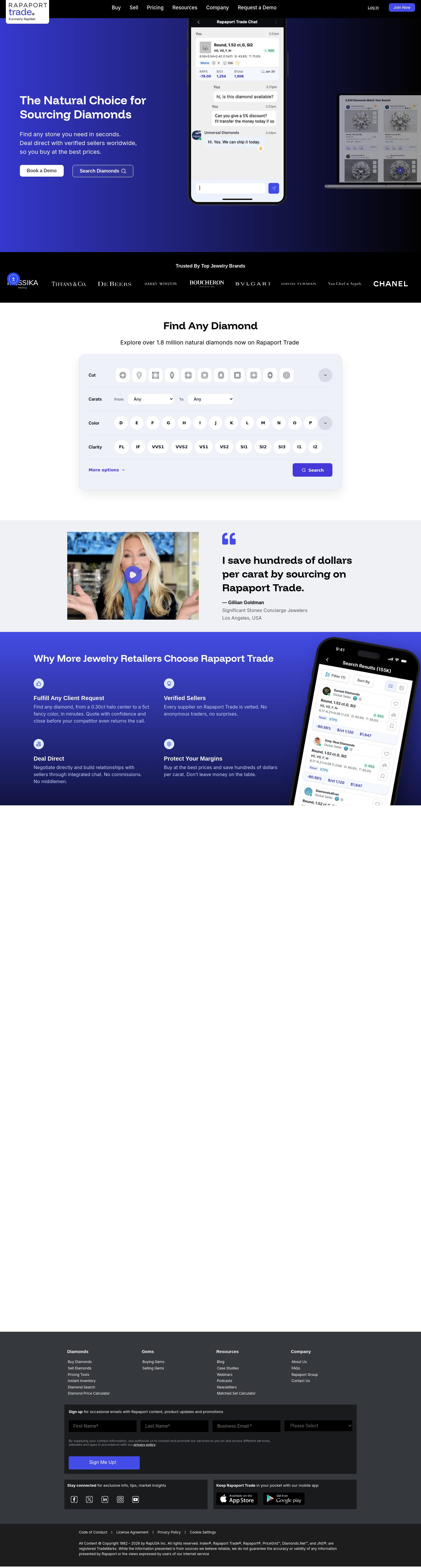
Its trade navigation exposes distinct commercial routes such as:
- Buying diamonds
- Selling diamonds
- Buying and selling gems
- Membership
- Quick search
- Diamond calculator
- Guides and resources
- Case studies
Borrow: the idea that a professional buyer should be able to enter through a specific task, not just a generic homepage. Do not copy: the breadth of an industry publication unless Carat Business genuinely has that content and authority.
3. IDEX — strongest utility and data-density benchmark
IDEX is relevant if Carat Business is connected to diamond search, prices, transactions, market information, or professional tools.
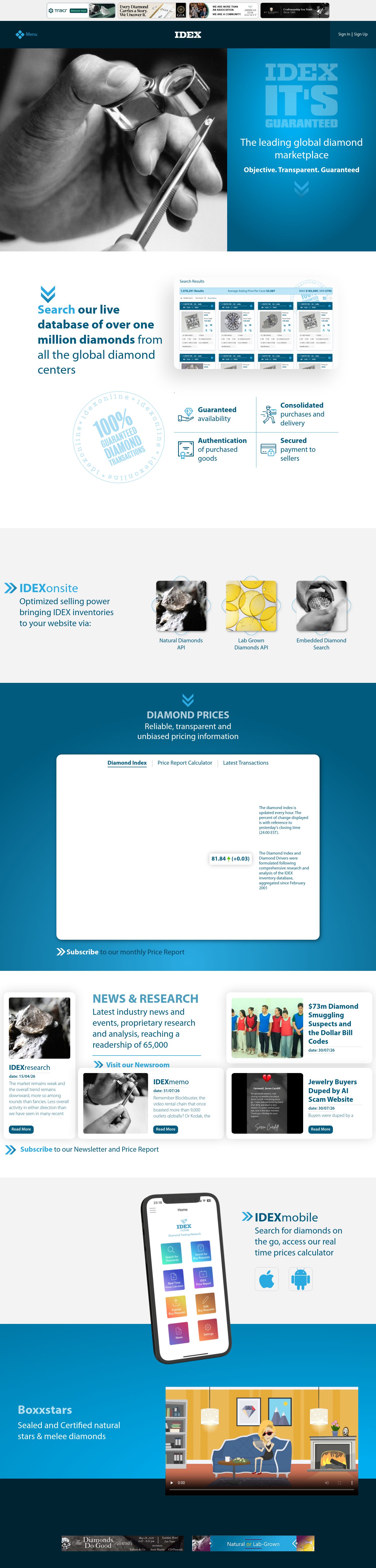
The inspected page uses a professional blue-and-white system with a dark header, structured utility areas, and a strong emphasis on search and market information. Its rendered type system includes large headings around 40–48px, 16px body text, and a consistent Myriad Pro family.
Borrow: dense, task-oriented navigation and strong visual prioritization of tools. Do not copy: older portal-like density if Carat Business needs to feel more premium, editorial, or relationship-led.
The IDEX capture was truncated before the full page ended, so it is useful as a directional reference rather than a complete page audit.
Competitor comparison
| Site | Best benchmark for | What Carat Business should learn |
|---|---|---|
| Nivoda | B2B marketplace and sourcing | Segment audiences and expose the trade workflow |
| Rapaport Trade | Authority and buyer confidence | Make professional tasks and trust resources easy to find |
| IDEX | Data, search, and trade tools | Prioritize practical actions over broad marketing copy |
| Carat Business | Opportunity | Combine the clarity of Nivoda, trust of Rapaport, and utility of IDEX without becoming generic |
Visual direction I would recommend
For a jewellery B2B business, I would aim for:
- Warm white or restrained neutral canvas
- Deep charcoal, ink, or dark blue for authority
- One restrained jewellery accent—gold, champagne, or a distinctive brand color
- Large, carefully cropped product photography
- Strong editorial headings paired with highly legible body text
- Thin borders and restrained shadows rather than many floating cards
- A consistent image ratio across catalogue cards
- Fewer decorative effects; let material, cut, metal, and craftsmanship provide the richness
The visual system should feel precise, premium, and commercially useful, rather than like a generic luxury landing page.
Highest-priority improvement sequence
- Rebuild the first screen around audience, offer, proof, and one primary CTA.
- Clarify the navigation around buyer tasks and product categories.
- Make catalogue discovery and product enquiries feel like the core experience.
- Move certifications, sourcing, manufacturing, and delivery proof into the relevant buying journey.
- Create a mobile-first enquiry flow with persistent access to catalogue and sales contact.
- Add repeat-buyer utilities if the business depends on ongoing retailer relationships.
Vibe-coded appearance check
Overall visible-design verdict: not assessable for Carat Business because the target page did not render. I won’t label its current design product-specific, mixed, or generic/default without a reliable desktop or mobile capture.
For the comparison sites:
- Nivoda — product-specific / earned: the visible trade vocabulary and pathways around jewellery, gemstones, sellers, retail tools, and demos belong to its marketplace role.
- Rapaport Trade — product-specific / earned: buying, selling, membership, search, pricing tools, guides, and case studies reinforce a professional diamond-trade context.
- IDEX — product-specific / earned: search, pricing, market information, and transaction-oriented routes support a utility-led trade product.
- Generic patterns to avoid for Carat Business: decorative luxury headlines without product clarity, repeated cards that hide the catalogue, vague “learn more” CTAs, and premium imagery that is not connected to an enquiry or buying task.
A target-specific critique of the current Carat Business hierarchy, typography, mobile layout, and visual defaults requires a successful render or a screenshot of the site.