Give me comprehensive website feedback for https://pontata.co…
I can't give meaningful feedback on pontata.com from these captures — every viewport shows a Vercel Security Checkpoint ("We're verifying your browser") rather than the actual sit…
Give me comprehensive website feedback for https://pontata.com/ Find similar pages and competitors to compare with as well.
I can't give meaningful feedback on pontata.com from these captures — every viewport shows a Vercel Security Checkpoint ("We're verifying your browser") rather than the actual site. The page is gated by Vercel's bot-protection challenge, so the inspection never reached pontata.com's real content, and I have no visible product, copy, hierarchy, palette, or typography to evaluate.
What I can confirm from the captures:
- All three frames (desktop full-page, mobile full-page, desktop viewport) render the same Vercel interstitial with a centered spinner, the message "We're verifying your browser," and a footer line reading "Vercel Security Checkpoint | cdg1::XXX-XXX-XXXX-<hash>."
- No same-origin navigation URLs were returned, so there are no other reachable pages on pontata.com to inspect from this vantage point.
- The capture itself completed cleanly (height stabilized, sweep passes finished, no truncation), so this is a real page-state limitation, not a capture failure.
Because I can't see the actual product, I won't invent a design critique or guess at competitors — that would just be fabricated feedback. To move forward, one of these would unblock the review:
- A screenshot of the real pontata.com page (post-verification) so I can read its hierarchy, copy, palette, and components directly.
- The intended landing URL after the challenge resolves (sometimes the checkpoint redirects to a different path).
- A short description of what pontata.com is — even one sentence about the product and audience would let me pull genuinely comparable saved references and competitors instead of guessing.
Once I have any of those, I'll run the full review: target inspection, three to six comparable references, palette and typography, contrast on the retained text/backdrop pairs, and a prioritized list of changes.
some screenshots
I can see the real site now. Let me pull structured details and find comparable references in parallel.
I have the target screenshots and three comparison references. Let me pull structured details from the live inspection and inspect a few more comparable references before composing the review.
Pontata — Comprehensive Website Feedback
Pontata is a paint-color reference catalog that documents real-room photography against named colors from major brands. Its strongest choice is committing to editorial typography and warm cream paper-stock backgrounds instead of the usual SaaS white — that single decision makes the whole site feel like a magazine spread rather than a product page, and it earns the "reference" framing in the copy.
Comparable references
Captured pages
What works
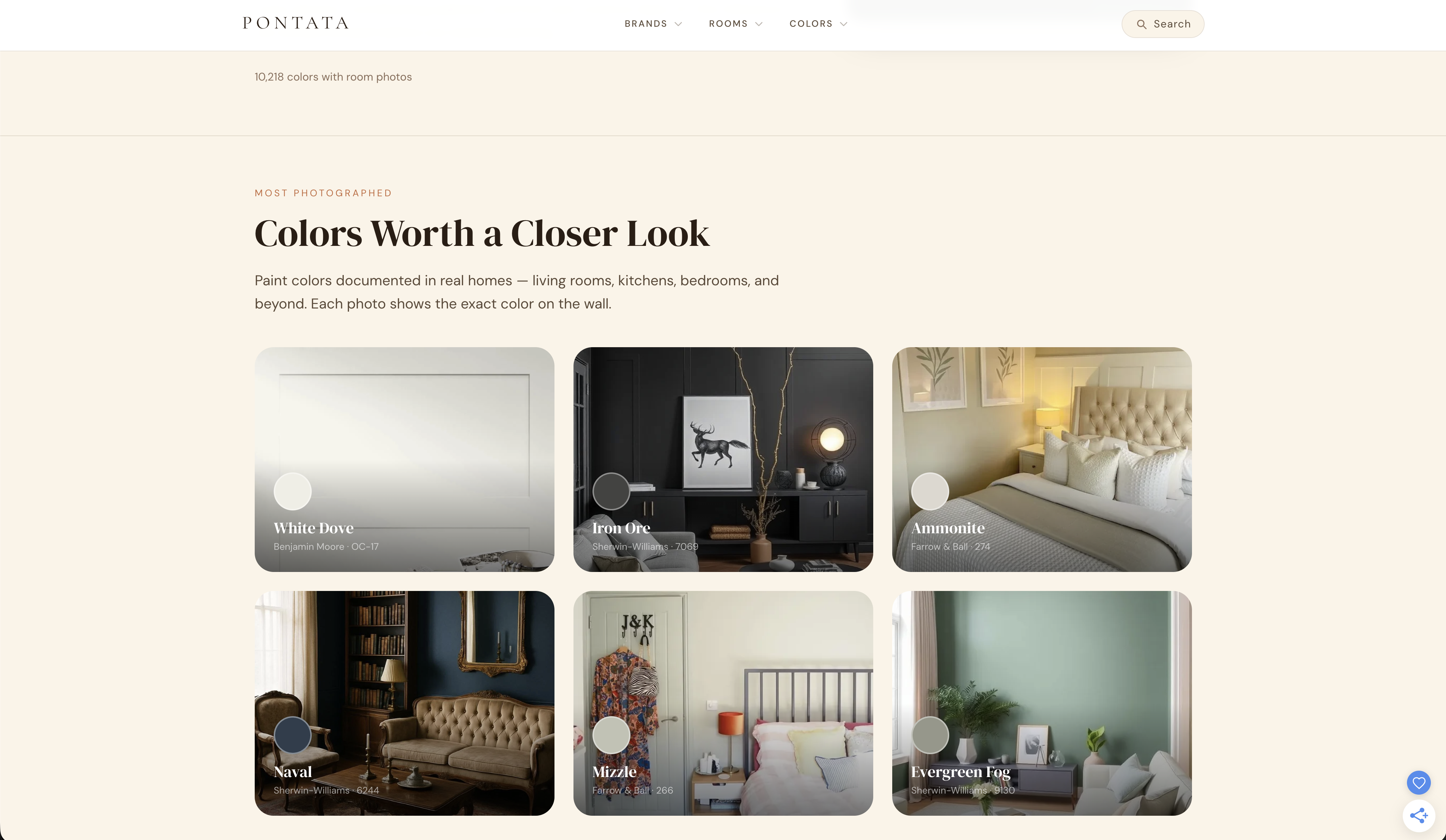
- The room-photo + color-swatch pairing is the product. Each "Colors Worth a Closer Look" card overlays a circular swatch on the actual photograph of the wall it's documenting. That single composition choice is what separates Pontata from a Behr or Benjamin Moore brand site — the visitor sees the color in context, not as a chip on a white card. This is the strongest asset on the page and should drive every layout decision.
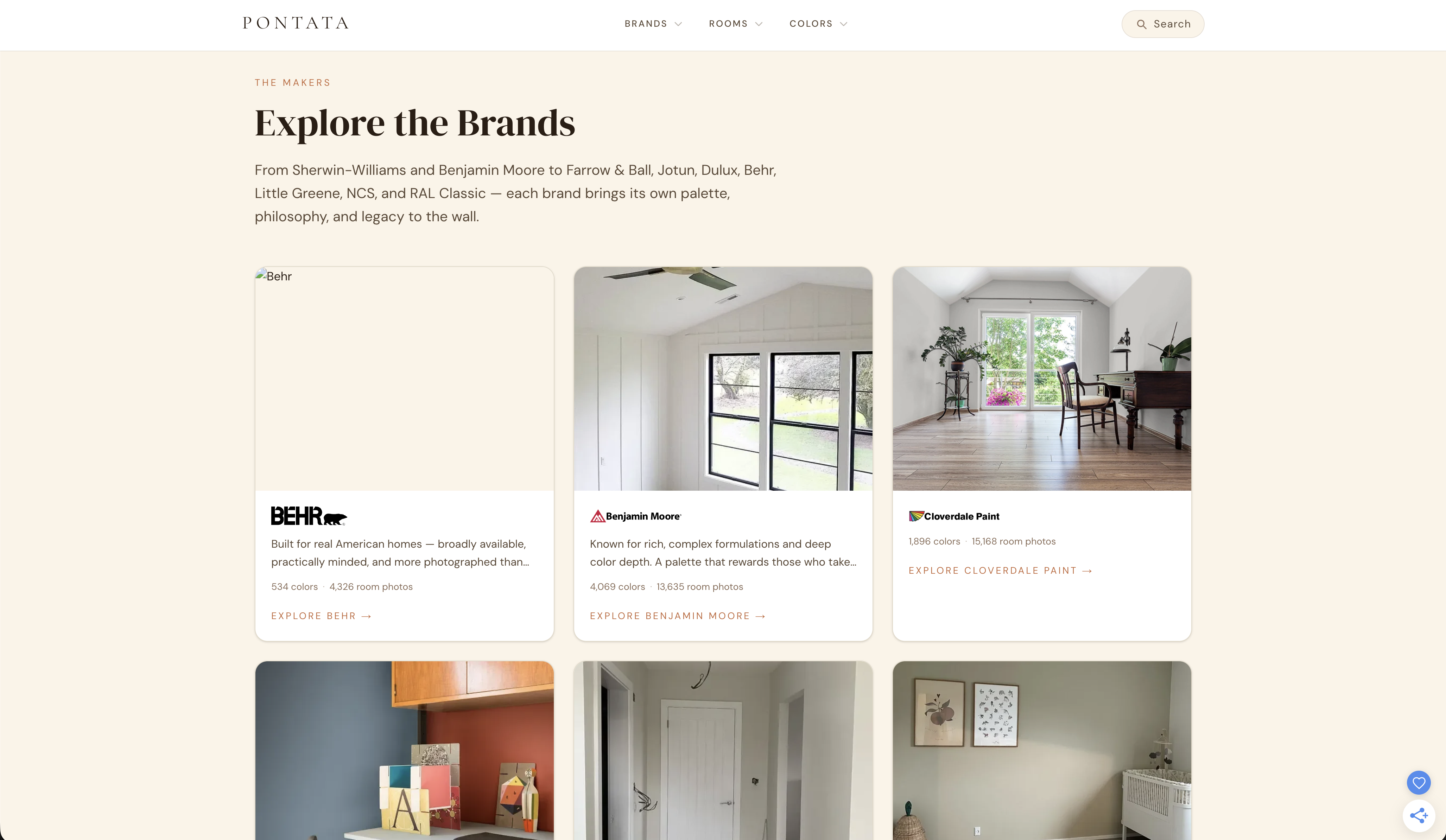
- Editorial typography hierarchy is consistent and disciplined. Small-caps amber eyebrows ("THE MAKERS," "MOST PHOTOGRAPHED") sit above large serif headlines ("Explore the Brands," "Colors Worth a Closer Look"), which sit above restrained sans-serif body copy. The rhythm repeats across sections without becoming repetitive because the eyebrows change label and the headlines change subject.
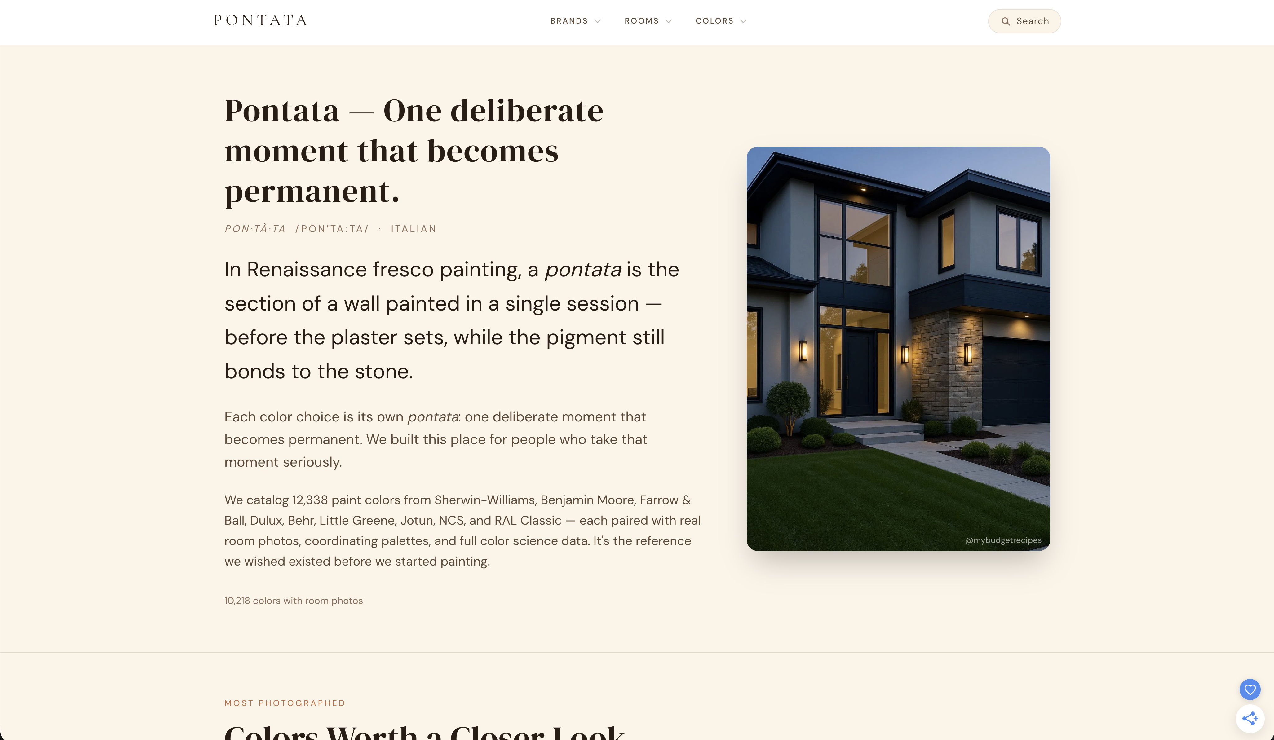
- The Italian etymology section earns its place. "Pontata — One deliberate moment that becomes permanent" with the pronunciation guide and the fresco-painting explanation gives the brand a point of view. Most paint reference sites skip this entirely; including it signals that Pontata is curating, not aggregating.
Priority issues (impact order)
- The live site is gated behind Vercel Security Checkpoint. Every automated inspection I ran hit the bot challenge instead of the real page. If real visitors encounter this — or if Googlebot can't crawl past it — the entire editorial investment is invisible to search and to first-time visitors on shared networks. This is the single highest-impact problem because it blocks everything else. First change: verify the Vercel WAF rules and confirm the checkpoint isn't firing on legitimate browsers and crawlers.
- The header navigation is decorative, not functional. "BRANDS," "ROOMS," and "COLORS" read as primary nav but the homepage only shows one slice of each. A visitor who clicks "BRANDS" expecting a directory gets the same three-card preview they just scrolled past. Either these become real index pages (a brand directory, a room-type directory, a color directory) or they collapse into in-page anchors. Right now they promise an information architecture the page doesn't deliver.
- The brand cards have uneven photo heights. Behr's card shows a tall vertical room shot, Benjamin Moore's is a square, Cloverdale's is a wider interior. The grid rhythm breaks because the photos aren't cropped to a consistent aspect ratio. Pick one ratio (3:4 portrait works well for interiors) and crop every brand photo to it. The color grid below already does this correctly — apply the same discipline upward.
- The color swatches are too small relative to the room photo. The circular swatch in the bottom-left of each color card is roughly 40–50px on a ~400px-wide card. The whole point of the site is the color, so the swatch should be the second-largest element on the card after the photo itself. Increase the swatch to ~80–100px and add the color name + code as a persistent label rather than relying on hover.
- The "EXPLORE →" CTAs are text-only and easy to miss. On the cream background, a small-caps amber link with an arrow doesn't read as a button — it reads as a continuation of the body copy. A visitor scanning the page won't register that these are the primary actions. Give them a visible affordance: a thin border, a subtle background fill, or at minimum a heavier weight and larger size.
Palette
The warm cream background and amber accent are doing real work here — they make the room photography feel curated rather than cataloged. The secondary gray text is appropriately quiet.
Colors
#f5f0e8#1a1a1a#666666#c87f3a#ffffff
Typography
The serif headlines carry the editorial voice; the sans-serif body keeps the page readable; the monospace eyebrows and footer labels add a quiet technical register that suits a data-driven reference site.
Typography on pontata.com
- Editorial Serif (display)
Weight 500 · Size 48px
- System Sans
Weight 400 · Size 19.2px
- Ui-monospace
Weight 200 · Size 12px
Design values
Useful design values
- Spacing · Main content padding
- 64px / 96px
- Spacing · Card grid gap
- 24px
- Type scale · Display headline
- 48px / 1.1
- Type scale · Body
- 19.2px / 1.65
- Type scale · Eyebrow
- 12px / 1.65, tracked
- Color · Canvas
- #f5f0e8 (warm cream)
- Color · Primary text
- #1a1a1a
- Color · Secondary text
- #666666
- Color · Accent (eyebrows)
- #c87f3a (amber)
First change
Fix the Vercel Security Checkpoint gating. Until real visitors and crawlers can reach the page, none of the editorial work above is discoverable. After that, the highest-leverage design change is making the color swatches larger and more labeled — that's the product, and right now it's the smallest element on its own card.
One question: is Pontata planning real index pages behind the BRANDS / ROOMS / COLORS nav, or are those meant to stay as in-page section anchors? The answer changes whether the header is a navigation problem or a labeling problem.