https://texttoanything.nl/ Give me comprehensive website feed…
Comprehensive feedback for texttoanything.nl Overall diagnosis: texttoanything.nl already has a credible developer-tool foundation—dark technical visual language, direct API-key C…
https://texttoanything.nl/ Give me comprehensive website feedback for texttoanything.nl find similar pages and competitors to compare.
Comprehensive feedback for texttoanything.nl
Overall diagnosis: texttoanything.nl already has a credible developer-tool foundation—dark technical visual language, direct API-key CTA, clear installation routes, and useful pricing transparency—but the product story is currently fragmented. The first improvement should be to make the site immediately explain what TextToAnything does, who it is for, and which API a visitor should use first.
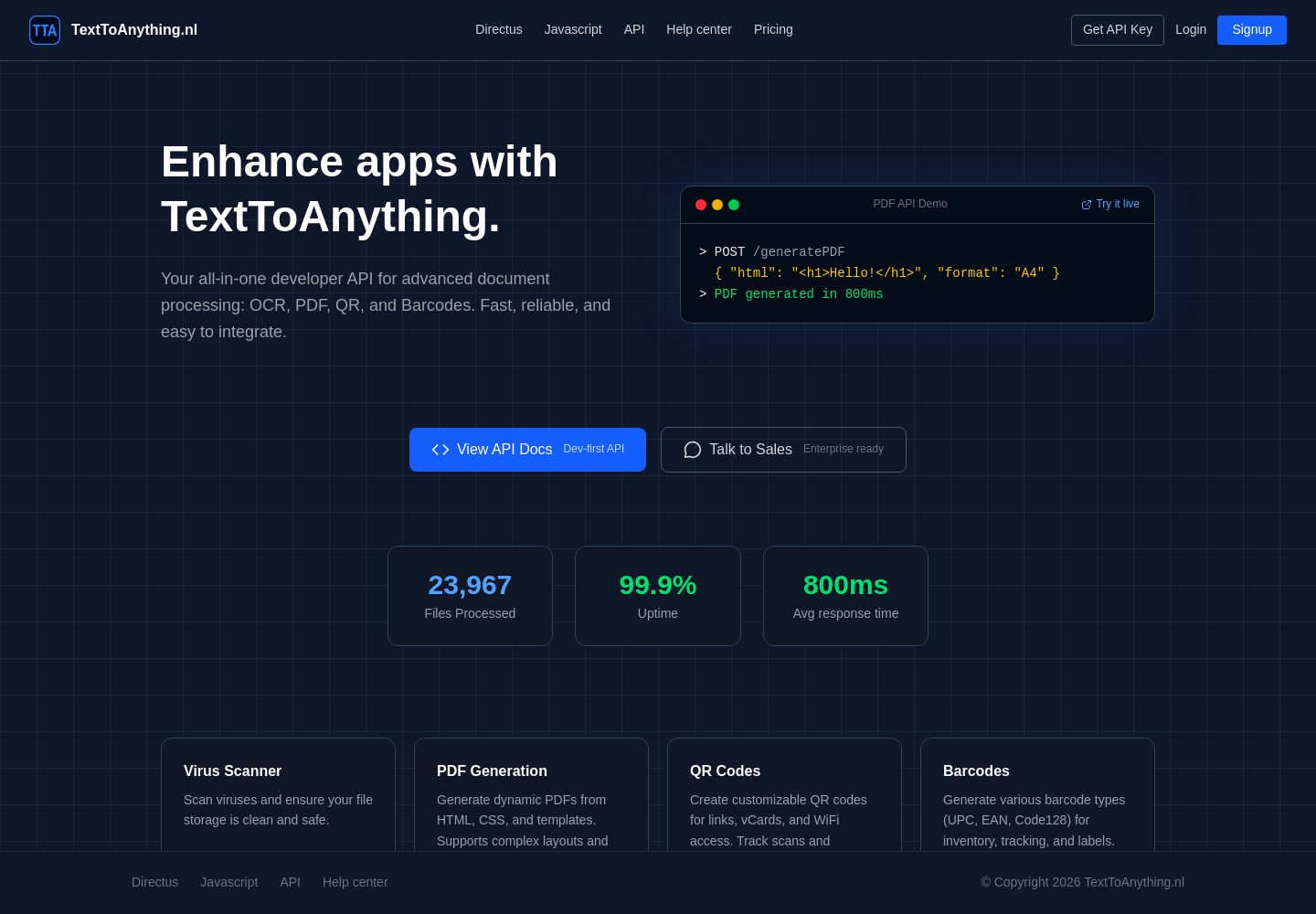
The strongest direction is not a visual redesign from scratch. It is a clearer developer-product narrative supported by stronger information architecture.
Comparison pages and adjacent competitors
The closest useful references I found are mostly adjacent API and developer-platform products rather than exact feature-for-feature rivals. They are useful for comparing positioning, documentation hierarchy, API examples, and pricing presentation.
Captured pages
What to borrow from these references
| Reference | Useful lesson for TextToAnything |
|---|---|
| Cloudflare Workers | Lead with the platform outcome before listing implementation options. |
| Notion Developer Platform | Explain why the API matters in plain language, not only which integrations exist. |
| Chrome for Developers | Give documentation a persistent structure: getting started, APIs, examples, guides, reference. |
| Twilio | Group capabilities around jobs users need to complete, not only technical products. |
| Resend | Put a convincing, copyable code example near the first product explanation. |
| Claude Code | Use a sharp product promise and show the working environment immediately. |
---
What currently works
1. The visual language fits a developer API
The dark navy foundation, grid background, blue actions, monospace code treatment, and compact navigation communicate “technical product” quickly. This is a suitable direction for an API that handles documents, OCR, QR codes, and barcodes.
The current rendered details include:
- Inter for the primary interface typography
- System monospace for code
- Dark navy page background
- Bright blue primary actions and links
- Green and yellow accents inside technical content
- Minimal shadow use
- Moderate 8px and 12px corner radii rather than excessive rounded surfaces
That restraint is valuable. The site does not need more gradients, glass effects, decorative illustrations, or oversized card styling.
2. The mobile header is compact and functional
The mobile layout reduces the navigation to the brand and menu control without consuming excessive vertical space. That is a good choice for documentation and API pages.
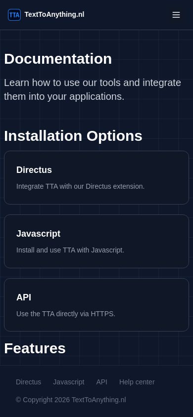
3. The installation choices are easy to understand
On the documentation page, the three visible routes—Directus, Javascript, and API—are presented as distinct cards. The categories are meaningful rather than decorative, so the card pattern feels justified.
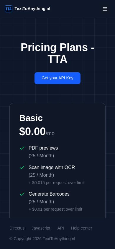
The pricing page also makes the free entry point and usage limits visible early rather than hiding them behind a sales form.
---
Priority improvements
1. Make the homepage explain the product before explaining the integrations
Current issue: the site has the visual appearance of an API platform, but the central product proposition is not immediately specific enough. A visitor should not have to infer whether TextToAnything is primarily a PDF service, OCR service, barcode service, or developer toolkit.
Why it matters: developers decide quickly whether a tool fits their use case. If the first screen does not establish the main job, the visitor has to navigate through documentation or pricing before understanding the product.
First change to make:
Rewrite the hero around one clear statement, such as:
> Generate PDFs, scan images, and create QR codes or barcodes through one simple API.
Then immediately provide:
- A short explanation of the supported workflows
- One primary “Get API key” action
- One secondary “Read the docs” action
- A small working request example
- Links to the four core capabilities
The homepage should make the difference between product capabilities and installation methods explicit:
- Capabilities: PDF, OCR, QR, barcode
- Ways to integrate: API, JavaScript, Directus
Cloudflare Workers and Resend are the best comparison directions here: both make the product’s value obvious before asking users to understand the underlying technical model.
---
2. Turn the documentation page into a real task-oriented information architecture
Current issue: the mobile documentation page has a strong heading and clear installation cards, but the visible “Features” heading is followed by no visible feature content before the footer.
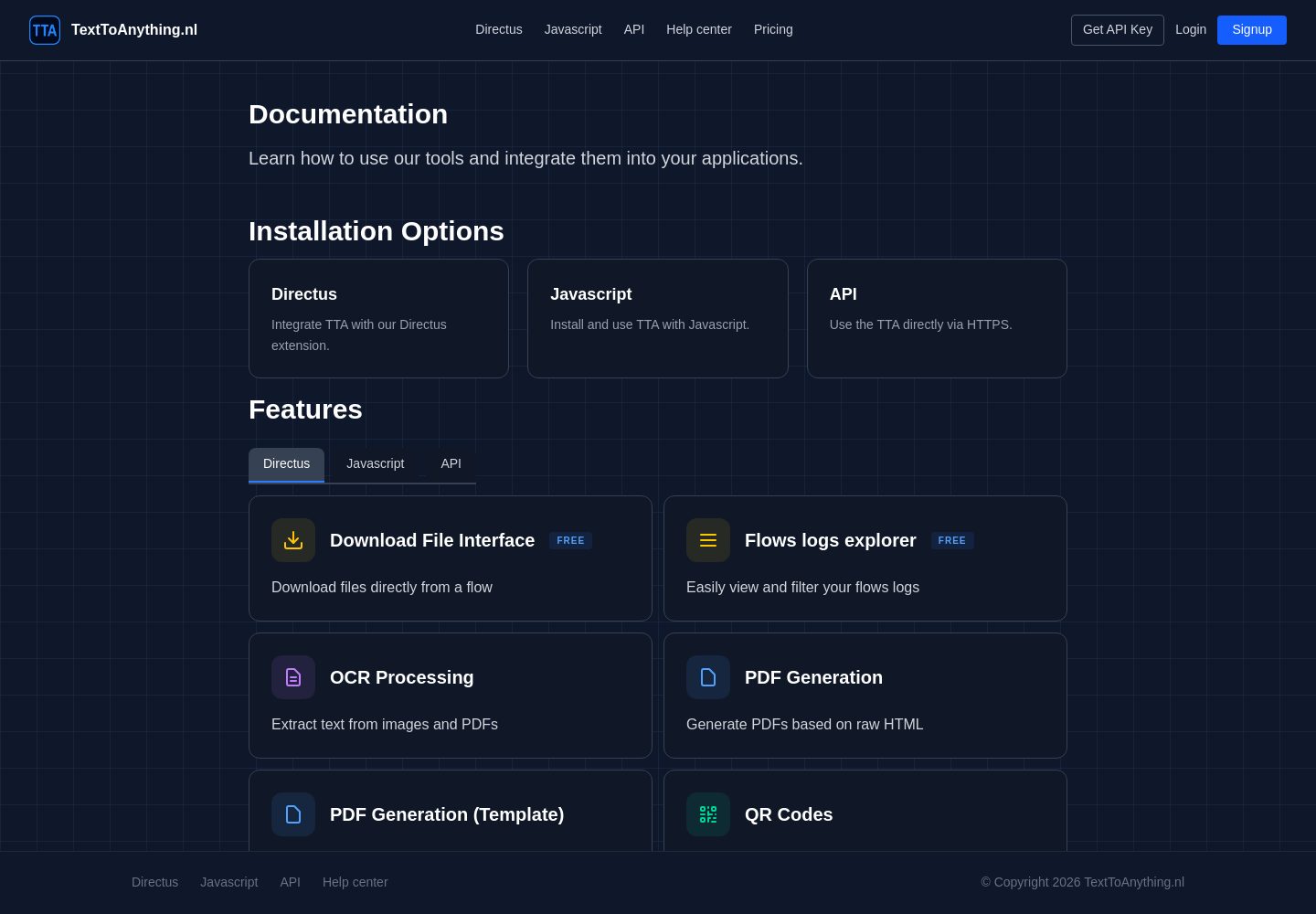
Why it matters: an empty heading creates the impression of unfinished or missing documentation. It also wastes the most valuable section of the docs landing page: the place where users should choose a task.
Recommended structure:
On desktop, use a two-column layout:
- Left: persistent documentation navigation
- Right: page content and examples
On mobile, turn the left navigation into a clearly labelled expandable “Docs menu” rather than relying only on the hamburger navigation.
Chrome for Developers is the strongest benchmark for this kind of hierarchy. The important lesson is not to copy its visual scale; it is to make the documentation structure visible and predictable.
---
3. Organize the product around user jobs, not only technical features
Current issue: “Directus,” “Javascript,” and “API” describe implementation routes, but they do not answer what users can accomplish.
Why it matters: a developer may arrive wanting “create an invoice PDF” or “extract text from an image,” not knowing which integration method to choose.
Recommended change:
Add a capability layer above or alongside the integration layer:
Document generation
- Generate PDFs
- Use PDF templates
- Create previews
Image and text processing
- OCR image scanning
- Text extraction
- File processing
Codes
- Generate QR codes
- Generate barcodes
Each capability should include:
- A one-sentence explanation
- A minimal request example
- Input and output format
- Link to the relevant API endpoint
- A practical use case
Twilio is a useful benchmark for this: the product is broad, but users can enter through a specific job rather than navigating an undifferentiated list of APIs.
---
4. Make pricing easier to scan and less visually interrupted on mobile
Current issue: the pricing page gives useful information, but the plan card is dense and the footer begins while the Basic card is still continuing in the mobile view.
Why it matters: pricing requires comparison and confidence. Any visual interruption makes limits, overage charges, and plan differences harder to understand.
Recommended changes:
- Use a compact pricing summary near the top:
- Monthly price
- Included requests
- Overage price
- Best for
- Separate included limits from overage pricing visually.
- Use a small “Included” and “Additional usage” grouping.
- Ensure the footer does not visually cover or compete with the final portion of a pricing card.
- Add a clear secondary action: “View API docs” or “See examples.”
- If additional plans exist below the Basic plan, show a visible plan summary or anchor navigation near the top.
The phrase “Pricing Plans - TTA” is functional but generic. A more useful heading would communicate the pricing model and product:
> Simple pricing for PDF, OCR, QR, and barcode APIs
The pricing page should also explain what happens after selecting “Get your API Key”. A small line such as “Create an account, receive your key, and start with the free monthly allowance” would reduce uncertainty without adding much content.
---
5. Give the code example a more prominent role
Current issue: the visual system includes monospace code styling, but the product should use code as a primary proof point rather than as a supporting decoration.
Why it matters: for developer products, the fastest credibility test is often whether the first request looks understandable.
Recommended change:
Place a small example directly on the homepage:
Include:
- Language tabs for cURL, JavaScript, and Python
- Copy button
- Response preview
- Link to the complete endpoint documentation
Resend and the stronger Cloudflare Workers references are good models for using code to communicate ease of adoption.
---
Page-by-page recommendations
Homepage
Keep
- Dark technical visual identity
- Blue primary action
- Grid texture, used subtly
- Compact header
- Code-oriented visual language
Change
- Make the first headline describe the actual service
- Show the four main capabilities immediately
- Add a working API request above the fold
- Separate “what you can do” from “how you integrate”
- Replace generic feature-card repetition with capability-specific examples
- Add a short trust-building explanation of inputs, outputs, and supported formats
A useful homepage flow would be:
Documentation
Keep
- Clear “Documentation” title
- Installation cards
- Dark readable presentation
- Short descriptive copy
Change
- Populate or remove the currently empty-looking Features section
- Add task-oriented capability links
- Add persistent desktop documentation navigation
- Add a clear “Start here” path
- Put authentication, errors, limits, and examples near the top
- Make API endpoint grouping visible before users open individual pages
Pricing
Keep
- Free entry price is prominent
- Usage allowances are visible
- Overage prices are disclosed
- The API key CTA is clear
Change
- Improve hierarchy between price, allowance, and overage
- Make the pricing model scannable in under ten seconds
- Clarify what happens after clicking the API-key CTA
- Add a docs link beside the primary CTA
- Avoid allowing the footer to visually compete with the card content on mobile
---
Product-specificity and default-pattern audit
| Visible pattern | Assessment | Recommendation |
|---|---|---|
| Dark navy grid background | Earned | It supports the technical/API identity. Keep it restrained so content remains dominant. |
| Three similarly sized installation cards | Neutral | The categories are meaningful, but capability cards should become more prominent than integration cards. |
| Monospace code treatment | Earned | Appropriate for API requests and technical examples. Use it for real executable examples, not labels. |
| Blue CTA and blue inline links | Neutral | A sensible interaction hierarchy, but reserve the strongest blue for the main action. |
| Rounded cards with 8px–12px radii | Neutral | Consistent and restrained. Avoid adding larger radii to every new section. |
| “Features” heading without visible content in the mobile docs view | Generic / unfinished-looking | Either populate it with actual task links or remove the heading until the content exists. |
| Mobile hamburger navigation | Neutral | Appropriate, but the docs need a stronger in-page navigation system after the menu opens. |
| Grid decoration | Earned, but easy to overuse | Keep it behind the hero and major sections; reduce it around dense documentation content. |
---
Current rendered design direction
The current page details support a compact, technical system rather than a decorative marketing system:
Colors
#0f172a#1e2939#155dfc#51a2ff#ffffff#99a1af#d1d5dc#05df72#fdc700
These values correspond to the current rendered navy surfaces, blue actions and links, white headings, muted text, and technical accent colors.
Current rendered design values
- Typography · Body
- Inter, 16px / 24px
- Typography · Primary heading
- 700, 48px / 60px
- Typography · Hero paragraph
- 400, 18px / 29.25px
- Typography · Card heading
- 600, 16px / 24px
- Typography · Code
- System monospace, 14px / 22.75px
- Spacing · Header padding
- 16px 32px
- Shape · Content card radius
- 12px
- Shape · Compact action radius
- 8px
- Shape · Header border
- 1px solid
Recommended design direction
Do not make the next version more visually elaborate. Make it more specific and useful:
- One clear product promise
- Four capability-led entry points
- One executable example
- One obvious first integration path
- Documentation organized around tasks
- Pricing organized around usage
- Stronger desktop docs navigation
- Mobile pages with no visually empty headings or interrupted content
The most important change is therefore content hierarchy, not color or ornament: help a developer understand the product and reach a working API request before asking them to navigate between Directus, JavaScript, API, pricing, and feature pages.
https://texttoanything.nl/ Give me comprehensive website feedback for texttoanything.nl find similar pages and competitors
Comprehensive website feedback for texttoanything.nl
TextToAnything is a developer-facing API and document-processing product site. Its strongest choice is the consistent dark, code-oriented visual system: it feels like a real technical tool rather than a generic marketing template. The main weakness is that the product story is less clear than the visual identity.
Executive summary
First change to make: make the homepage immediately answer:
- What does TextToAnything do?
- Who is it for?
- Which capability should I try first?
- How quickly can I make my first API request?
At the moment, the site communicates “developer platform” effectively, but visitors must assemble the product definition from the homepage, documentation, pricing, and integration options.
The recommended direction is not a complete visual redesign. Keep the dark technical foundation, then improve:
- Product positioning
- Capability hierarchy
- Documentation navigation
- Code-first onboarding
- Pricing clarity
- Mobile content flow
---
Similar pages and design benchmarks
These are saved design references that are useful for comparison. They are not all direct feature competitors; they are strong benchmarks for developer-product positioning, documentation, pricing, and API onboarding.
Captured pages
What to borrow
| Reference | Transferable idea |
|---|---|
| Cloudflare Workers | Explain the platform outcome before listing technical implementation details. |
| Notion Developer Platform | Translate technical capability into a plain-language benefit. |
| Chrome for Developers | Use predictable groups such as Start here, Guides, APIs, Examples, and Reference. |
| Twilio | Let users enter through a task or use case, not only through a product list. |
| Resend | Put a concrete, copyable API example close to the first product explanation. |
| Claude Code | Use a concise promise and immediately show the developer’s working environment. |
---
Competitive landscape
TextToAnything appears to sit across several adjacent categories rather than one narrow market. These are the competitor and alternative groups worth benchmarking:
| Category | Products to investigate | What TextToAnything should compare |
|---|---|---|
| Document and PDF APIs | PDF.co, Cloudmersive, PDF4me, Nutrient DWS | Endpoint breadth, SDK support, input/output formats, trust signals, pricing clarity |
| PDF generation | PDFMonkey, Documint, Anvil | Template workflow, first successful document, preview experience |
| OCR APIs | OCR.space, Cloudmersive OCR, Google Cloud Vision | First-request simplicity, supported file types, result explanation |
| Barcode and QR APIs | Dynamsoft, Barcode Bakery, QRServer API | Code generation/scanning clarity, technical documentation, examples |
| Developer automation platforms | Cloudflare Workers, Zapier, Make | Integration story, onboarding, documentation, platform positioning |
| Focused developer APIs | Resend, Twilio, Postmark | How the product explains one technical service without overwhelming the visitor |
These should be treated as an adjacent competitive set, not as proof that every product has identical functionality. The key comparison is how each product makes its value, first request, supported workflows, and pricing understandable.
---
What works well
1. The visual language is appropriate for the product
The dark navy background, fine grid treatment, blue actions, code blocks, and restrained card styling establish a technical environment quickly.
This is a good foundation because the product appears to target people who are comfortable with:
- APIs
- Code examples
- Developer documentation
- File and data-processing workflows
- Integration tools
The design does not need more visual decoration. More gradients, glass panels, large illustrations, or ornamental cards would likely weaken the product’s technical character.
2. The page has a credible developer hierarchy
The homepage contains the basic ingredients of a developer product:
- A compact header
- A clear primary action
- Technical content
- Capability or integration links
- Documentation access
- Pricing access
- A code-oriented visual treatment
The documentation and pricing pages also create a credible product journey rather than presenting only a promotional landing page.
3. The integration choices are understandable
The documentation experience presents distinct integration routes such as API, JavaScript, and Directus. Those are meaningful categories, not arbitrary repeated cards.
The problem is not that these options exist. The problem is that they are currently more visible than the jobs users want to accomplish.
4. The responsive foundation is solid
The mobile header is compact, the dark theme remains coherent, and the layout does not appear to depend on desktop-only composition.
The mobile version should still receive more content prioritization, especially on the documentation and pricing pages, but the foundation is sound.
---
Priority improvements
1. Clarify the homepage proposition
Problem
“Text To Anything” is memorable as a name, but the visitor must work to understand exactly what the service provides. The site appears to cover PDFs, OCR, QR codes, barcodes, and related processing, but that breadth is not organized into one immediately understandable promise.
Why it matters
Developers quickly ask:
- Can this solve my specific workflow?
- Is this a PDF API or a general-purpose utility API?
- Is it a hosted service, SDK, plugin, or automation layer?
- What should I try first?
If those questions are not answered in the first screen, visitors may go directly to competitors with more focused positioning.
Recommended change
Use a more explicit hero structure:
Then show four capability paths:
- Generate PDFs
- Extract text with OCR
- Create QR codes
- Create barcodes
Keep API, JavaScript, and Directus as a separate integration methods section.
Best comparison
Cloudflare Workers and Resend are useful references for the distinction between:
- What the product does
- How developers integrate it
---
2. Organize the site around capabilities before integrations
Problem
“API,” “JavaScript,” and “Directus” describe implementation choices. They do not describe the visitor’s goal.
A visitor is more likely to think:
- “I need to turn data into a PDF.”
- “I need to scan an image.”
- “I need to generate a QR code.”
Recommended information architecture
Each capability should have:
- A one-sentence explanation
- A small example
- Supported inputs and outputs
- A link to its endpoint documentation
- One realistic use case
Best comparison
Twilio is the strongest benchmark for capability-led organization. Notion’s developer platform is useful for making technical functionality feel approachable instead of purely infrastructural.
---
3. Rework the documentation landing page
Problem
The documentation landing page gives attention to integration choices, but the task-based route is less prominent. The visible structure also risks creating a gap between introductory content and the actual feature documentation.
Recommended structure
Desktop recommendation
Use a two-column layout:
- Persistent left navigation
- Content area on the right
The navigation should clearly show the current section and the user’s progression.
Mobile recommendation
Use a visible “Docs menu” control near the page title. Do not make the user rely only on the global hamburger menu to understand the documentation structure.
Best comparison
Chrome for Developers is the most useful reference for information architecture. The important lesson is the predictable grouping, not necessarily the visual style.
---
4. Make the first API request the main proof point
Problem
The site uses a technical visual language, but the first executable example should carry more of the persuasion.
Why it matters
A developer can often judge a product within seconds by looking at:
- Request format
- Authentication complexity
- Input structure
- Output structure
- Language support
Recommended homepage module
Show one practical request, not only abstract syntax:
Include:
- cURL tab
- JavaScript tab
- Python tab
- Copy button
- Link to the complete example
- Small response preview
The example should correspond to one of the most important capabilities, probably PDF generation if that is the core product.
Best comparison
Resend is a good benchmark for code-first product explanation. Claude Code is useful for showing how quickly a technical product can establish context with a concise, specific promise.
---
5. Improve pricing scanability
What works
- The free entry point is visible.
- Usage limits are presented.
- Additional usage is disclosed.
- The API-key CTA is easy to find.
Problem
The pricing information is denser than it needs to be, especially on mobile. The visitor has to parse price, included usage, and overage information as one continuous block.
Recommended card hierarchy
Also explain what happens after clicking the CTA:
> Create an account, receive your API key, and start using the free allowance.
That small sentence removes an important point of uncertainty.
---
6. Add stronger proof without making the site feel corporate
The current site is technically credible, but it could better communicate why someone should trust it for production workflows.
Useful additions:
- Supported file formats
- Typical request/response examples
- Clear error examples
- Security and privacy summary
- Uptime or infrastructure details, if available
- A small list of common implementation scenarios
- “Built for” descriptions such as SaaS products, internal tools, and automation workflows
Avoid adding generic customer-logo walls unless there are genuinely relevant customers. For this product, concrete examples are likely more persuasive than broad brand decoration.
---
Page-specific feedback
Homepage
Keep
- Dark technical visual identity
- Blue primary CTA
- Grid background
- Code styling
- Compact navigation
- Capability links
Change
- Make the main value proposition explicit
- Show the API request above the fold
- Put four capabilities before integration options
- Explain supported inputs and outputs
- Add a concise “How it works” section
- Add a pricing summary and direct documentation CTA
Suggested homepage order
Documentation
Keep
- Strong page title
- Separate integration options
- Dark readable environment
- Direct links to API content
Change
- Add a clear Quickstart
- Organize documentation by task
- Add persistent desktop navigation
- Add authentication and error handling near the beginning
- Ensure every section heading leads to visible useful content
- Provide copyable examples for each API capability
Pricing
Keep
- Transparent usage model
- Free entry option
- Clear API-key action
Change
- Separate included usage from overage
- Add “best for” descriptions
- Improve mobile card rhythm
- Explain the signup/API-key flow
- Link directly to documentation and examples
---
Visual system
The current rendered page uses a coherent technical palette:
Colors
#0f172a#1e2939#155dfc#51a2ff#ffffff#99a1af#d1d5dc#05df72#fdc700
The most useful design decision is to keep the palette restrained:
- Navy for the canvas
- Slightly lighter navy for structural surfaces
- Bright blue for primary actions and links
- White for primary text
- Muted gray for secondary text
- Green and yellow for code syntax or technical status
Do not introduce many additional accent colors. The current blue should remain the primary interaction color, while green and yellow should stay mostly inside code or status contexts.
The rendered typography uses Inter for interface content and a system monospace stack for code.
Current rendered design values
- Typography · Body
- Inter, 16px / 24px
- Typography · Main heading
- Inter, 700, 48px / 60px
- Typography · Hero paragraph
- Inter, 18px / 29.25px
- Typography · Navigation
- Inter, 14px / 20px
- Typography · Code
- System monospace, 14px / 22.75px
- Spacing · Header padding
- 16px 32px
- Shape · Content card radius
- 12px
- Shape · Compact action radius
- 8px
- Shape · Header border
- 1px solid
This system is already sufficient. The next design effort should focus on hierarchy and content, not token expansion.
---
Mobile experience
The mobile foundation works, but the pages should be reviewed against these priorities:
- Put the product promise before secondary navigation.
- Keep the first CTA visible without excessive scrolling.
- Make capability selection easier than integration selection.
- Keep pricing details grouped into short scan-friendly chunks.
- Ensure documentation headings are followed immediately by useful links or examples.
- Avoid letting a footer visually interrupt unfinished pricing or documentation content.
- Add a visible in-page docs menu.
The mobile version should not simply be a compressed desktop page. It should prioritize:
---
Vibe-coded appearance check
Overall verdict: mixed. The technical visual language feels product-specific, but parts of the hierarchy still resemble a generic developer landing-page template.
| Visible occurrence | Judgment | Consequence and recommendation |
|---|---|---|
| Dark navy canvas with subtle technical grid | Earned | Supports the API and developer-tool character. Keep it restrained. |
| Monospace code presentation | Earned | Fits the product. Give it a real executable example rather than using it mainly as atmosphere. |
| Blue action/link system | Earned | Appropriate for technical navigation and primary actions. Keep one clear strongest CTA. |
| Repeated integration cards | Neutral | The categories are meaningful, but capability cards should lead the journey. |
| Moderate 8px–12px card radii | Neutral | Restrained and appropriate. Avoid increasing radii across every future surface. |
| Integration methods appearing before user tasks | Generic/default | Makes the product feel implementation-led. Reorder around PDF, OCR, QR, and barcode workflows. |
| Documentation landing page emphasizing entry routes over tasks | Generic/default | Makes users decide how to integrate before they understand what to build. Add a task-based “Choose a capability” section. |
| Pricing information presented as a dense continuous block | Neutral, but under-refined | Makes plan comparison slower. Separate price, included usage, and overage. |
| Minimal shadow use | Earned | Keeps the technical interface sharp. No need to add decorative elevation. |
---
Contrast check
The current live inspection retained the relevant rendered colors, but deterministic contrast calculations were not available for the selected text/backdrop observations. I would check these pairs before treating them as final tokens:
| Element | Foreground | Background | Size / weight | WCAG | AA | AAA | APCA |
|---|---|---|---|---|---|---|---|
| Body text | #ffffff | #0f172a | 16px / 400 | Unresolved | Unresolved | Unresolved | Unresolved |
| Hero paragraph | #99a1af | #0f172a | 18px / 400 | Unresolved | Unresolved | Unresolved | Unresolved |
| Navigation | #d1d5dc | #0f172a | 14px / 400 | Unresolved | Unresolved | Unresolved | Unresolved |
The reason is specific: the current inspection did not retain a usable contrast observation for those pairs, so I would not label them compliant or non-compliant from the screenshot alone.
---
Recommended order of work
Phase 1: clarify the product
- Rewrite the homepage hero
- Define the four primary capabilities
- Separate capabilities from integrations
- Add one concrete API example
Phase 2: improve discovery
- Reorganize the documentation landing page
- Add Quickstart, Authentication, Examples, and Reference
- Add persistent desktop docs navigation
- Add a mobile docs menu
Phase 3: improve decision-making
- Rework pricing card hierarchy
- Explain the API-key/signup flow
- Add supported formats and common workflows
- Add links from pricing directly to relevant examples
Phase 4: strengthen differentiation
- Add production-use proof
- Explain privacy/security and operational details
- Create capability-specific landing pages
- Compare the product more directly against PDF/OCR/document API alternatives
The key principle is:
> Keep the visual identity, but make the product’s capabilities and first successful API request impossible to misunderstand.