Give me comprehensive website feedback for vela.cx here are s…
I'll run the contrast calculations and search for similar pages and competitors in parallel. Vela.cx — Comprehensive Website Feedback Vela is a dark-mode AI support platform targe…
Give me comprehensive website feedback for vela.cx
here are some screenshots. find similar pages and competitors to compare with as well.
I'll run the contrast calculations and search for similar pages and competitors in parallel.
Vela.cx — Comprehensive Website Feedback
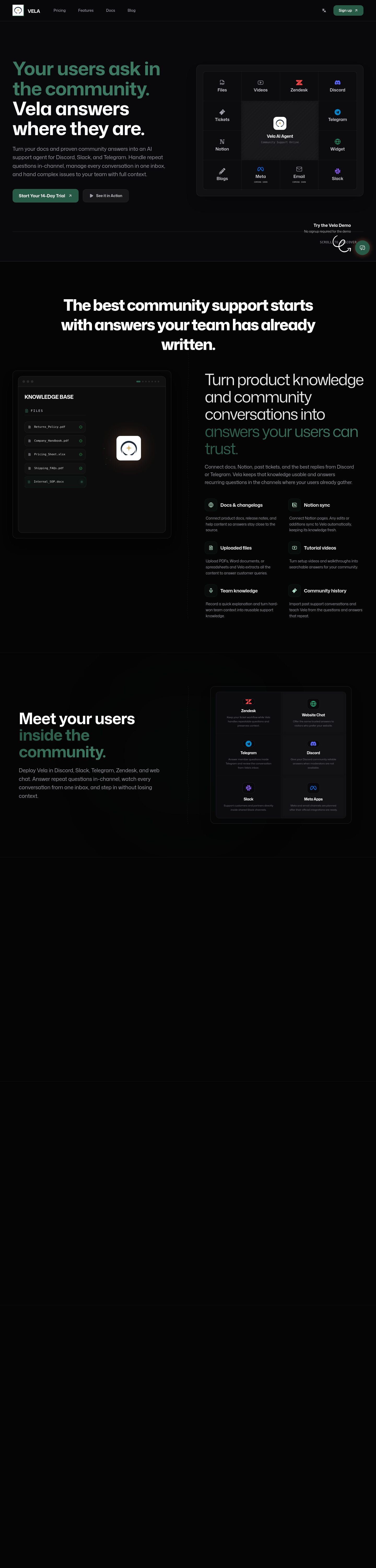
Vela is a dark-mode AI support platform targeting community-first products. The page is a single long-scroll landing (observed ~11,500px tall, captured to 6,000px) with seven stacked sections: hero, social proof, "How it works," integrations, "Why Vela," pricing teaser, and footer. The strongest choice is a tight, restrained dark canvas with a single green accent and a GitHub-grade sans typeface — it reads as a developer tool, not a generic AI wrapper.
What works
- Typography discipline. A single family (Mona Sans) carries the entire page from a 72px hero down to 14px body, with JetBrains Mono reserved for code-like labels and badges. Negative tracking on display sizes (-1.8px on the hero, -3px on section h2s) gives the headlines a confident, technical voice without feeling decorative.
- Color restraint. The palette is essentially three roles: canvas
#09090b, ink#e5e7eb, and a single green accent#285a48(with a gradient stop at#3d7a63). The orange#ff8a58only appears as a glow shadow on the hero CTA — a smart way to add warmth without polluting the system. - Shape language. Buttons use 12px radius, cards use 16px, and the hero CTA uses a pill (
3.35544e+07px). The hierarchy of radii is consistent and reads as deliberate rather than default. - Section rhythm. Each section is separated by a 1px hairline at 5–10% white opacity rather than a hard divider — a quiet, modern way to chunk a long page.
Priority issues
- The hero CTA is the only place the brand "speaks." The green button is the lone moment of color saturation on the page. Everything else is monochrome. The risk: a visitor who scrolls past the hero before clicking has no visual anchor to remember the brand by. Consider giving the green accent a second, quieter role — a thin underline on the active nav item, a tinted badge on the "How it works" step numbers, or a subtle green border on the pricing card.
- The "How it works" section is the weakest visual moment. Three numbered steps sit in a row with thin borders and small icons, but the icons are monochrome and the step numbers are tiny. Compared to the confident hero, this section reads as filler. Either elevate it (larger icons, a tinted background card, or a connecting line between steps) or fold it into the hero as a single visual.
- The pricing teaser is undersold. The page ends with a three-tier pricing block, but the tiers are visually identical to the integration cards above them — same border weight, same radius, same muted text. A pricing block needs to feel like a decision point. Add a "Most popular" badge on the middle tier, a tinted background, or a single highlighted border to make the choice legible at a glance.
- The mobile capture failed. The mobile inspection returned a session-closure error, so I can't judge the responsive behavior. Given the page is 11,500px tall with seven sections, mobile is where the long-scroll format will either hold up or fall apart. This is the highest-risk unknown.
- The accent green fails AAA on small text. The green accent text (
#3d7a63on#09090b) hits 3.94:1 — passes AA only because it's used at 72px. If you ever use this green for body copy or small labels, it will fail. The orange glow on the hero CTA is decorative only and doesn't carry text, so it's fine.
Contrast table (exact retained pairs)
| Element | Foreground | Background | Size / weight | WCAG | AA | AAA | APCA |
|---|---|---|---|---|---|---|---|
| Body text | #e5e7eb | #09090b | 16px / 400 | 16.06 | Pass | Pass | -92.09 |
| Hero headline (white) | #ffffff | #09090b | 72px / 700 | 19.89 | Pass | Pass | -107.77 |
| Hero accent word | #3d7a63 | #09090b | 72px / 700 | 3.94 | Pass (large) | Fail | -26.89 |
| Primary CTA label | #ffffff | #285a48 | 14px / 600 | 7.94 | Pass | Pass | -92.07 |
| Footer CTA label | #ffffff | #285a48 | 12px / 700 | 7.94 | Pass | Pass | -92.07 |
| Muted body | #a1a1aa | #050505 | 18px / 400 | 7.96 | Pass | Pass | -51.72 |
The highest-impact failure is the accent green at small sizes — keep it at display scale only.
Product-specificity audit (vibe-coded defaults)
- Monospace as technical signal: JetBrains Mono is used for small uppercase labels ("INTEGRATIONS," step numbers, code snippets). Earned — it fits a developer-tool audience and is restrained to label-sized text, not body copy.
- Pill CTA: The hero "Get started" button is a full pill. Earned — it's the single primary action and the pill shape matches the rounded card system.
- Large display scale: 72px hero with tight negative tracking. Earned — the page is a single-message landing and the scale carries the value prop.
- Thin border cards: Integration and pricing cards use 1px borders at 60–80% white opacity. Earned — consistent across the page and matches the hairline section dividers.
- Green glow on CTA: The hero button has a
rgba(255,138,88,0.4)outer glow. Neutral — adds warmth but the orange-on-green combination is unusual; verify it reads as intentional rather than accidental. - Repeating diagonal stripe pattern: A
repeating-linear-gradient(135deg, ...)appears in the hero. Neutral — it's a subtle texture, not a dominant pattern, and doesn't read as a default. - Identical card rhythm: Every section uses the same card border + radius + padding. Generic — the pricing block especially needs differentiation from the integration cards above it.
Comparable references
Captured pages
Exact source palette
Colors
#09090b#e5e7eb#285a48#3d7a63#ff8a58
Typography used on vela.cx
Typography used on vela.cx
- Mona Sans
Weight 400 · Size 16px
- Mona Sans
Weight 700 · Size 72px
- Mona Sans
Weight 800 · Size 60px
- JetBrains Mono
Weight 700 · Size 12px
Useful design values
Useful design values
- Spacing · Section gap
- ~120px vertical between sections
- Spacing · Card padding
- 24px
- Radius · Button radius
- 12px
- Radius · Card radius
- 16px
- Radius · Hero CTA pill
- full pill
- Type scale · Hero h1
- 72px / 1.06 / -1.8px tracking
- Type scale · Section h2
- 60px / 1.06 / -1.5px tracking
- Type scale · Body
- 16px / 1.5
- Type scale · Muted body
- 14px / 1.625
- Border · Card border
- 1px solid rgba(255,255,255,0.08)
- Shadow · Card shadow
- 0 25px 50px -12px rgba(0,0,0,0.25)
- Shadow · Hero CTA glow
- 0 0 60px rgba(255,138,88,0.25)
First change to make
Give the pricing block a visual identity that separates it from the integration cards above — a "Most popular" badge on the middle tier, a tinted background, or a single highlighted border. Right now the page's most important decision point looks identical to the cards above it, which costs conversions.