# How html.to.design is designed
[Open the live Fudge conversation](https://design.withfudge.com/share/html.to.design-design)
Last updated: 2026-08-10
## Captured pages
[](https://design.withfudge.com/share/pin-4228)
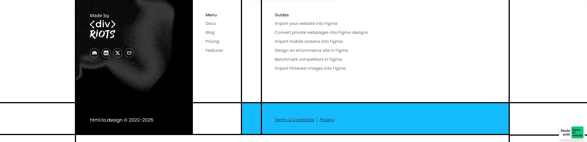
[Footer section with dark brand panel, social icons, and bright cyan legal bar with Terms & Conditions link](https://design.withfudge.com/share/pin-4228)
[](https://design.withfudge.com/share/pin-4227)
[Testimonials section with four white cards on black grid lines and cyan accent block, featuring user avatars and quotes](https://design.withfudge.com/share/pin-4227)
[](https://design.withfudge.com/share/pin-4226)
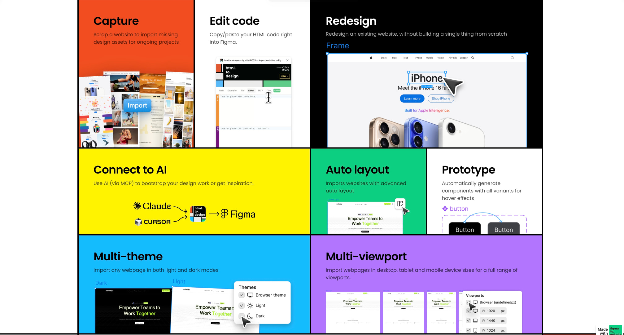
[Feature grid with six colorful panels in orange, yellow, green, cyan, purple, and black showcasing Capture, Edit code, Redesign, Connect to AI, Auto layout, Prototype,](https://design.withfudge.com/share/pin-4226)
[](https://design.withfudge.com/share/pin-4225)
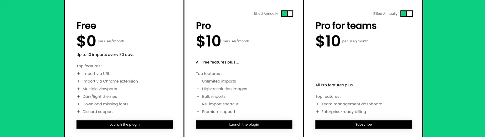
[Pricing section with three white cards on green background showing Free, Pro, and Pro for teams tiers with black action buttons](https://design.withfudge.com/share/pin-4225)
## Overview
The html.to.design visual system is built around a striking grid-based architecture that uses heavy black lines to carve the page into distinct rectangular territories. This is not a subtle or minimal aesthetic—it is confident, tool-like, and immediately communicates that this is a product for people who work with structure and code. The design pairs stark black-and-white foundations with saturated, almost playful accent colors that appear in large flat blocks behind feature descriptions. The result is a high-energy, developer-friendly identity that feels more like a creative coding environment than a conventional SaaS landing page.
The system relies on a single type family, Poppins, used across all text from large display headings to small legal copy. This consistency reinforces the technical precision of the product while the weight variations create clear hierarchy. The layout philosophy is modular: every section is a self-contained panel with its own background color or white surface, separated by visible black borders that act as both structural seams and graphic elements. There is no softening through shadows or gradients—everything is flat, crisp, and deliberately two-dimensional. The overall impression is of a tool that respects the user's intelligence and doesn't hide behind decorative excess.
## Colors
The color system operates on a principle of maximum contrast for structure and selective vibrancy for expression. Black lines define every boundary; white surfaces provide reading space; and a rotating cast of bright accent colors gives each feature area its own identity.
| token | value | use |
|---|---|---|
| canvas | `#FFFFFF` | Primary page background, testimonial card surfaces, pricing card backgrounds |
| ink | `#000000` | Primary text, grid lines, borders, button backgrounds, footer brand panel |
| muted-ink | `#555555` | Secondary text, feature descriptions, pricing details, guide links |
| action | `#000000` | Primary button backgrounds, interactive emphasis |
| action-text | `#FFFFFF` | Text on dark buttons and inverse surfaces |
| accent-cyan | `#1DBFFF` | Footer legal bar, feature panel backgrounds, structural accent blocks |
| accent-green | `#00D084` | Pricing section background, feature panel backgrounds |
| accent-orange | `#F25C2A` | Feature panel backgrounds, particularly Capture section |
| accent-yellow | `#FFE600` | Feature panel backgrounds, particularly Connect to AI section |
| accent-purple | `#A855F7` | Feature panel backgrounds, particularly Multi-viewport section |
| surface | `#FFFFFF` | Card backgrounds, content panels, reading areas |
| surface-inverse | `#000000` | Footer brand area, dark feature panels like Redesign |
| border | `#000000` | All grid lines, card outlines, section separators |
The interface does not use gradients or shadows for depth. Color is applied in flat, unmodulated fields. The black grid lines are not merely decorative—they are load-bearing structural elements that separate every major zone. Accent colors are used at full saturation and large scale, often filling entire viewport-width panels. The Redesign feature panel inverts this pattern, using black as the panel background with white text, demonstrating that the system supports dark surfaces when content demands it. The relationship between light and dark modes is handled through explicit panel choices rather than a global theme switcher in the visible interface.
## Typography
The type system is singular and disciplined. Poppins, designed by Jonny Pinhorn and published by Indian Type Foundry, serves every text role. The family is used in weights from Regular to Semibold, with display sizes set tight and body sizes given comfortable leading. Verify licensing for these families before production use.
| token | family | size | weight | leading | tracking | use |
|---|---|---:|---:|---:|---:|---|
| hero-display | Poppins | 3rem | 600 | 1.1 | -0.02em | Page headlines, major section titles |
| section-display | Poppins | 2rem | 600 | 1.2 | -0.01em | Feature panel headings, pricing tier names |
| body | Poppins | 1rem | 400 | 1.5 | 0em | Paragraphs, descriptions, testimonials |
| body-small | Poppins | 0.875rem | 400 | 1.5 | 0em | Secondary descriptions, footer copy, legal text |
| label | Poppins | 0.75rem | 500 | 1.4 | 0.02em | Buttons, tags, small emphasized metadata |
| navigation | Poppins | 0.875rem | 500 | 1.4 | 0em | Menu items, guide links, footer navigation |
Display sizes use negative letter spacing for a compact, authoritative presence. Body text remains neutral in tracking for readability. The weight distinction between Regular (400) and Semibold (600) provides all necessary hierarchy without introducing additional weights. No italic styles are visible in the interface. The type scale is built on a 4px relative unit, with sizes landing on whole-number multiples: 12px (0.75rem), 14px (0.875rem), 16px (1rem), 32px (2rem), and 48px (3rem).
## Layout
The layout system is fundamentally grid-based and border-driven. The page is divided by persistent black lines that create a visible framework across all sections. These lines are not decorative accents—they are structural elements that separate content areas and create the system's distinctive architectural quality.
The grid appears to use a 12-column underlying structure, with content panels spanning varying numbers of columns. Feature panels in the main grid are large rectangular blocks, often half-width or full-width, each with its own background color. The testimonial section shows a four-column card layout with equal-width white cards separated by black vertical dividers. The pricing section uses a three-column card layout on a full-bleed green background.
Spacing between sections is generous, typically 6rem or more, allowing each colored panel to breathe as an independent unit. Internal padding within cards and panels is consistently 2rem, creating comfortable reading margins without excessive whitespace. The grid lines themselves appear to be 2px or 3px in weight—substantial enough to read as deliberate design elements rather than subtle separators.
The footer breaks from the main grid with a two-part structure: a dark brand panel on the left containing social icons and copyright, and a bright cyan legal bar extending to the right containing terms and privacy links. This asymmetry provides a strong terminal moment to the page while maintaining the system's graphic boldness.
## Visual language
The visual language is flat, graphic, and intentionally two-dimensional. There are no drop shadows, no gradients, no glassmorphism, no rounded corners on major structural elements. The aesthetic recalls design tools themselves—Figma's canvas, code editors with visible grid lines, technical documentation layouts.
Imagery within feature panels takes the form of screenshots and interface mockups, presented without frames or device chrome. These screenshots sit directly on their colored backgrounds, often bleeding to the panel edges. The Redesign panel shows a full browser screenshot; the Multi-theme panel shows side-by-side dark and light mode previews. This treatment reinforces the product's function: these are not polished marketing renders but actual working interfaces.
Iconography is minimal and functional. Social icons in the footer are simple line circles containing platform marks. The pricing toggle uses a straightforward switch control. There are no illustrative icons or decorative graphics beyond the product screenshots themselves.
The overall mood is confident and technical without being cold. The bright accent colors—cyan, green, orange, yellow, purple—introduce personality and energy that balances the severity of the black grid. This is a system that celebrates structure and process, appropriate for a tool that converts code into design files.
## Components
### Primary action button
- **Anatomy**: Text label centered within a rectangular button shape
- **Surface and text color**: Black background (`{colors.action}`) with white text (`{colors.action-text}`)
- **Typography**: `{typography.label}` — 0.75rem, weight 500
- **Shape**: Slight rounding at `{rounded.button}` (approximately 0.25rem), otherwise rectangular
- **Spacing**: Padding approximately 0.75rem vertical and 1.5rem horizontal
- **Composition**: Full-width within card containers in pricing section; inline in feature contexts
- **Variants**: "Launch the plugin" and "Subscribe" labels visible; consistent styling across contexts
### Feature panel
- **Anatomy**: Large rectangular content block containing heading, description, and supporting image or screenshot
- **Surface and text color**: Variable background per panel—orange, yellow, green, cyan, purple, or black; text is black on light panels, white on dark panels
- **Typography**: `{typography.section-display}` for headings; `{typography.body}` for descriptions
- **Shape**: Zero border radius; sharp rectangular edges aligned to grid
- **Spacing**: `{spacing.card-padding}` internal padding; panels separated by `{colors.border}` grid lines
- **Composition**: Half-width or full-width grid cells; screenshots positioned below or beside text
- **Variants**: Light variant (colored background, dark text) and inverse variant (black background, white text) for Redesign panel
### Testimonial card
- **Anatomy**: White card containing circular avatar, user name, and quote text
- **Surface and text color**: White surface (`{colors.surface}`); black name (`{colors.ink}`); gray quote (`{colors.muted-ink}`)
- **Typography**: Name uses `{typography.section-display}` at smaller effective size or `{typography.body}` weight 500; quote uses `{typography.body}`
- **Shape**: Zero border radius; separated by visible black vertical lines
- **Spacing**: `{spacing.card-padding}` internal padding
- **Composition**: Equal-width columns in four-card row; avatar and name in horizontal alignment with quote below
- **Variants**: Single visible state; no rating stars or other metadata
### Pricing card
- **Anatomy**: White card with tier name, price, billing period, feature list, and action button
- **Surface and text color**: White surface (`{colors.surface}`); black headings (`{colors.ink}`); gray feature text (`{colors.muted-ink}`)
- **Typography**: Tier name `{typography.section-display}`; price `{typography.hero-display}`; features `{typography.body-small}`
- **Shape**: Zero border radius; separated by black vertical lines
- **Spacing**: `{spacing.card-padding}` internal padding; generous vertical space between price and features
- **Composition**: Three equal-width columns on green background; toggle control above for billing period
- **Variants**: Free, Pro, and Pro for teams tiers with identical structure; button label varies
### Footer brand panel
- **Anatomy**: Dark rectangular area with "Made by" label, divRIOTS logo mark, social icon row, and copyright
- **Surface and text color**: Black background (`{colors.surface-inverse}`); white text and icons (`{colors.action-text}`)
- **Typography**: `{typography.body-small}` for labels and copyright
- **Shape**: Zero border radius; left-aligned within footer grid
- **Spacing**: `{spacing.card-padding}` internal padding
- **Composition**: Stacked vertical arrangement with logo prominent, social icons in horizontal row, copyright at bottom
- **Variants**: Single visible state
### Footer legal bar
- **Anatomy**: Bright cyan horizontal bar containing Terms & Conditions and Privacy links
- **Surface and text color**: Cyan background (`{colors.accent-cyan}`); black text (`{colors.ink}`)
- **Typography**: `{typography.body-small}`
- **Shape**: Zero border radius; extends full width of right footer area
- **Spacing**: Approximately 1rem vertical padding, 2rem horizontal padding
- **Composition**: Links separated by vertical divider; left-aligned within bar
- **Variants**: Single visible state
## Responsive behavior
The grid-based layout with heavy borders suggests specific responsive considerations. At narrower viewports, the multi-column layouts should stack vertically while preserving the black border separators between items. The four-column testimonial grid should become two columns on tablet and single column on mobile, with horizontal borders replacing vertical ones. The three-column pricing grid should similarly stack, with each tier becoming full-width and separated by horizontal lines.
The feature panel grid, with its mix of half-width and full-width panels, should maintain its block structure but reflow to single column. The colored backgrounds must remain full-bleed within their stacked containers. Typography should scale down proportionally: hero-display from 3rem to 2rem on tablet and 1.5rem on mobile; section-display from 2rem to 1.5rem and then 1.25rem.
The persistent black grid lines are essential to the identity and should not be hidden at any breakpoint. Instead, their orientation should change—vertical dividers becoming horizontal as columns stack. The footer should transition from its asymmetric two-part structure to a stacked arrangement with brand panel above and legal bar below, both full-width.
## Practical implementation guidance
### Preserve
- The heavy black grid lines as structural separators, not decorative borders
- Flat color fields without gradients, shadows, or transparency effects
- Sharp rectangular corners on all major panels and cards
- Single type family (Poppins) across all text roles
- High contrast between panel backgrounds and text
- Screenshot imagery presented without frames or device chrome
### Avoid
- Rounded corners on cards or buttons beyond the minimal 0.25rem button radius
- Drop shadows or elevation effects
- Gradient backgrounds or overlays
- Multiple type families or decorative display fonts
- Soft, muted color palettes—the system requires saturation and confidence
- Container max-widths that would break the full-bleed panel effect
### Recommended build order
1. Establish the 4px relative unit and type scale
2. Implement the black grid line system as visible borders
3. Build the feature panel grid with variable accent backgrounds
4. Create the testimonial and pricing card components with zero-radius white surfaces
5. Implement the footer with its asymmetric dark/cyan two-part structure
6. Add the minimal button component with slight rounding
7. Apply Poppins at all sizes with correct weight and tracking values
### Accessibility
- Ensure black text on colored panels meets WCAG contrast minimums; the orange and yellow panels may need adjusted text colors or increased weight
- The black grid lines should not be the only visual indicator of content separation; maintain adequate spacing
- Social icons in the footer need accessible labels
- Pricing toggle should have clear state indication beyond color
- All interactive elements should have visible focus states, likely as inverted color or outline variations
## Scope note
This guide covers the html.to.design homepage visible in the supplied images, including the feature grid, testimonials, pricing, and footer sections. Navigation behavior, mobile layouts, hover states, form interactions, and any pages beyond the homepage are not represented. Measurements are practical adaptation targets based on visible proportions.
## More website design guides
[Browse website design guides by pattern and website](/design-guides).